


Purpose
The UX team was asked to review the add-on widget (for “Frequently bought together,” a.k.a “Add-ons” recommendations) on the Fingerhut product description page (PDP) to see if we could make any potential user experience enhancements to the existing space. Simply put, could we make this section easier for users to read while at the same time increase how often users follow through on adding both items to their cart.
My role as a UX designer was to review the current state of the add-on widget, conduct competitive research and analysis and then work toward a design recommendation. I worked with the eCommerce/product shop team product owner and business analyst and received guidance from the shop UX designer along the way. I used different resources and tools to complete my work, including Sketch (wireframe), Axure (prototype), Zeplin (design specifications) and JIRA (project management).
Process
I learned quite a bit from my competitive analysis in terms of how others display add-on products to users. Of the competitors viewed, quite a few have some sort of widget just below the product description (i.e. “People Also Viewed”) while others had a similarly named widget to the right side of the product. There was also an instance of a “Frequently Bought Together” popup modal on one site.
Keeping all of this research in mind, I then reviewed the current state of the FHT widget. Based on what I could gather from previous usability studies, FHT users really value product images and titles, so naturally, I was looking to bring more attention to this. The product image size increased with each iteration until it was almost double in the final stage.
Right away in my first iteration, I opted to tighten up the widget title space (Frequently Bought Together) and move the instructional text (Item you’re currently viewing) on top of the product image to better improve readability. The instructional text color was also changed to a darker gray color so it was more easily seen. Originally, the background colors were white (for the selected item) and light blue (for the recommended item). I felt this was a poor visual experience for users (it’s typically the other way around), so I switched them.
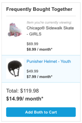
Current state - Desktop view
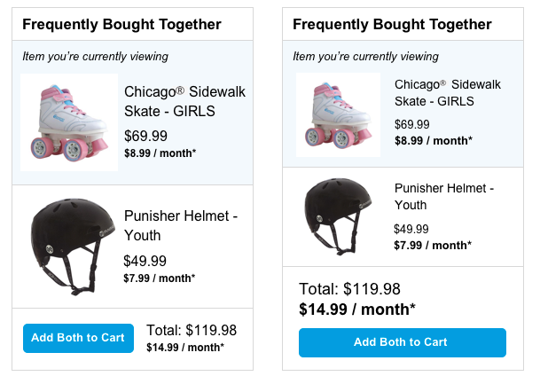
Initial design iterations which shortened the widget title space, moved and darkened the instructional text, increased image size and limited the product title characters to 60.
In later iterations, I looked for ways to further reduce the clutter and that led us to reducing the product title character limit from 60 to 50 (including spaces and ellipses). This ended up being changed across the board on other pages, such as and product listing page (PLP), so everything was uniform.
Later design iteration that included increased product image sizes, increased image padding and a further reduced product title character limit (60 to 50, including spaces and ellipses).
During the final design iterations, stakeholders recommended centering the product image and moving the text below it to match other sections of the site. I felt this move would take away from the overall flow of the design (as the centered image forces the user’s eye to move to the center and then go back to the left), but acquiesced on the need to have uniform patterns that match what’s already been published. Changing the image and text placing caused the size of the widget box to extend, which meant that we were no longer working within the current space. It also pushed the call to action (CTA) below the fold, which resulted in mixed feelings from some stakeholders.
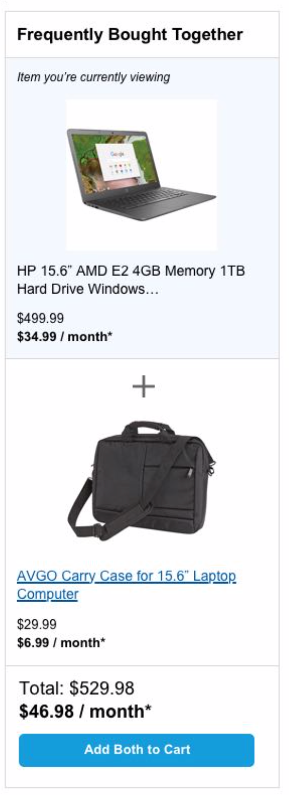
Additionally, a plus sign (+) was added to the design as a visual cue/reminder to users of the additional product recommendations.
Due to sizing, the tablet version of the widget ended up using a horizontal layout. The plus sign is in the middle of the two product selections to accommodate the horizontal layout.
Similar enhancements were made to the image sizes and padding, background and alignments of the popup modals in the next step, which involves users selecting whether they want to purchase a service plan for applicable items.
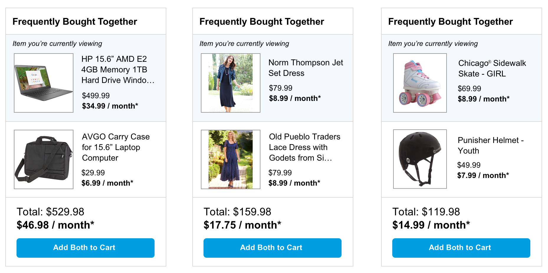
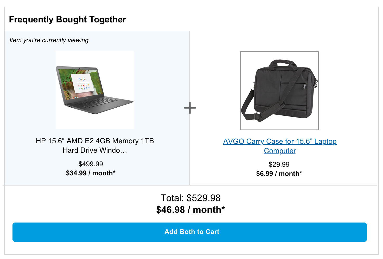
Final approved design
Final tablet design with horizontal layout
Conclusion
In the end, I think users will get a better experience from larger product titles and a more clear idea of which items are being presented in the add-on. However, if I had infinite time, I would consider redesigning what’s already been done for product listings to the style presented in my early iterations. I feel it flowed better and would love the chance to test both ideas out in usability sessions.
Additionally, one of the downsides was inconsistent product images. Some had solid white backgrounds with the product on top of it; some had bars of white on two sides. Ideally, it’d be better to only have images with white backgrounds.
Overall, this was a great learning experience. I was able to work with the team and provide some good insight (the selected item background idea was especially well received). The notes I made in my Sketch and Axure files were also a big help according to the business analyst I worked with in creating stories in JIRA.