Anoka-Hennepin School District website
During the redesign (version 2.0), we focused heavily on site navigation and how it was going to be organized. Much of this was presented and subsequently discussed via the redesign committee that I served on in a key role. The committee consisted of staff from the district and school level as well as parents and community members.
In addition to the redesign committee's work, I was also busy creating the designs for the second site version. This was an important experience and learning process for me as it was my first set of website designs post-college. Here are some of my early surviving sketches.
Roles: Information architecture/design, interaction design, user experience design, visual design, art direction, photography. Tools: Adobe Illustrator, Adobe Photoshop, Adobe Dreamweaver, Sublime 2, SchoolCenter (content management system), Blackboard Web Community Manager (formerly Schoolwires Centricity2, a content management system), Siteimprove (web governance content management system).
My initial role with the district included making basic content edits when needed. We did not have anyone who really devoted much time or thought into website structure and maintenance, but it soon became clear to me that with my design background and organizational skills, it was something I should pursue. Thus, my department began the long process of redesigning the district website.As Anoka-Hennepin Schools communication specialist, I served in a senior-level designer role in providing art direction for the district’s online presence. I was also the resident expert on all things technology, including web/e-news content management systems (CMS), and served as point person for interaction with the vendors.
I oversaw content management on all sites and provided ongoing training and support for staff using our CMS tools. I lead the charge in getting the district’s sites up to WCAG 2.0 accessibility standards and worked to develop a system for online governance and design/quality standards through a new and improved brand book.
In the 16 years or so the district has had an online presence, it has only ever had three website designs/versions. I’ve played a lead role in the creation of two of the three versions. The first version had been in place for a few years by the time I started working for the district. Other than recommendations on what info schools should have on home pages, the sites had no real unifying look in terms of design, nor was there any real support structure in place.
In the 16 years or so the district has had an online presence, it has only ever had three website designs/versions. I’ve played a lead role in the creation of two of the three versions. The first version had been in place for a few years by the time I started working for the district. Other than recommendations on what info schools should have on home pages, the sites had no real unifying look in terms of design, nor was there any real support structure in place.
During the redesign (version 2.0), we focused heavily on site navigation and how it was going to be organized. Much of this was presented and subsequently discussed via the redesign committee that I served on in a key role. The committee consisted of staff from the district and school level as well as parents and community members.
In addition to the redesign committee's work, I was also busy creating the designs for the second site version. This was an important experience and learning process for me as it was my first set of website designs post-college. Here are some of my early surviving sketches.
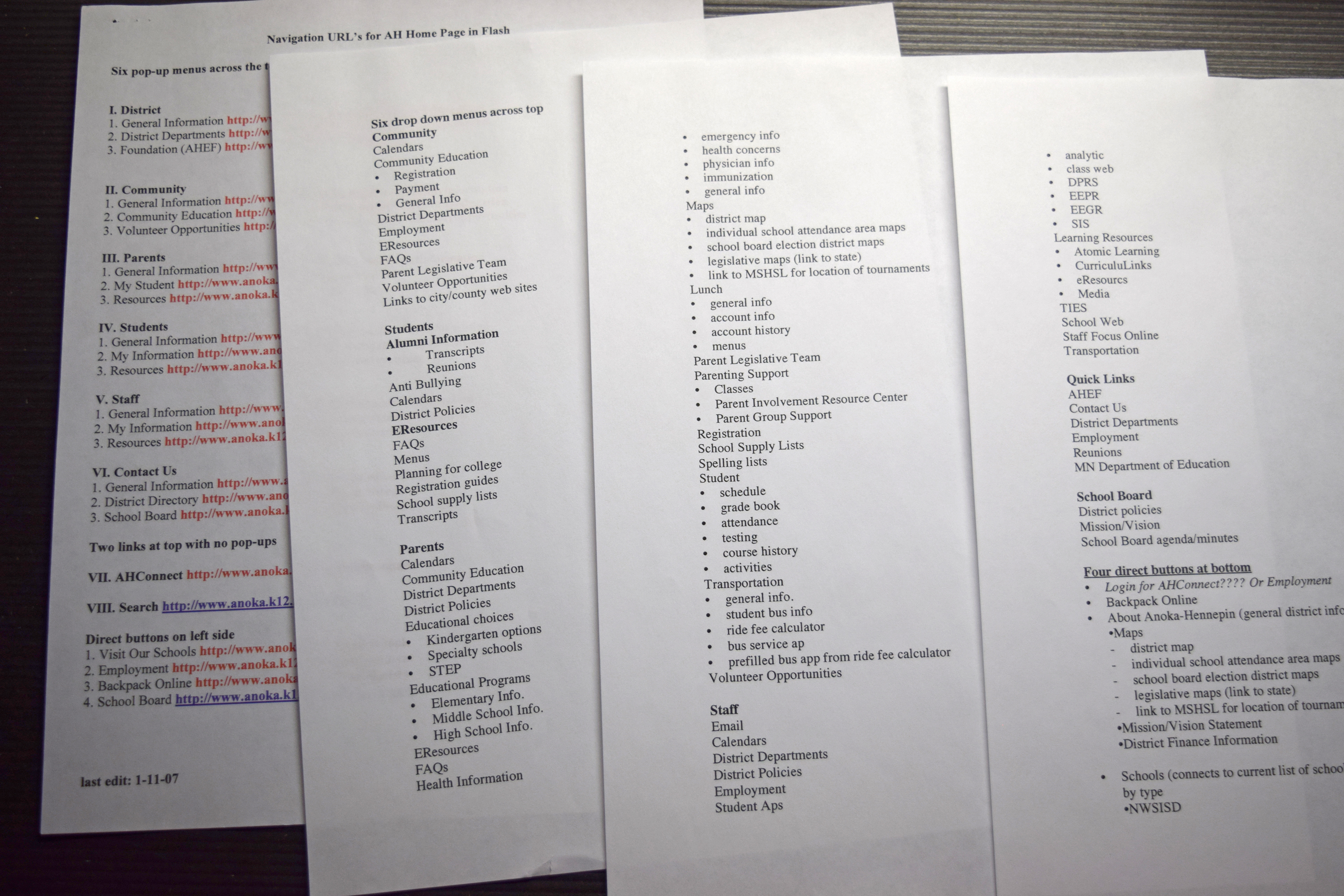
Website navigation planning
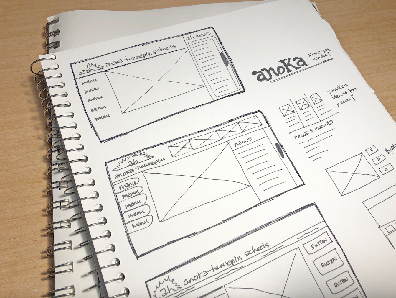
Site sketch example.
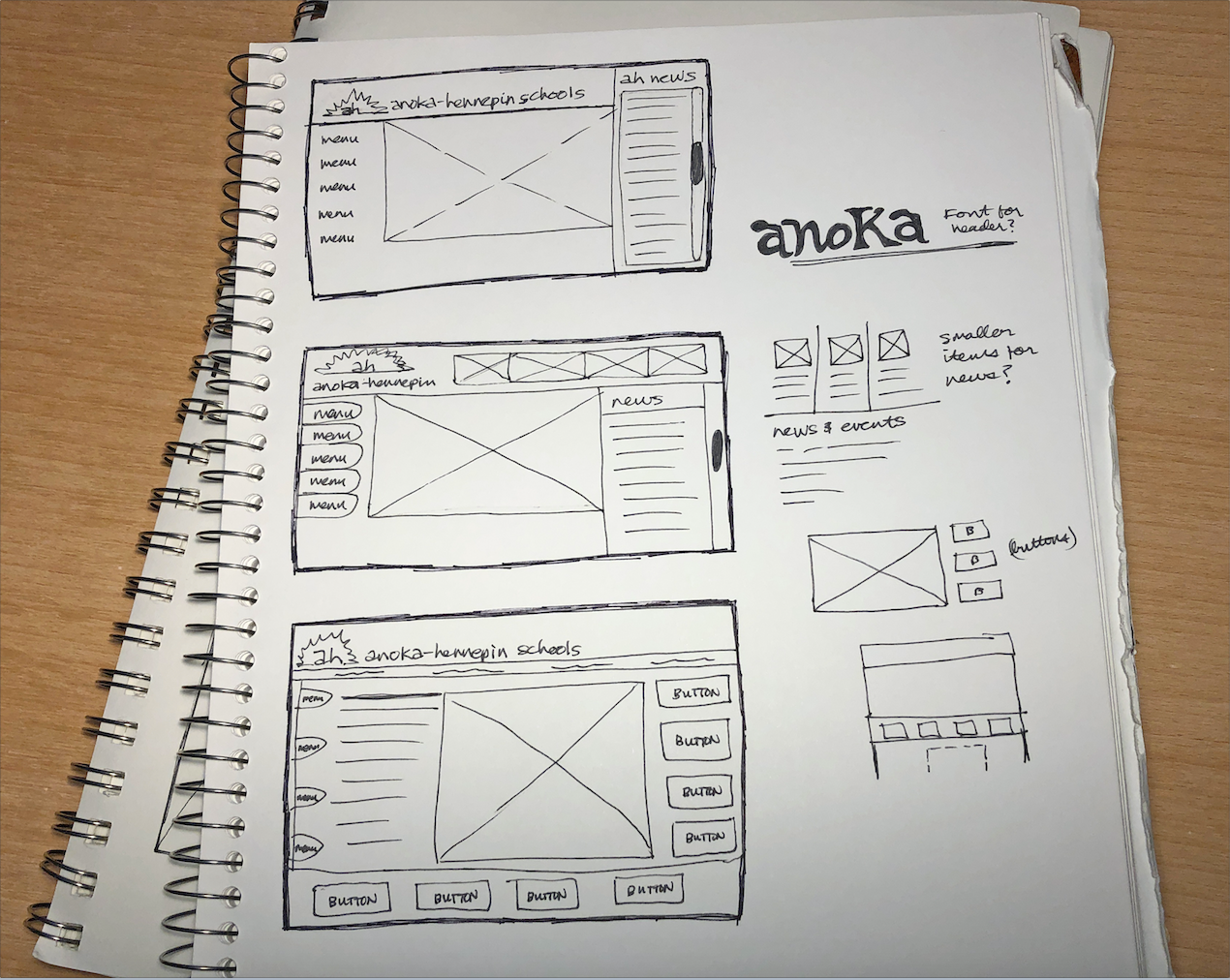
Site sketch example.
One of the first mockups created in Adobe Illustrator for the second site version. At this point, we were in the process of designing a new district logo and hadn't settled on a final choice yet so various logo iterations were used in the mockups. We did not have a final color palette either.
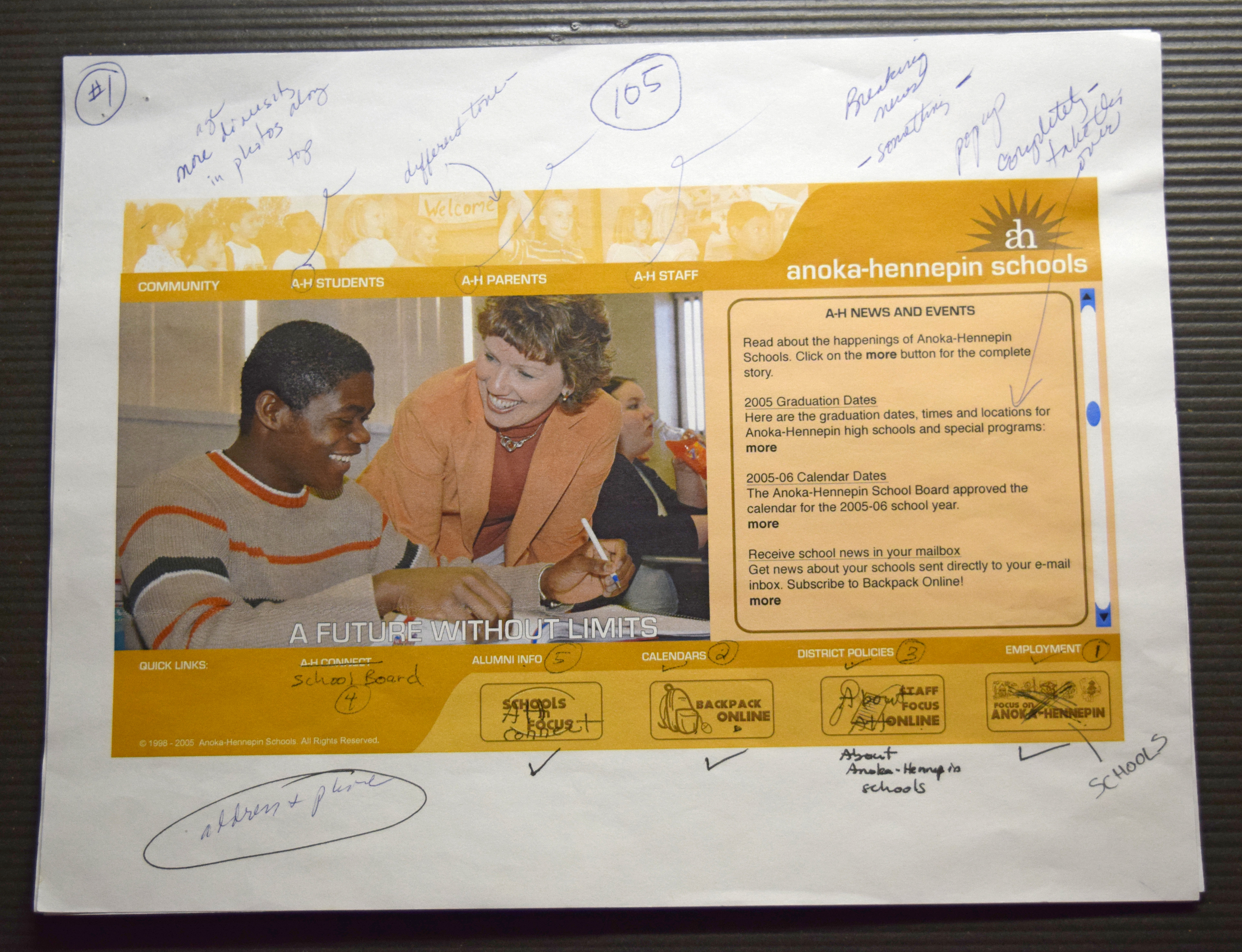
This is one of the later mockups developed in the redesign process for version two of the district site. At this point, our final district logo had been created and we had a better idea of what our color palette was going to be.
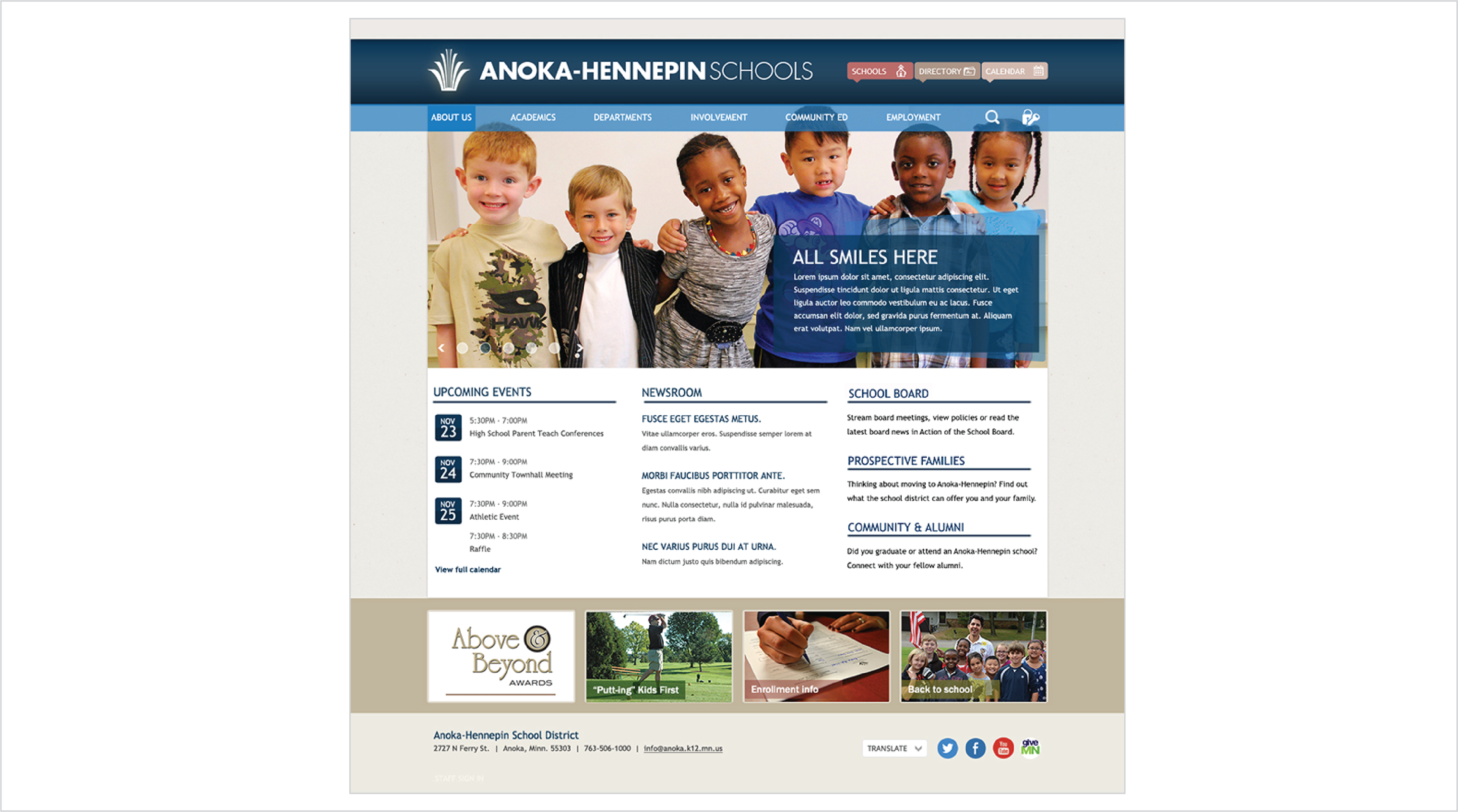
This was the final mockup for the site (version 2.0). By this time in the process, we knew that we wanted news to be the main focus of the site (as displayed in the two prominent photos/news blurbs and scrolling news section) and for users to have easy access to the wealth of information that was available within the site navigation. The site navigation was divided into user roles: students, parents, staff, community, school board and quick links. The footer was to feature "hot topic" buttons that would change seasonally.
When we presented my final mockups to our then content management system vendor, they came back and said the only way they could build it was to do the home page in Flash. The rest of the site would be built in the native content management system. This was prior to the first iPhone release and before mobile platforms and responsive design were really a thing, so we said ok. It was a decision that would come back to haunt us in several ways once mobile devices (like the iPad) really took off as our home page couldn't be viewed on them.
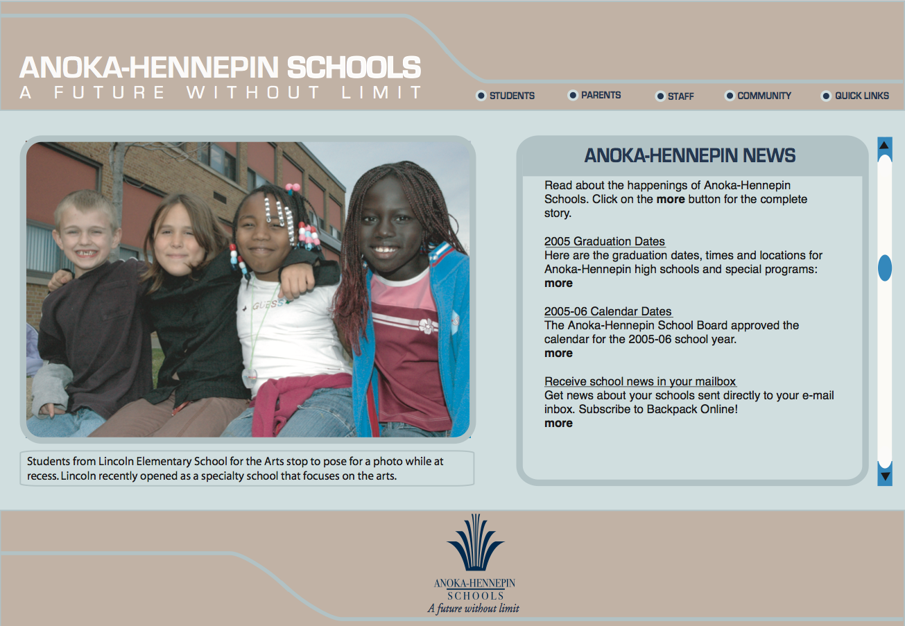
During this point in the process, our footer buttons were moved due to screen size limitations within Flash. We also decided to go with a green and yellow color palette to match the colors of our printed newsletter based on committee input. The committee wanted to avoid using any of the primary colors of our five regular high schools as it might be seen as a sign of favoritism. This ended up being a choice that users wanted to see changed in the next version (green and yellow are the colors of the Green Bay Packers professional football team, which is a no-no in Minnesota Vikings territory).
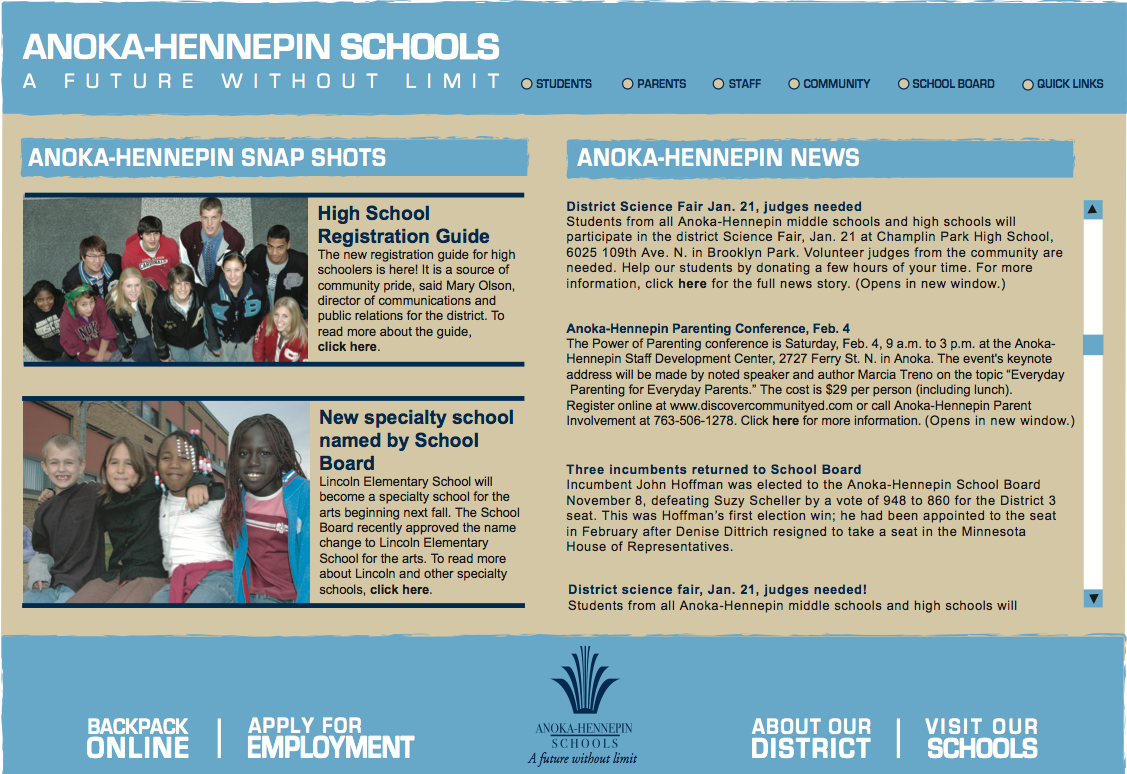
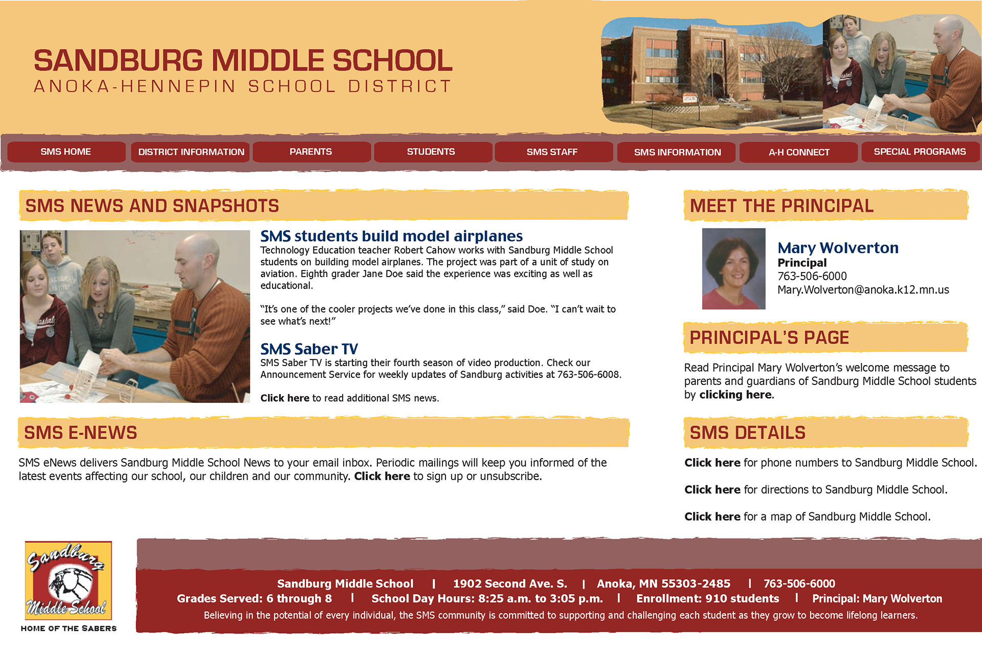
Below is a snapshot of how the district home page (version two) looked just before we launched our new and improved third redesign.
During this point in the process, our footer buttons were moved due to screen size limitations within Flash. We also decided to go with a green and yellow color palette to match the colors of our printed newsletter based on committee input. The committee wanted to avoid using any of the primary colors of our five regular high schools as it might be seen as a sign of favoritism. This ended up being a choice that users wanted to see changed in the next version (green and yellow are the colors of the Green Bay Packers professional football team, which is a no-no in Minnesota Vikings territory).
Below is a snapshot of how the district home page (version two) looked just before we launched our new and improved third redesign.
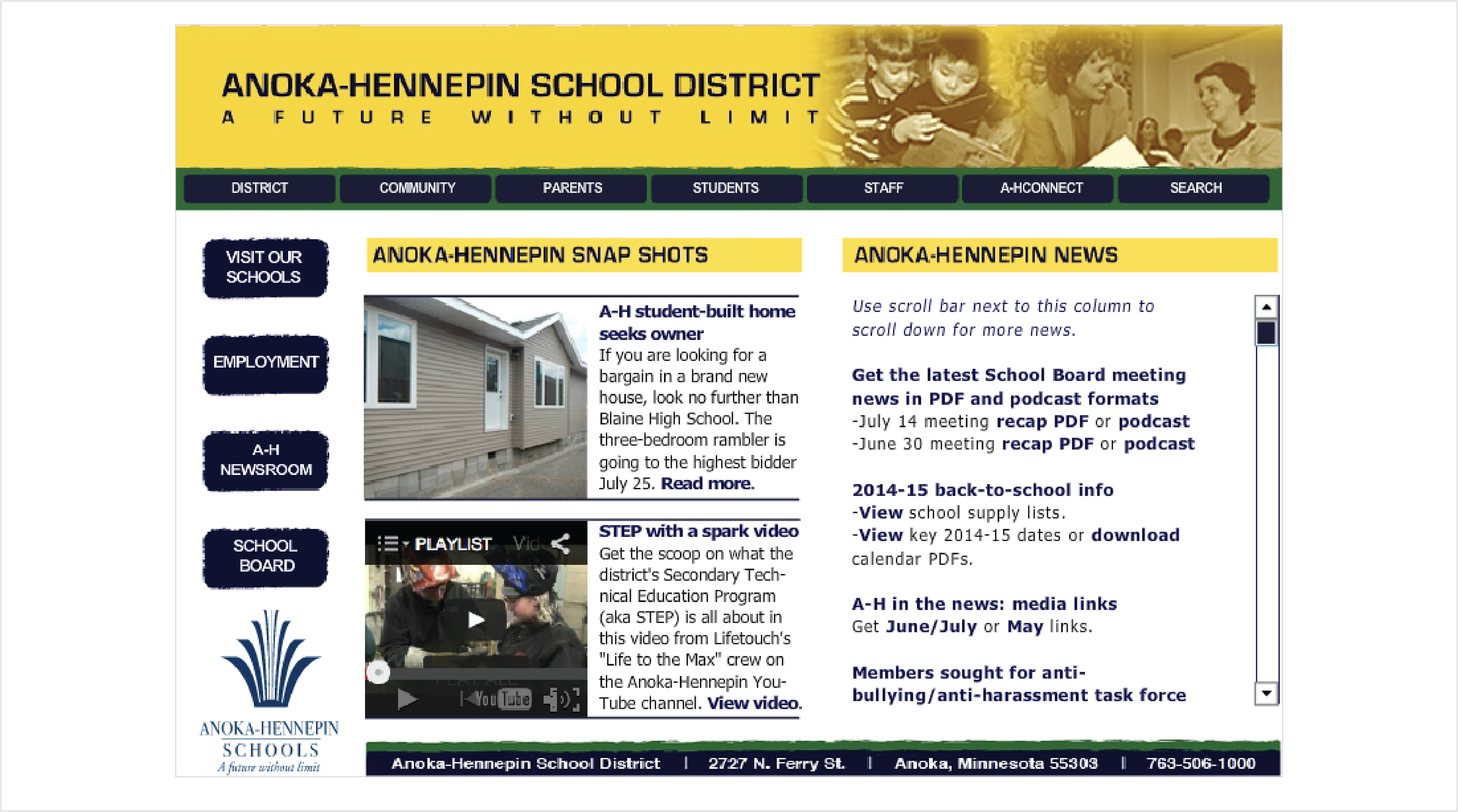
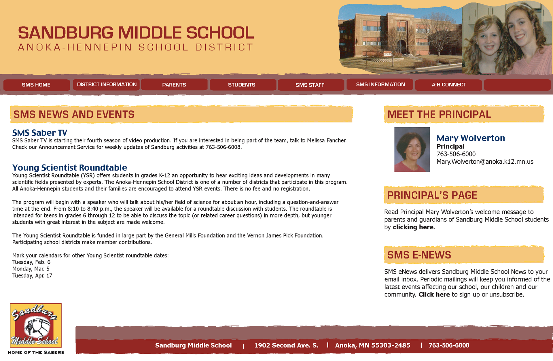
Based on my final mockup and direction we were headed with on the district home page (in Flash). I also created layouts for school websites. My initial thought was that the school versions would have followed the district template and used the school's primary logo colors. Unfortunately, this did not come about due to the restraints of Flash and staffing limitations.
A few years into our second site version, we started looking at launching another website redesign. Ultimately, we wanted a template that all schools could use and something that would work better on the emerging mobile platform. And so our journey to a new website began.
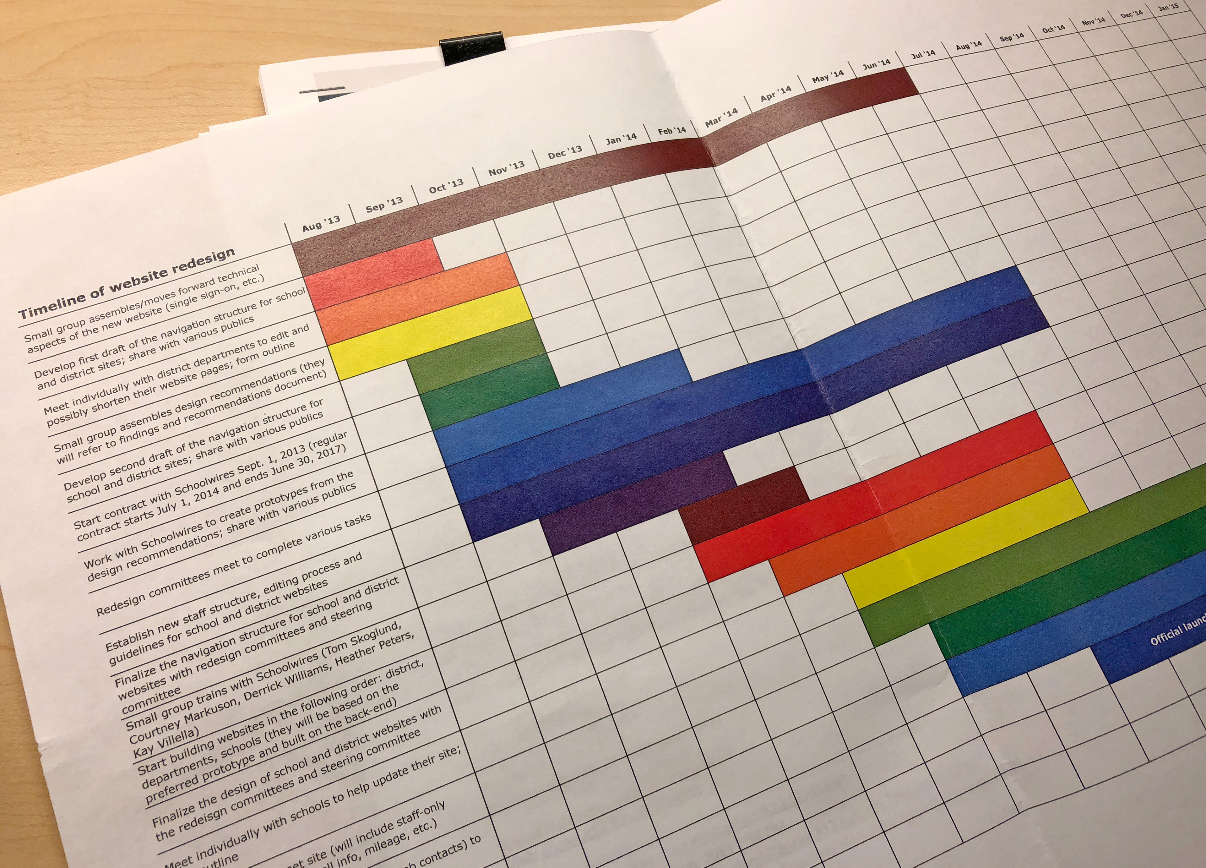
To start, we began with research on how to properly conduct a thorough website redesign process (e.g. modern day user centered design) and developed a project timeline. Much time was also spent developing strategy (e.g. site goals, purpose, measurements of success, how this process would be communicated to stakeholders) and conducting additional research and analysis tasks (evaluation, interviews, surveys, focus groups, card sorting). In the midst of the strategy and research phases, we also conducted a request for proposal (RFP) to find a new content management system (CMS) vendor).
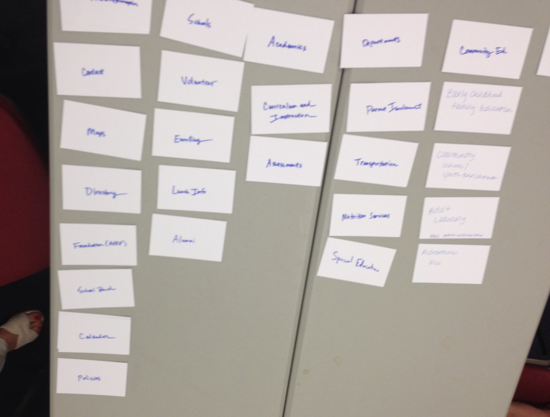
Card sorting activity.
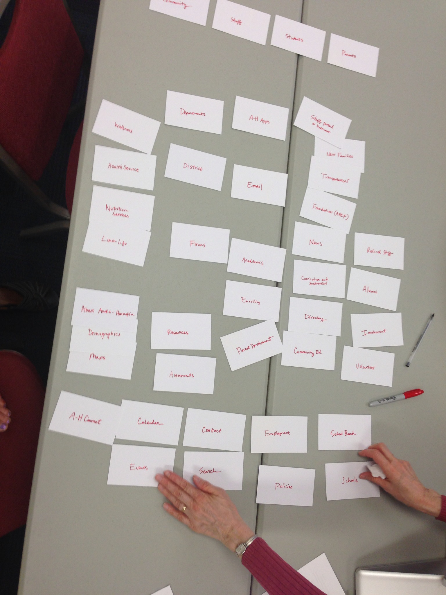
Card sorting activity.
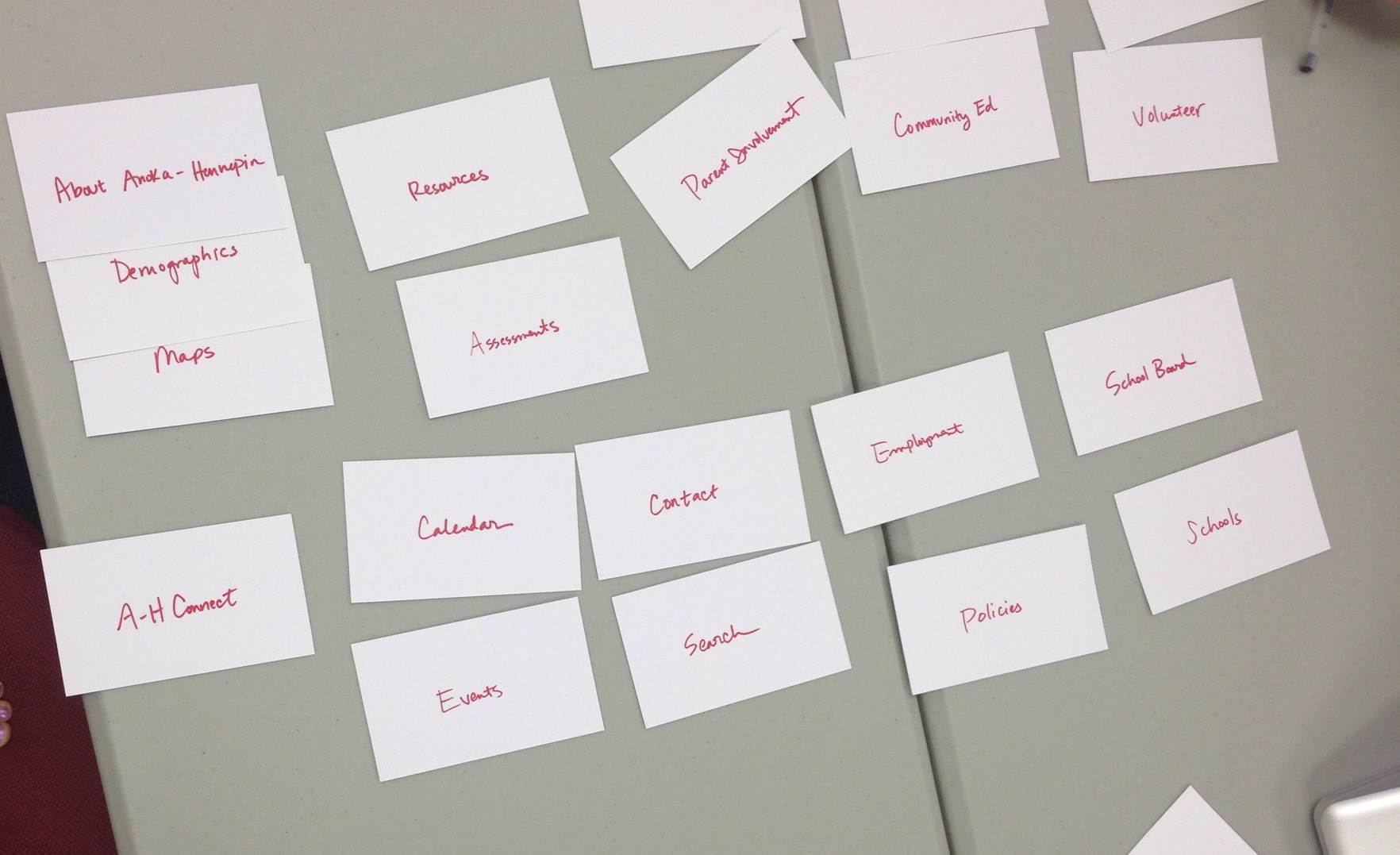
Card sorting activity.
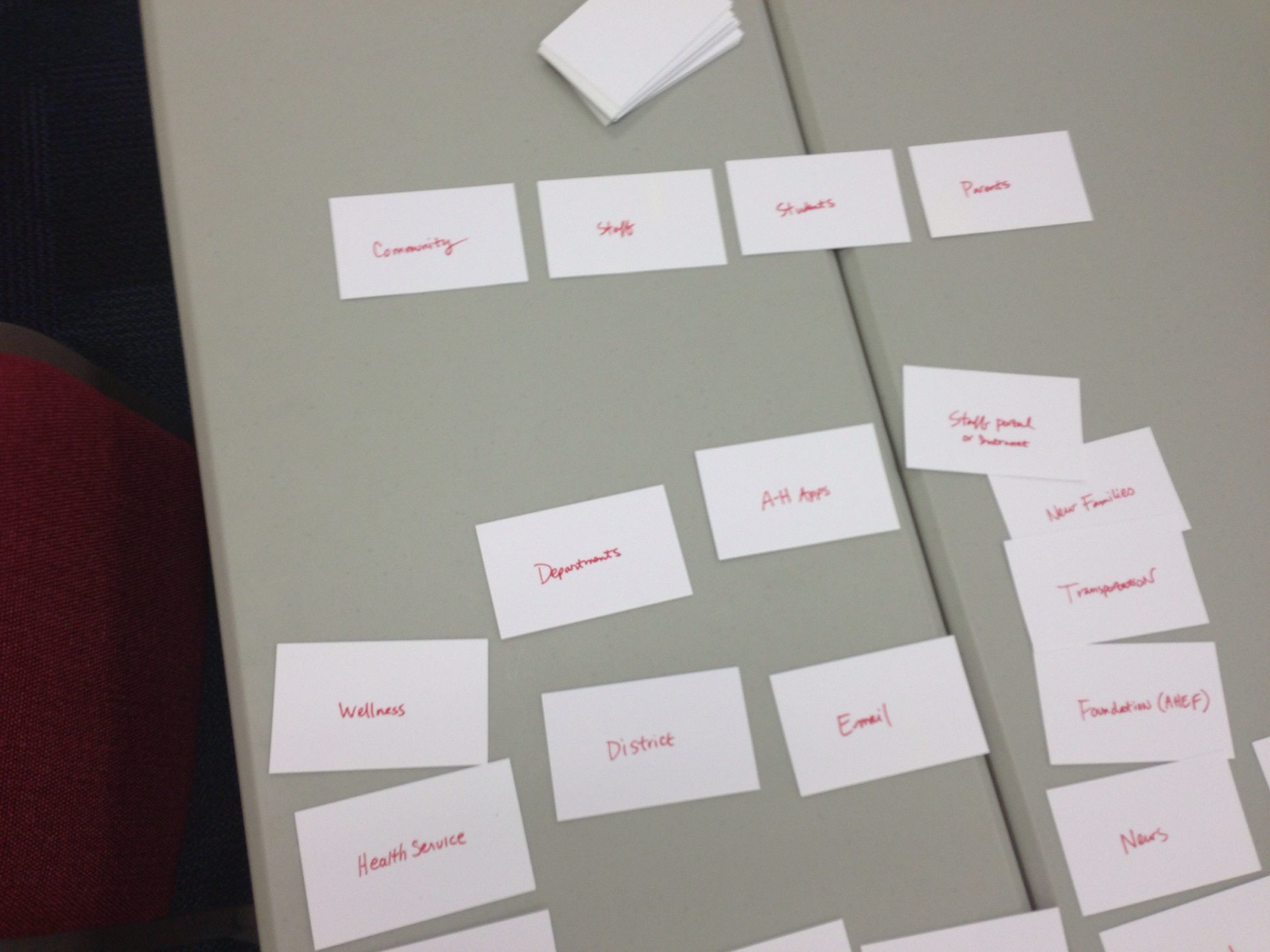
Card sorting activity.
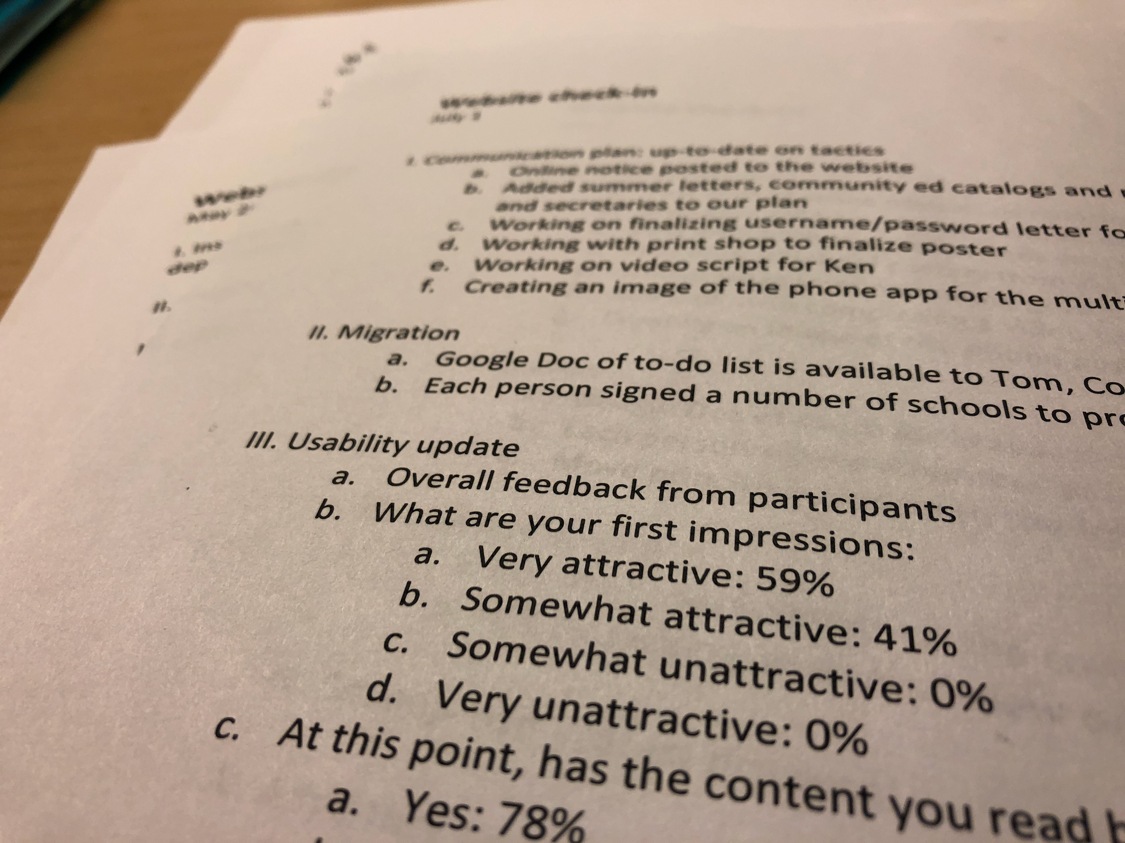
Usability testing results.
Next, various committees were formed to focus on district and school website needs, along with an internal design steering committee (of which I served as a key player on all three). The design steering committee formally established our set of design recommendations, which were based on a thorough analysis of user experience research and discussion amongst the three committees.
In terms of design, I wanted to use a flat design that focused on being clean, clutter-free and was also responsive (essentially, something that lacked gradients and where objects mimicked their real world counterparts, but also incorporated solid colors, white space and crisp typography). At the time, Fitbit was on our mood board - good site examples list. I particularly liked their use of photos and thought we could apply something similar to our sites to promote the latest news articles.
The final mockup/prototype for site version 3.0 created by our new CMS vendor’s design and development teams with heavy input from our internal design steering committee. These examples later went through extensive usability testing with stakeholder groups (particularly during sessions held in building computer labs in which participants were asked to complete various tasks while facilitators monitored). Further iterations were then made based on this feedback.
The next phase involved a massive effort in training staff on how to use our new CMS and migrating content, of which I was responsible for. In the process, I helped to trim our page count from 68,000 to 10,000 across our entire domain.
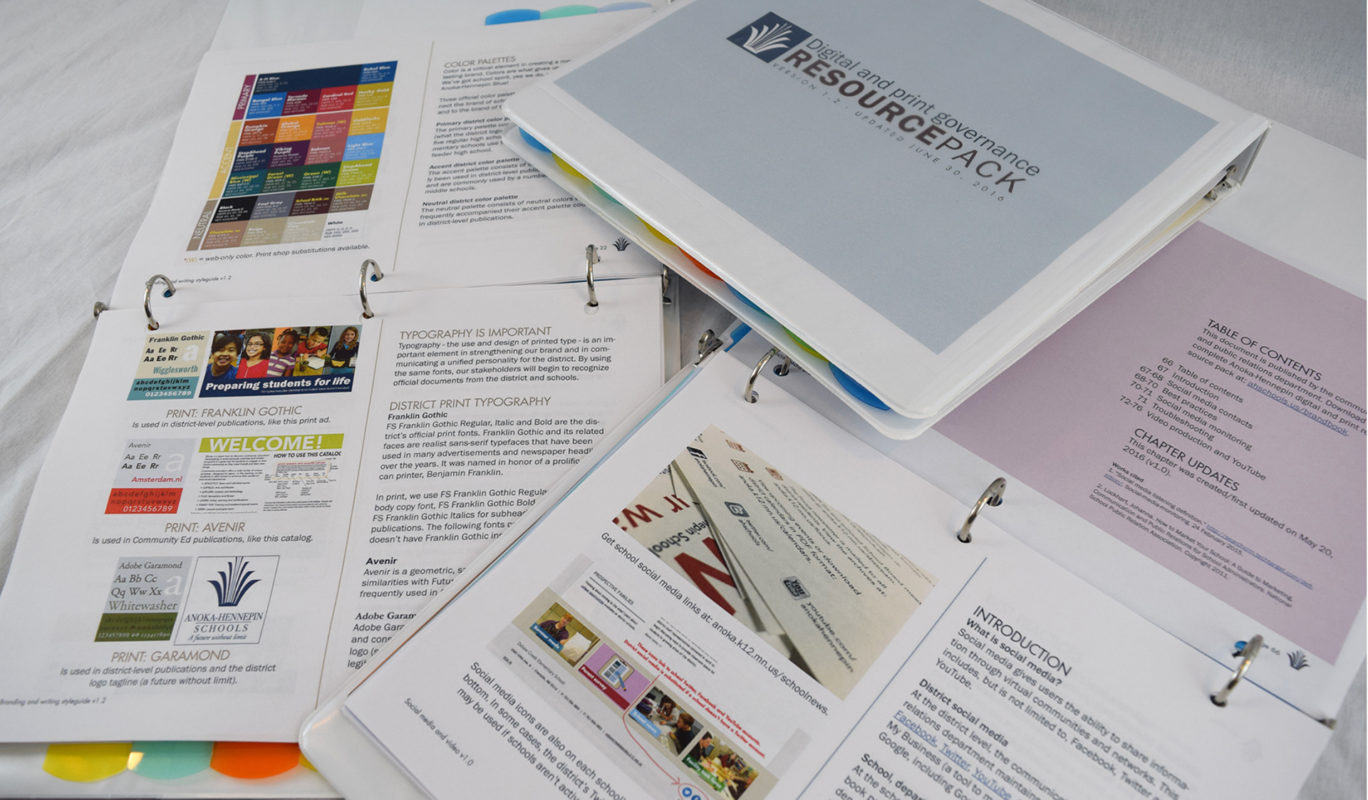
Throughout our third website redesign process, I developed a district brand book (featuring palette colors, logos, etc.) and website best practices. Since the time of the redesign and migration, the brand book has evolved into what I call a resource pack that includes information on digital and print governance in Anoka-Hennepin, best practices for e-newsletters, social media and candid photography guidelines. You can read more about this resource pack on my style guide page.
Additionally, I also created a brand new support structure system for staff, which you can read more about on my help documents page.
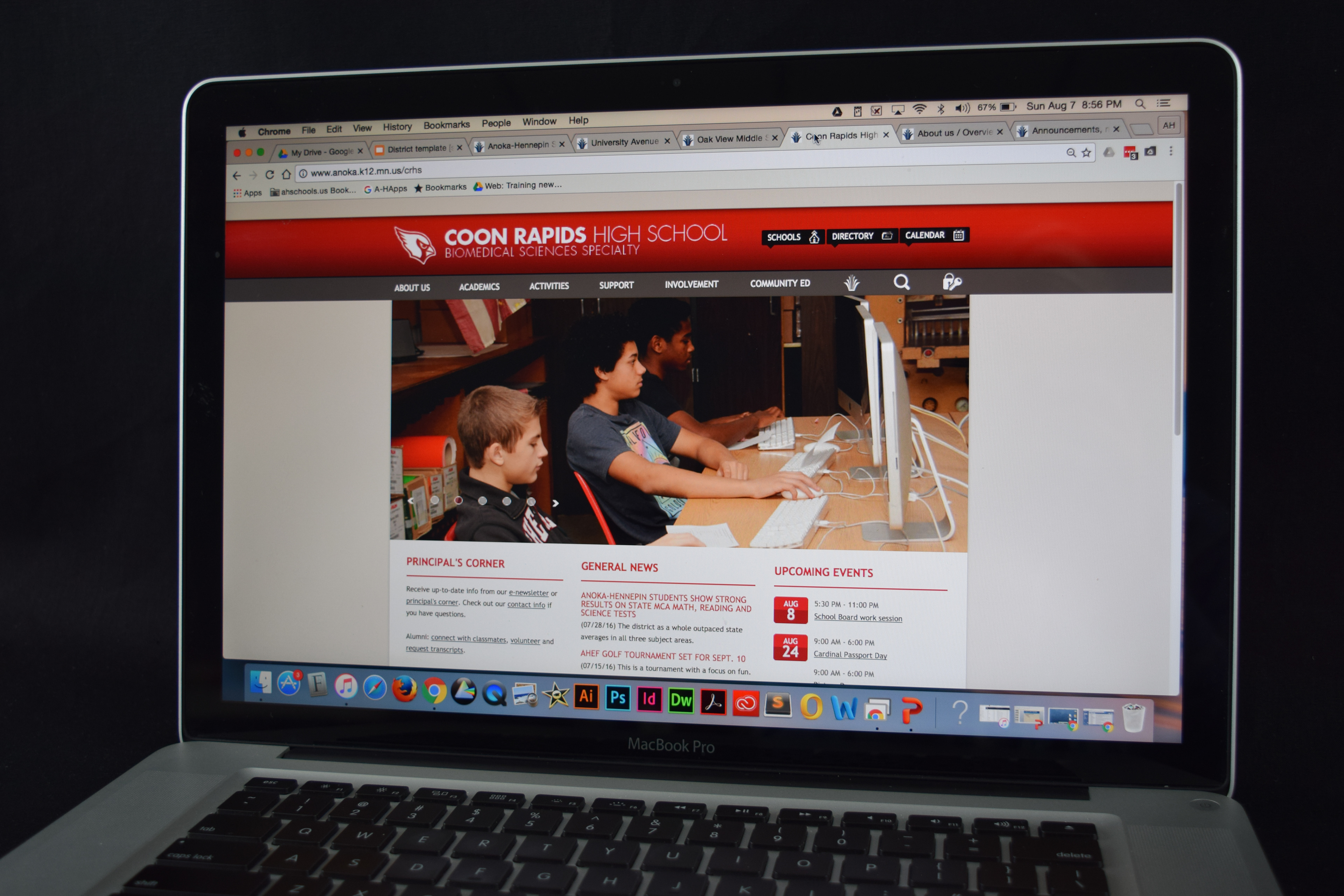
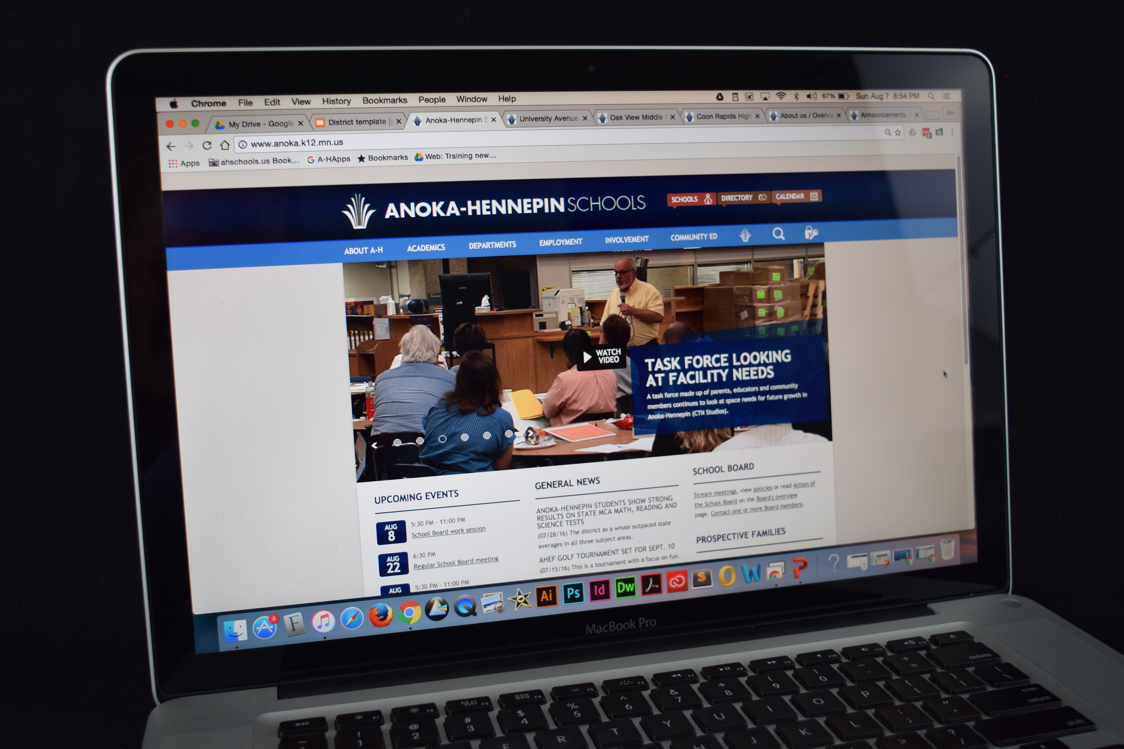
A look at the Anoka-Hennepin website as it currently looks today (version 3.0). For our efforts, my department received the Golden Achievement Award for our website redesign process from the National School Public Relations Association (NSPRA).
Current mobile view of two school websites (version 3.0). Anoka-Hennepin has more than 40 sites within its umbrella.
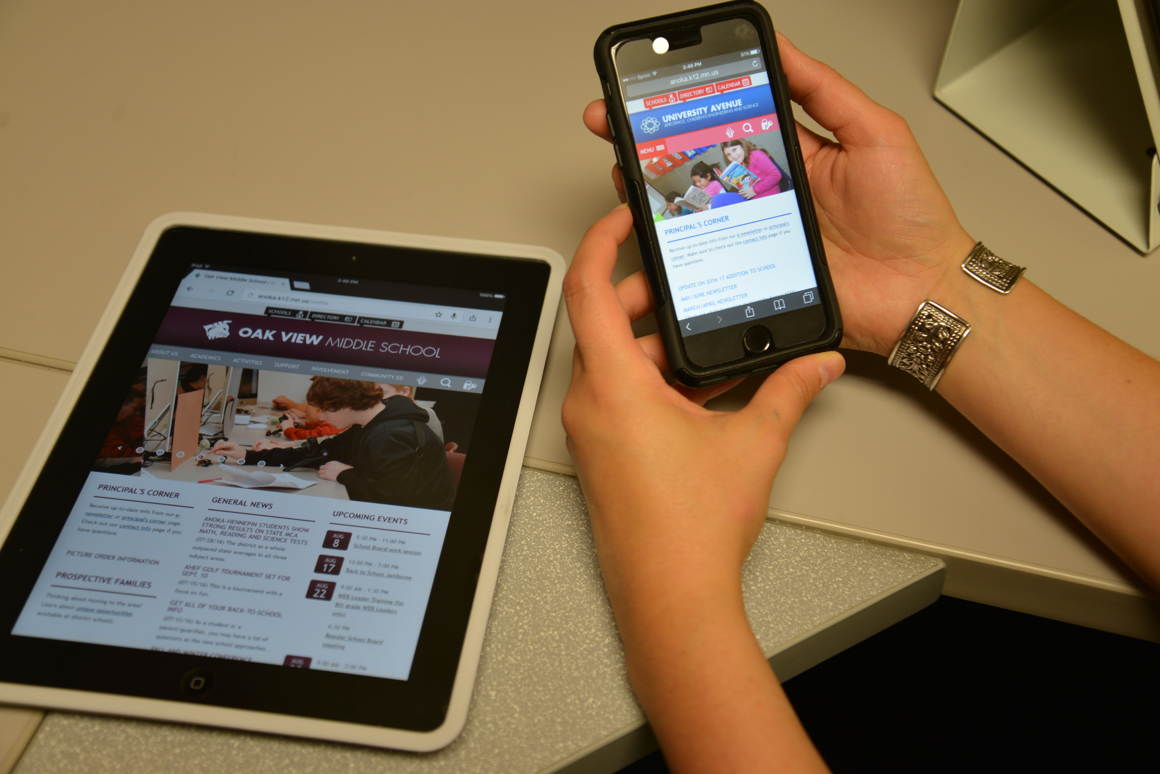
Our research showed that there were many audience groups, so that’s how we organized the site navigation. Navigation paths are similar at each grade level (e.g. elementary, middle school, high school) with some small differences.
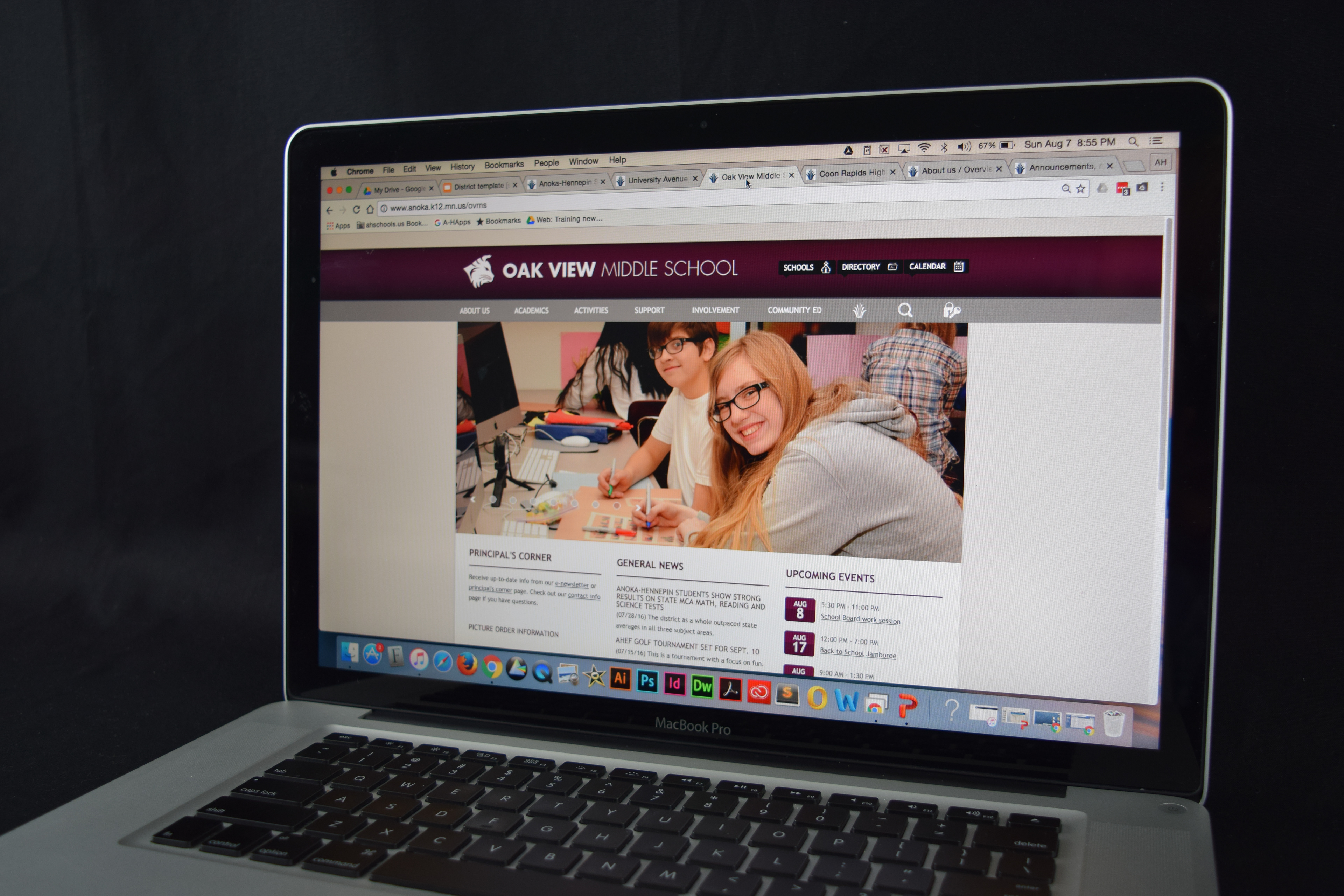
Examples of what school website layout currently looks like (version 3.0).