Roles: Graphic design, art direction, layout, branding, photography, content writing and editing, marketing and advertising, website design. Tools: Adobe Illustrator, Adobe Photoshop, Adobe InDesign, Adobe Acrobat DC, Adobe Dreamweaver.
Personal branding - monogram
A collage of the personal branding I use for professional networking (e.g. LinkedIn). The monogram uses my initials (CGM) and is primarily golden brown with blue and gray accents.
Personal branding - monogram
A collage of the personal branding I use for professional networking (e.g. LinkedIn). The monogram uses my initials (CGM) and is primarily golden brown with blue and gray accents.
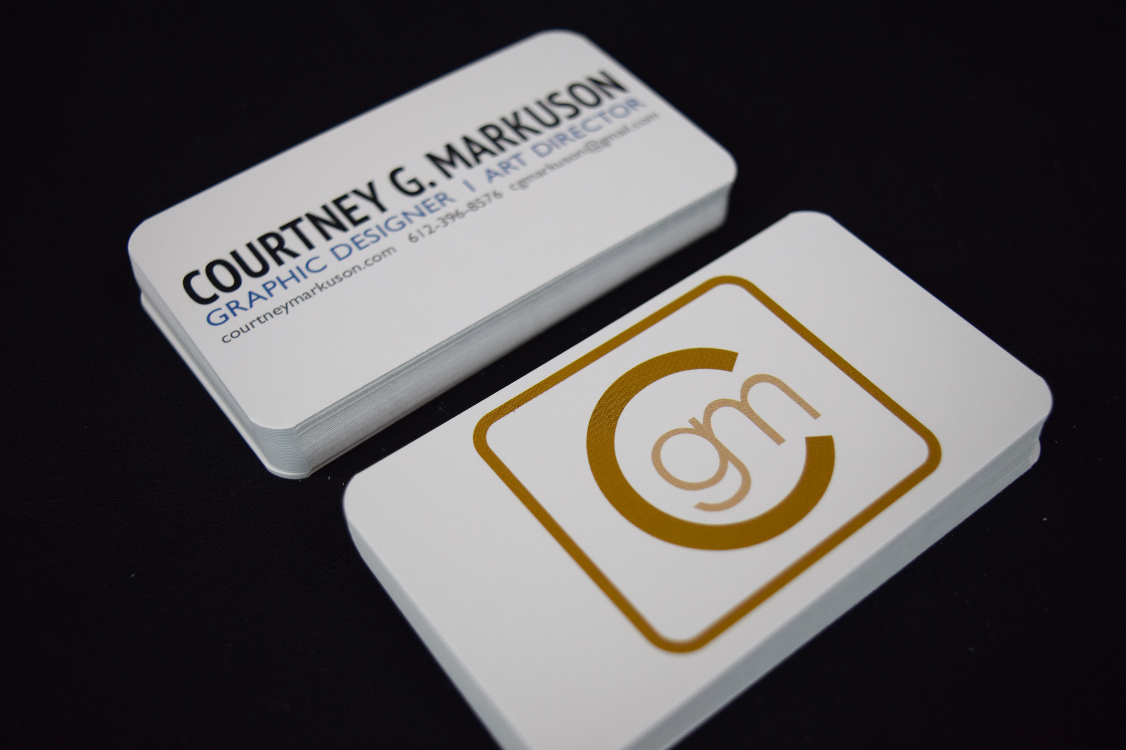
More personal branding business card examples.
The rounded "CGM" logo represents a slightly tweaked version of my monogram logo.
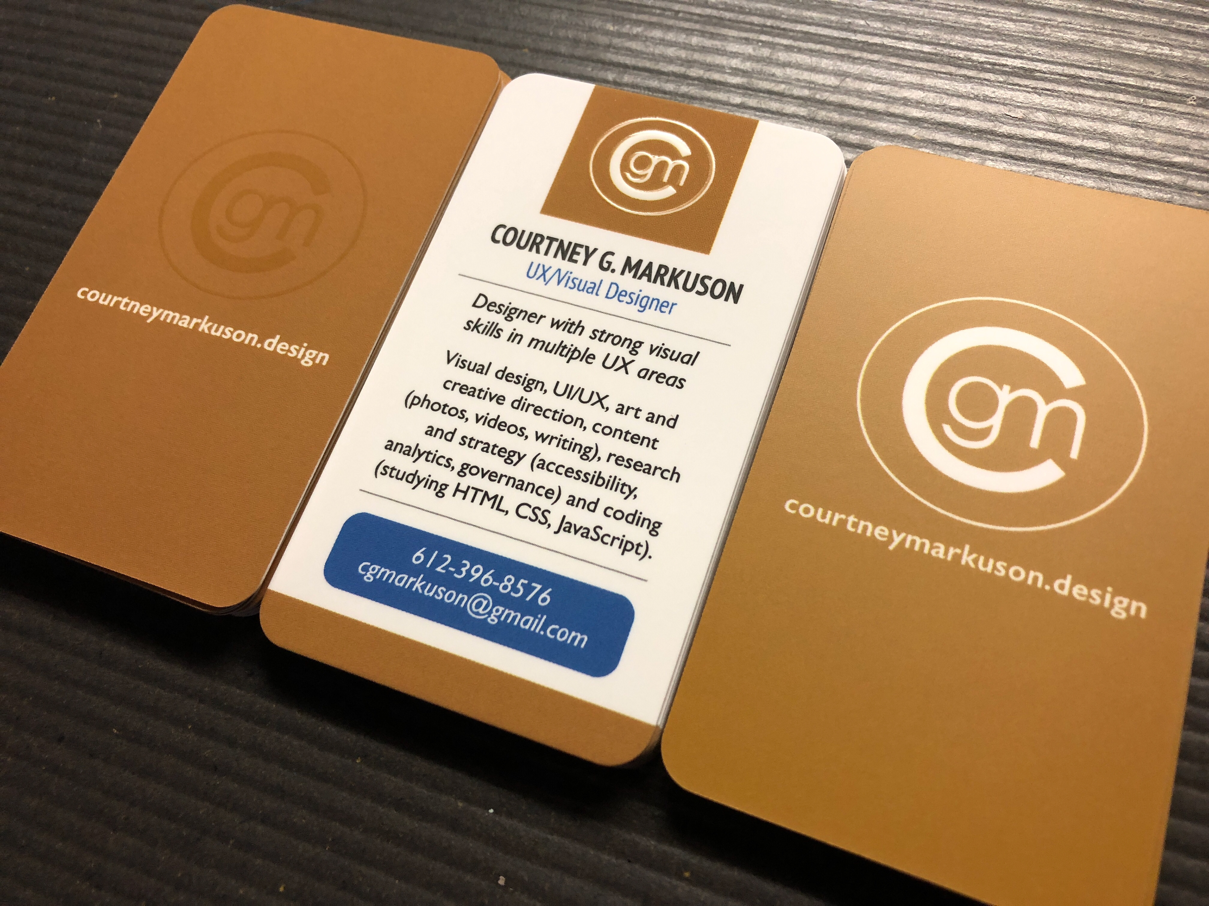
Revamped business cards with the monogram design.
Personal branding - freelance company
A sampling of Goldstorms Visual Communications, which is the heading I use to brand my work for freelance clients. When I was 15 years old, I decided to create a handle for myself to use online and eventually came up with goldstorms after two of my favorite Stevie Nicks songs (Gold Dust Woman and Storms). Ever since then, it's been part of my online identity.
A sampling of Goldstorms Visual Communications, which is the heading I use to brand my work for freelance clients. When I was 15 years old, I decided to create a handle for myself to use online and eventually came up with goldstorms after two of my favorite Stevie Nicks songs (Gold Dust Woman and Storms). Ever since then, it's been part of my online identity.
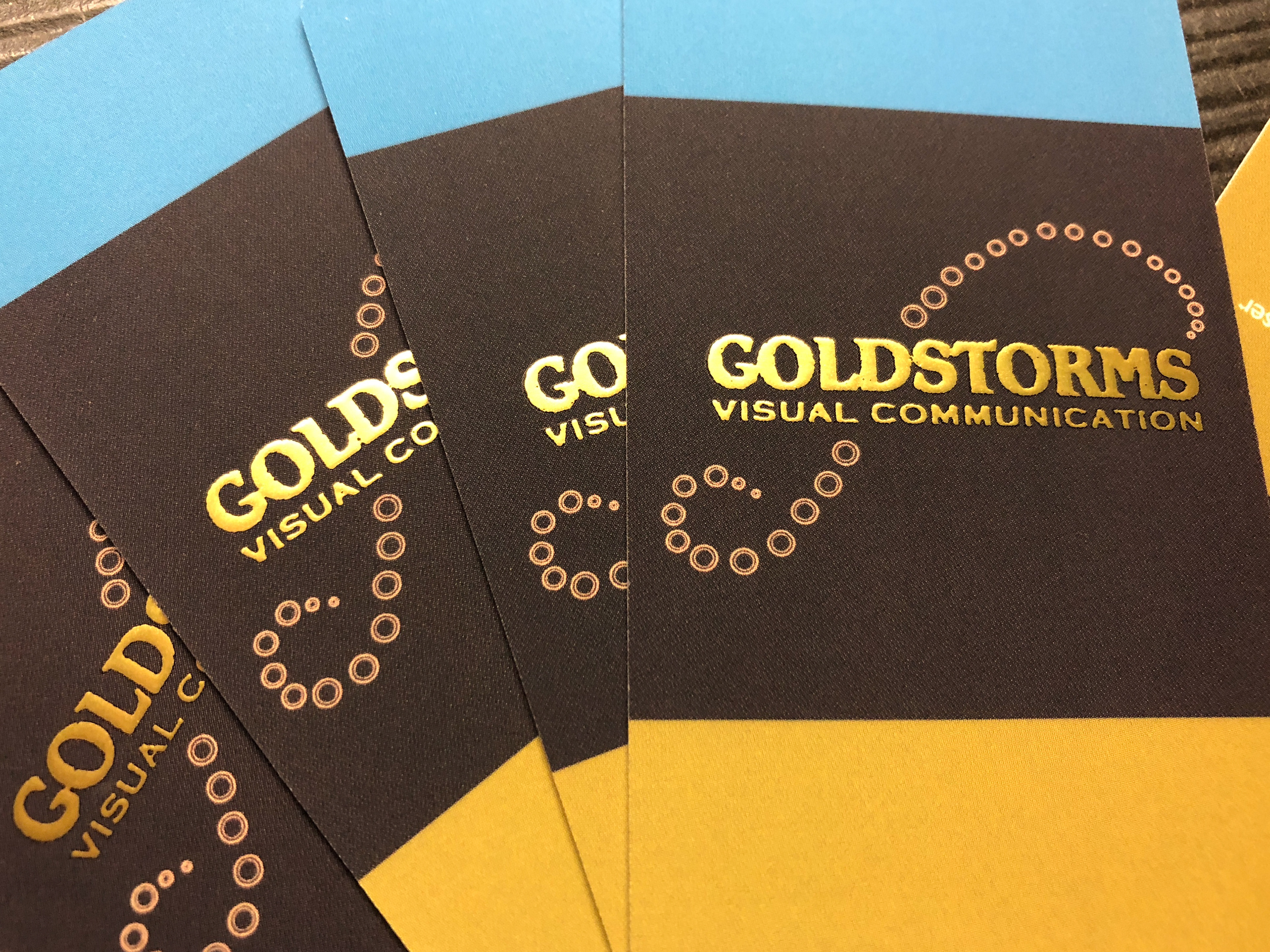
Redesign of freelance business cards.
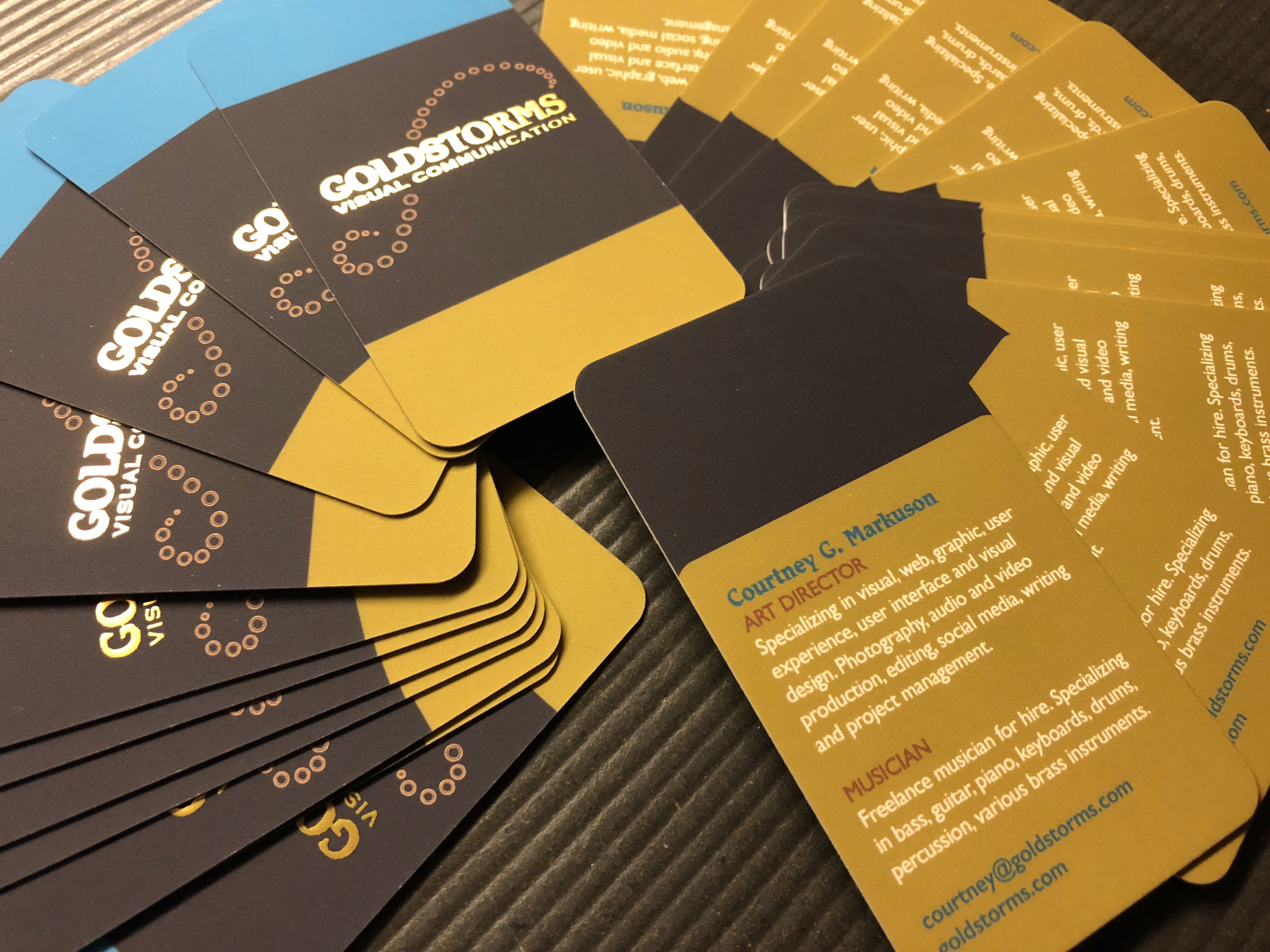
Redesign of freelance business cards.
District branding
Business card samples for the district. This design grew out of the initial mockups I made many years ago. In the upper left hand corner is the version for district staff, which utilizes the district's main palette color. The school versions (which are scattered through out the photo) use other main palette and accent colors to represent school identities.
Business card samples for the district. This design grew out of the initial mockups I made many years ago. In the upper left hand corner is the version for district staff, which utilizes the district's main palette color. The school versions (which are scattered through out the photo) use other main palette and accent colors to represent school identities.
Current letterhead samples for the district. This design grew out of initial mockups I made years ago. The district name is prominently featured at the top in the district's main palette color, followed by contact information. Departments and programs use this layout and coloring as well but have the name of their department or program in place of the Educational Service Center (district headquarters).
Current school letterhead samples for the district. This design grew out of initial mockups I made years ago. School names, contact info and principal names are included at the top. The text uses the district's main palette color along with the school's main color in key areas (i.e. logo).
Current magnet samples for the district and schools. This design grew out of a mockup I made. It was designed for schools to hand out to families during events and contains important school numbers. The majority of these magnets are printed with just the school's main palette color and the main district palette color.
A collection of current branding samples for the district: pocket folders, business cards, magnets, letterhead, envelopes and two promotional cards. Each school has their own version of folders, letterhead, magnets, business cards and envelopes that use their assigned palette colors.
So Connected branding
A sampling of identity items for So Connected Mental Strength Coaching and Personal Training.
A sampling of identity items for So Connected Mental Strength Coaching and Personal Training.
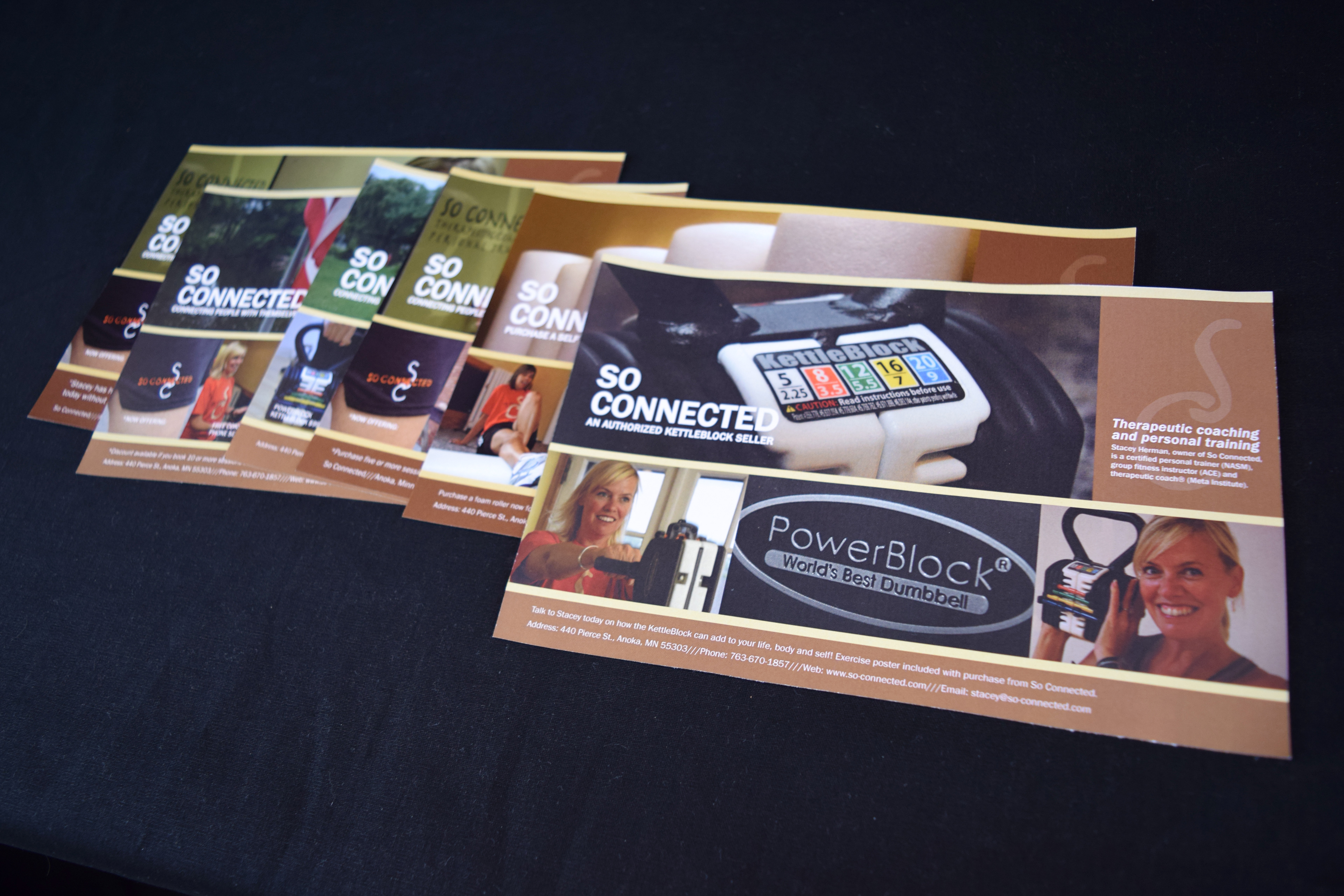
So Connected fliers.

So Connected merchandise.
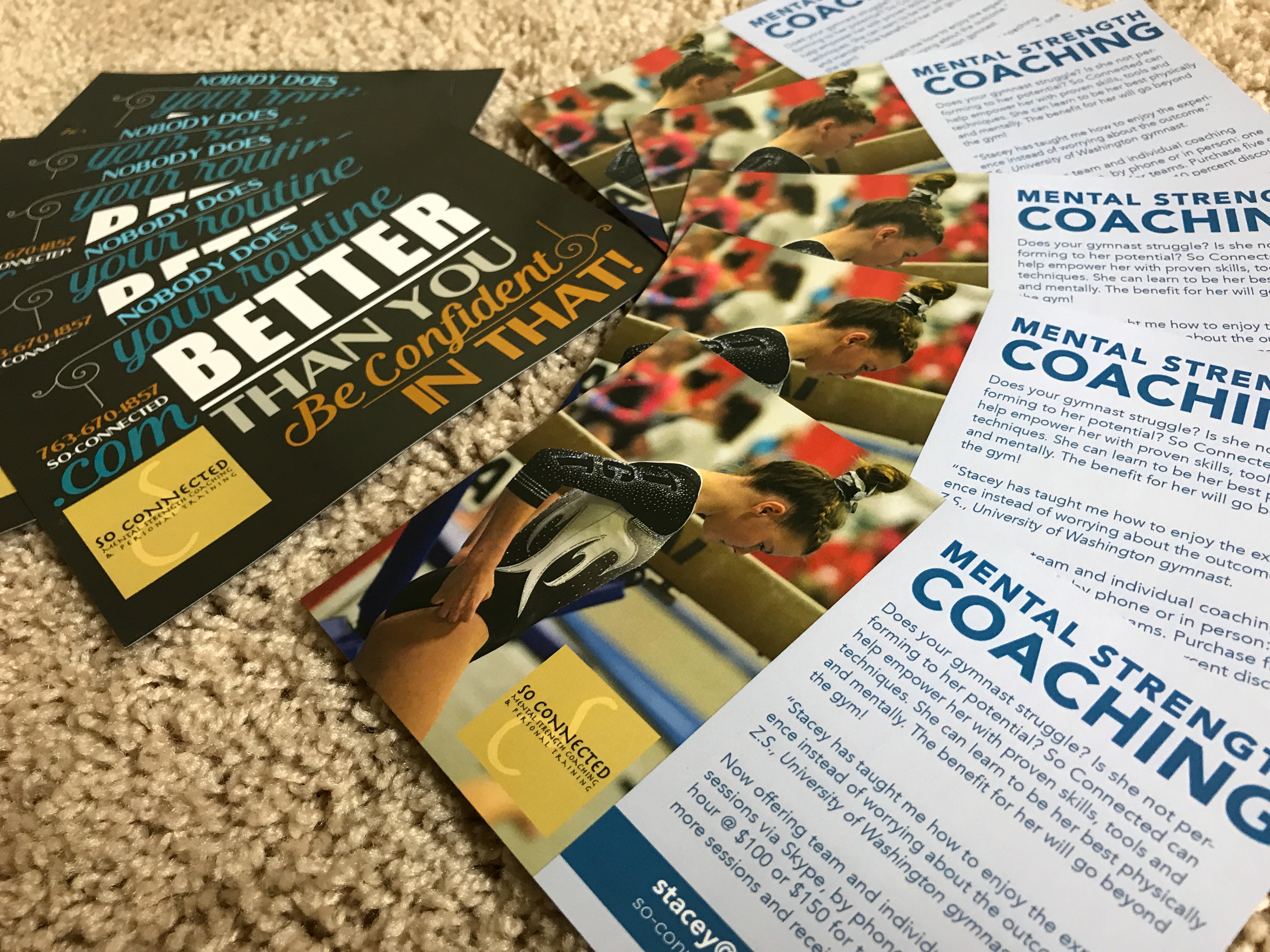
So Connected magnet series.
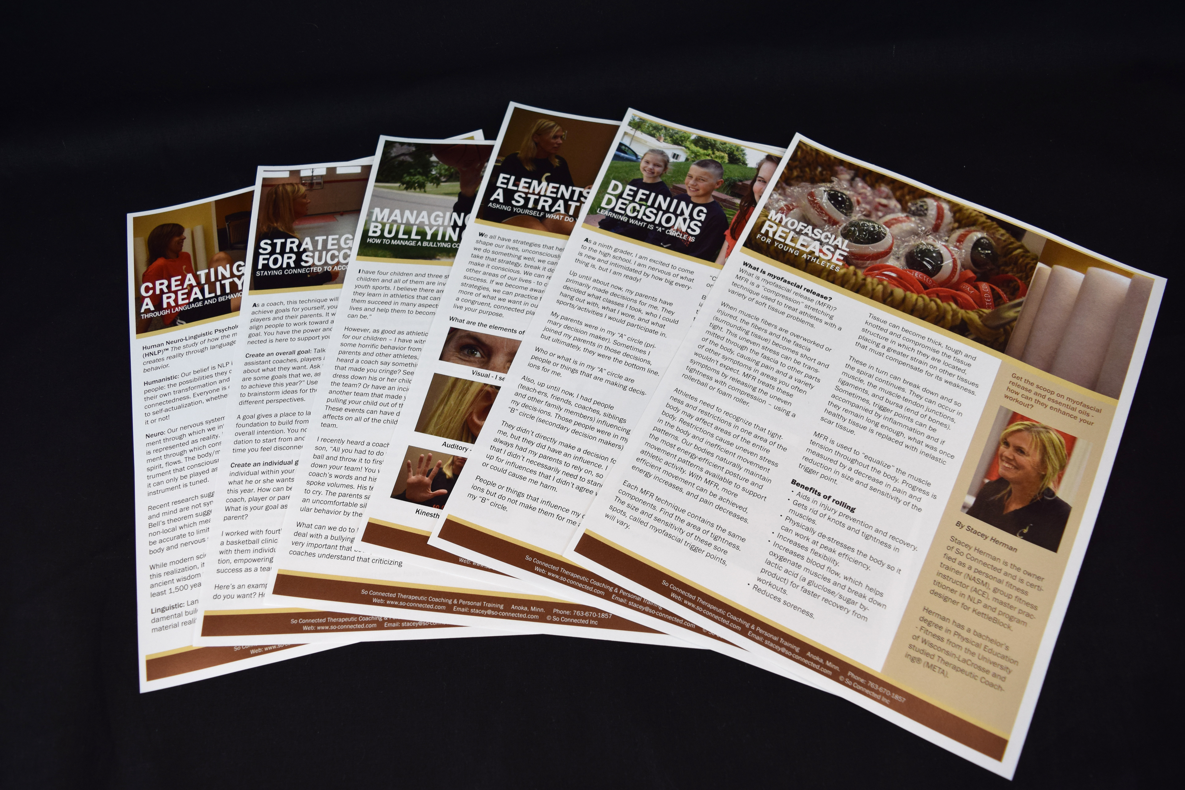
So Connected printed article series.
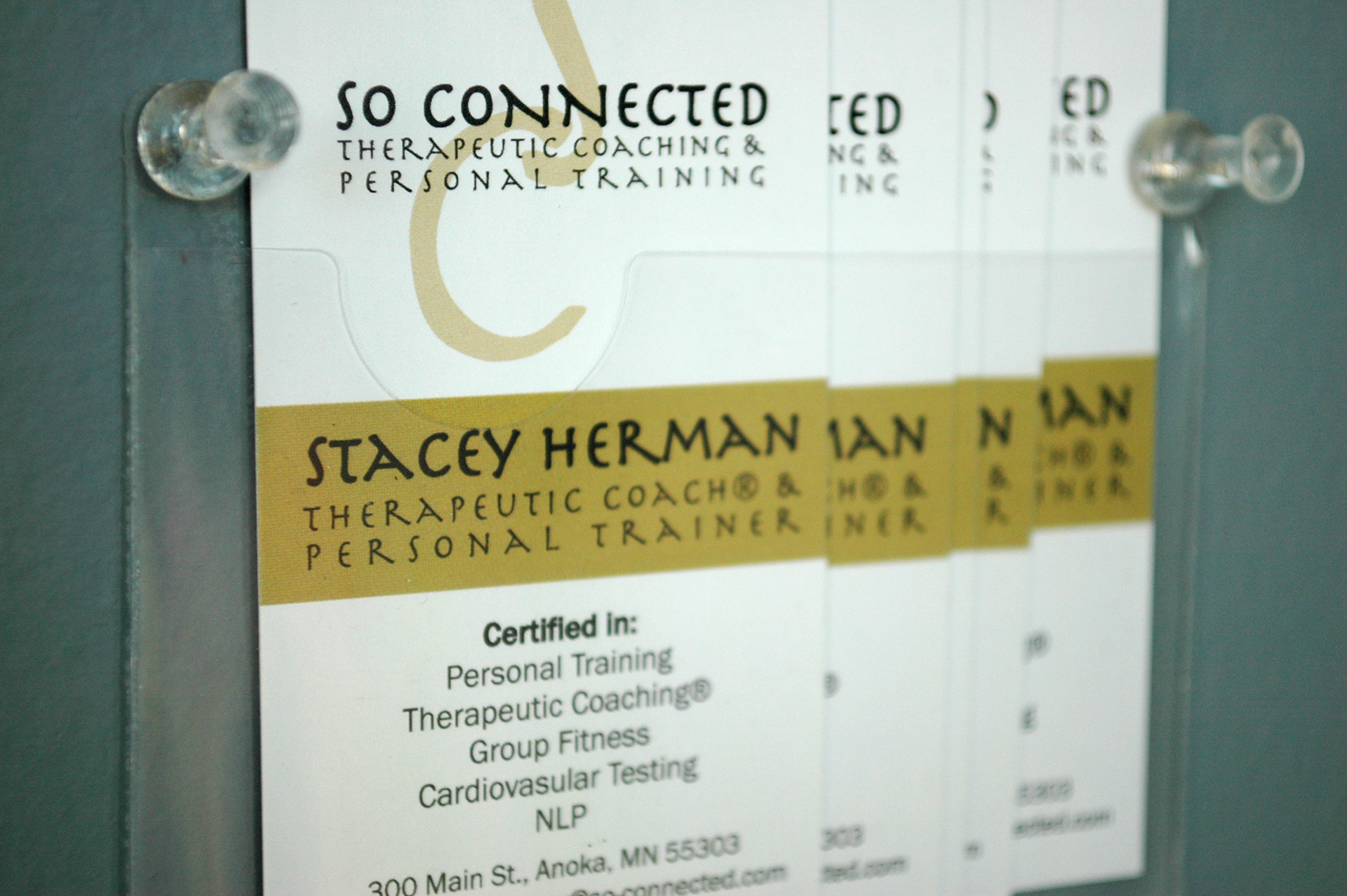
So Connected business cards.
Team Carc
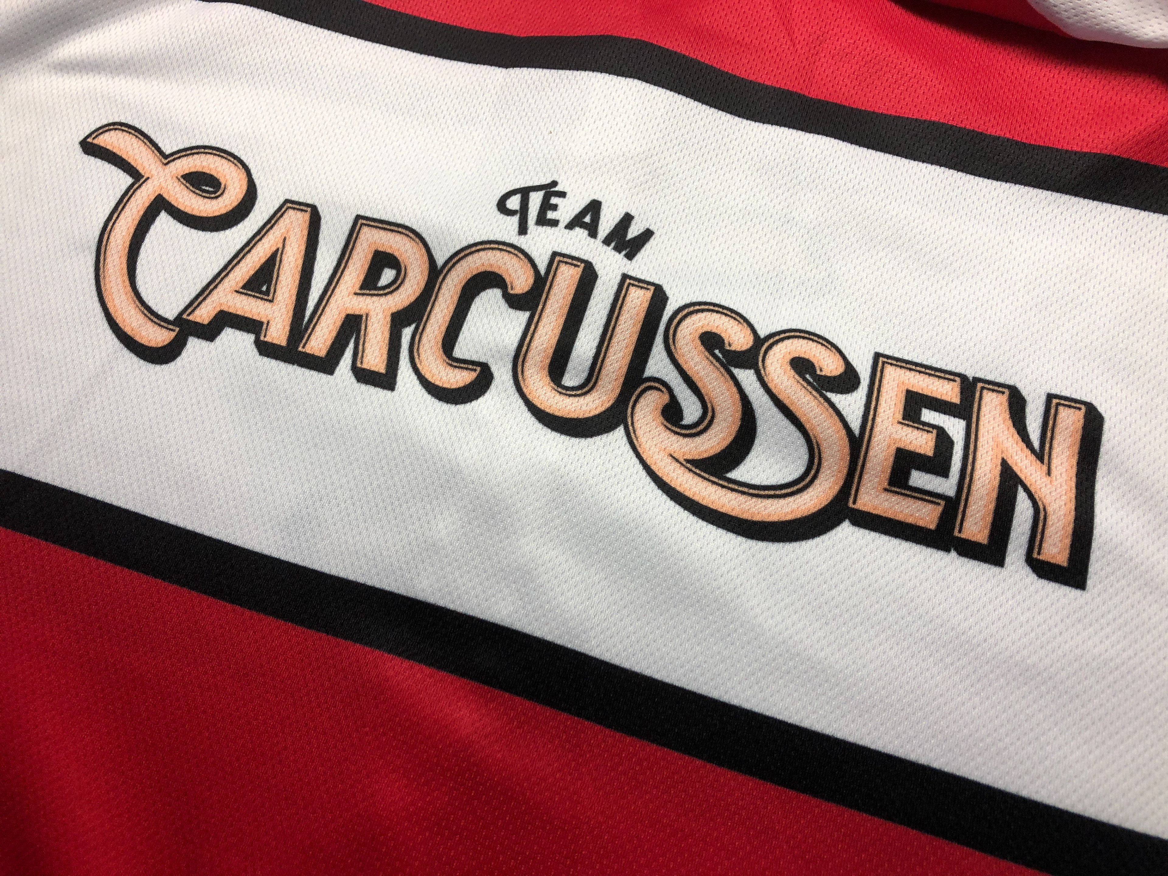
Team Carcussen (a.k.a Team Carc) is a husband and wife cycling team and their motto is, "The team that rides tandem together stays together." The team’s enthusiasm for cycling began in 2016 as a new year’s resolution to get back into shape and has blossomed into a full-fledged lifestyle. As the couple started participating in cycling events later on that year, they knew a unified cycling kit and logo was needed, and thus, Team Carcussen was born. The name is a combination of the team’s first and last names.
Team Carcussen (a.k.a Team Carc) is a husband and wife cycling team and their motto is, "The team that rides tandem together stays together." The team’s enthusiasm for cycling began in 2016 as a new year’s resolution to get back into shape and has blossomed into a full-fledged lifestyle. As the couple started participating in cycling events later on that year, they knew a unified cycling kit and logo was needed, and thus, Team Carcussen was born. The name is a combination of the team’s first and last names.
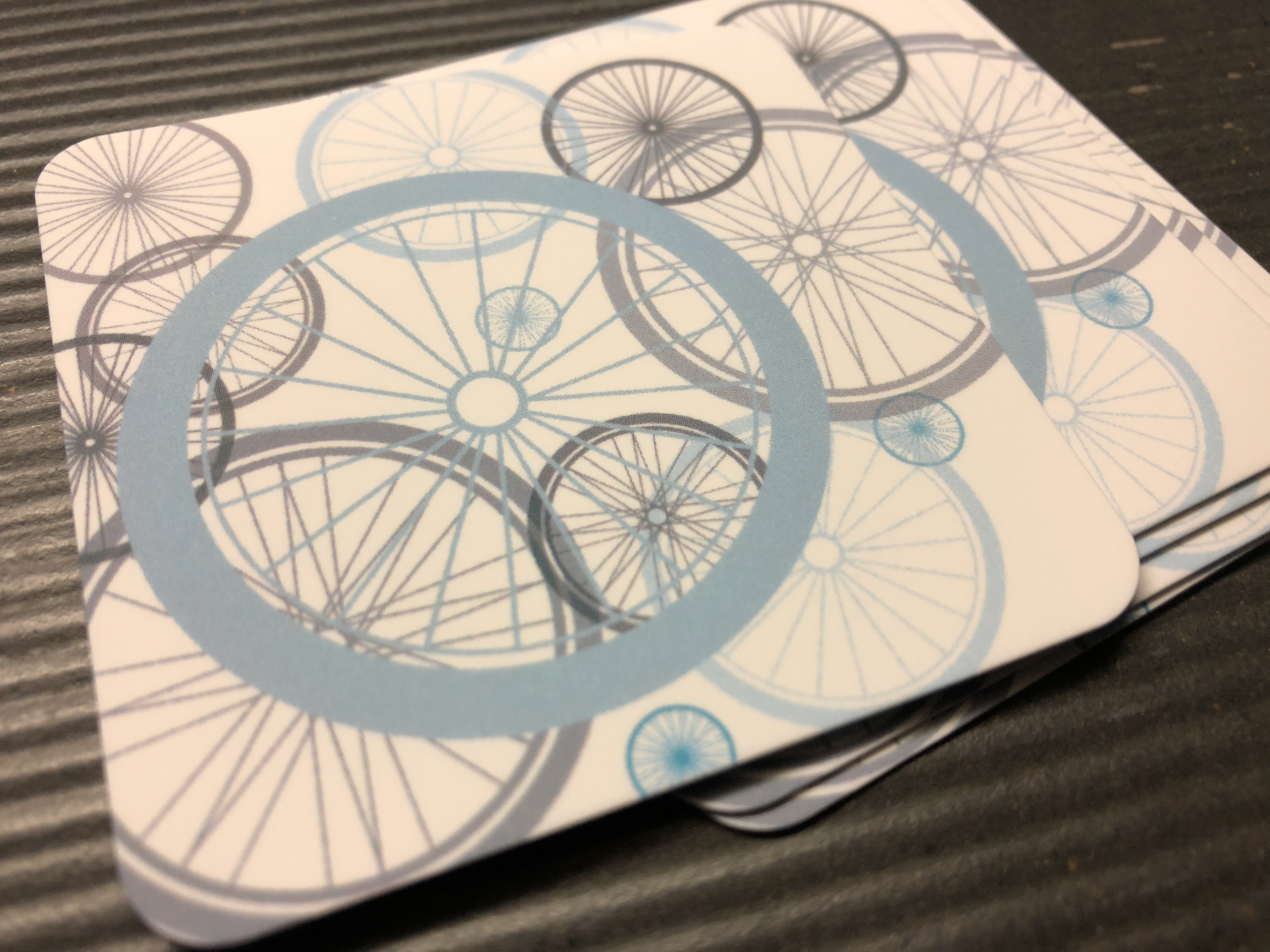
Circle of cycling wheels design for business card.
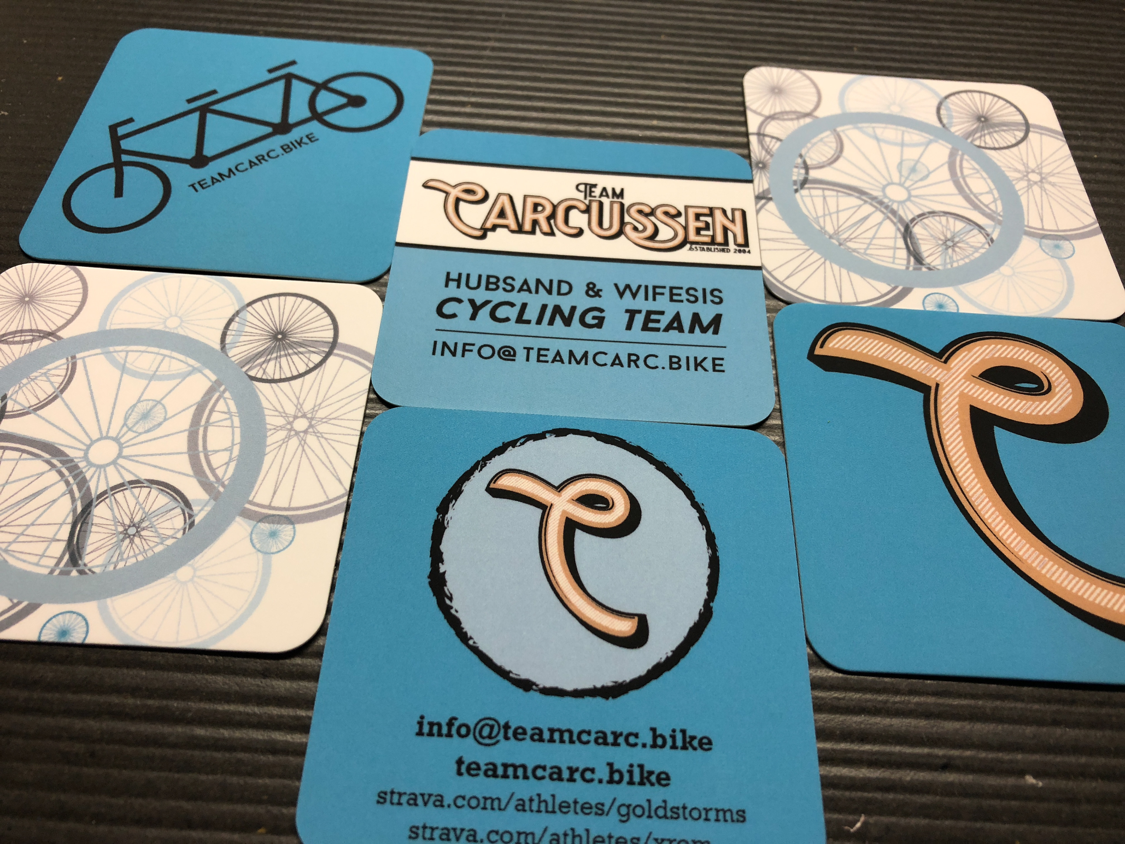
Team Carc business cards.
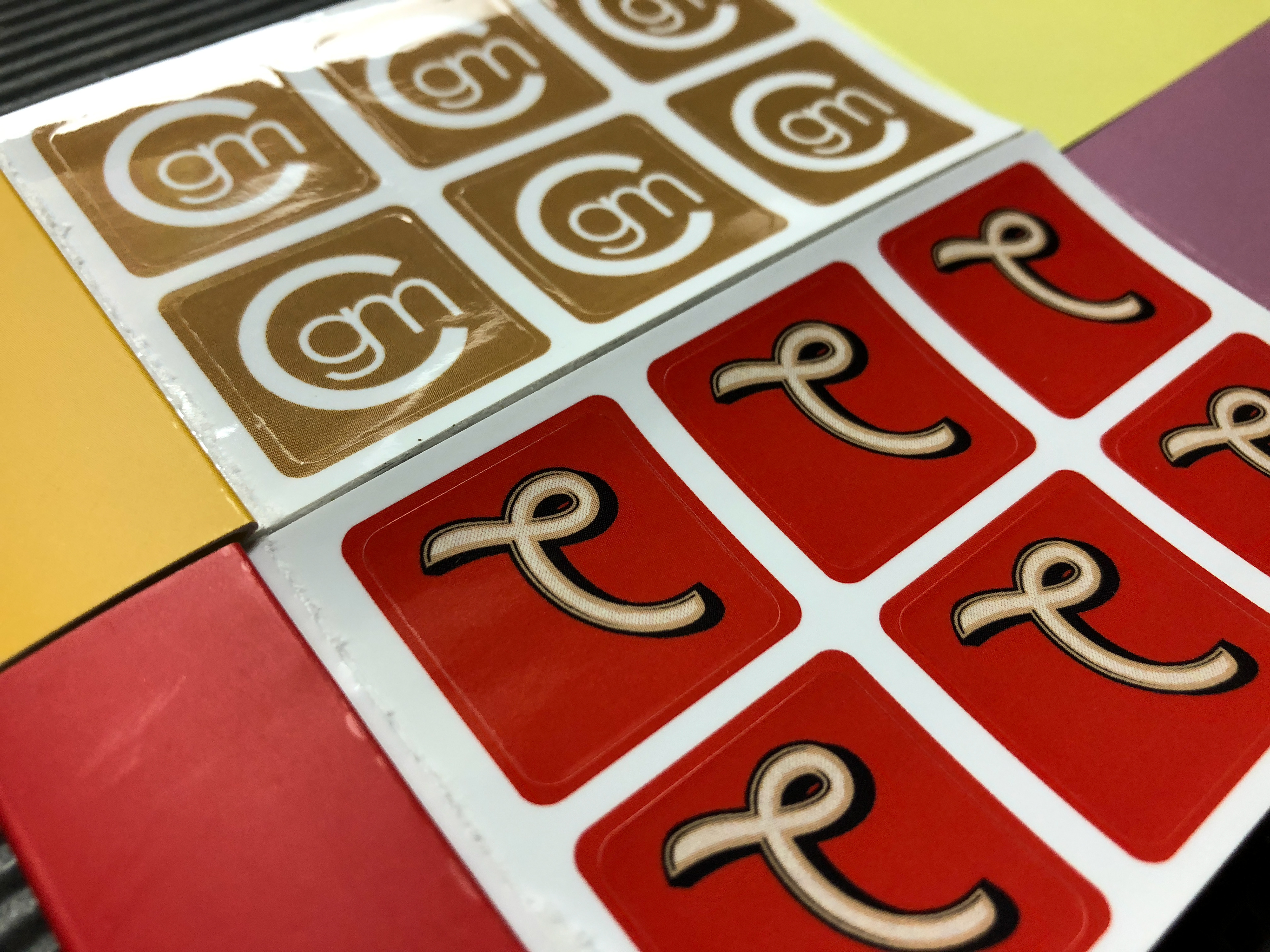
Team Carc stickers.
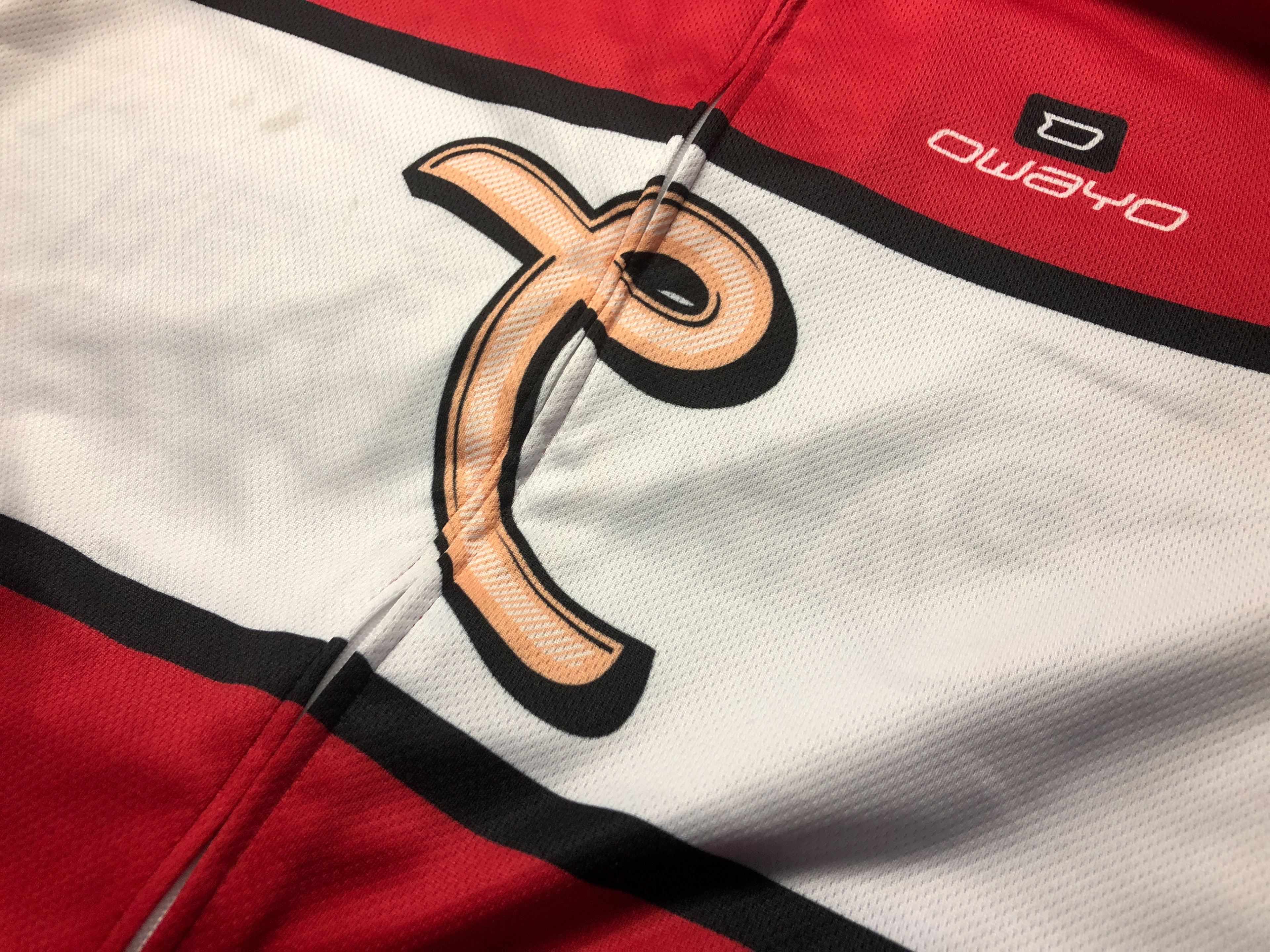
Team Carc cycling jersey (front).
