


Purpose
The UX team was asked to make user interface (UI) changes to the shopping cart page of the Haband site as part of the migration progress. These changes would affect other Orchard brand sites down the road in order to provide a seamless look across the board.
My role as a UX designer was to review the current state of the shopping cart page, conduct competitive research and analysis and provide design recommendations. I worked closely with the eCommerce/produce checkout team product owner and business analyst and received guidance from the UX team for this project. I used different resources and tools to complete my work, including Sketch (wireframe), Axure (prototype), Zeplin (design specifications) and JIRA (project management).
Process
Although the project seemed pretty straight forward in terms of cleaning up U (such as increasing the font sizes and callouts to savings, removing the instructional text underneath the top checkout now button and combining the individual edit links next to each applicable attribute into one), I still did quite a bit of competitive analysis of shopping cart pages and popup modals just to be thorough.
Although the project seemed pretty straight forward in terms of cleaning up U (such as increasing the font sizes and callouts to savings, removing the instructional text underneath the top checkout now button and combining the individual edit links next to each applicable attribute into one), I still did quite a bit of competitive analysis of shopping cart pages and popup modals just to be thorough.
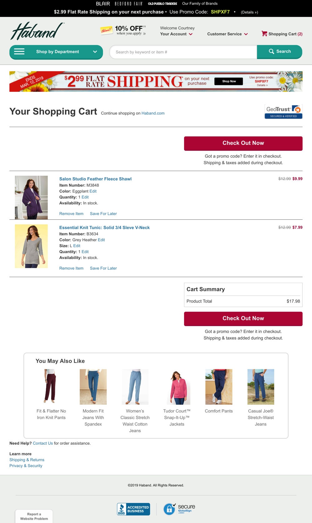
Current state - Desktop
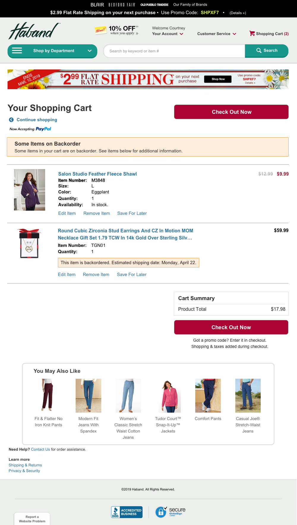
Final design iteration, including back order error messages.
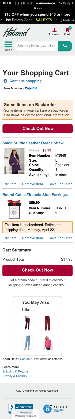
Final mobile version
The interesting part came when there was a request from the stakeholder group to turn the continue shopping link (which was a text link) at the top of page into a button. Using my research, we were able to make a case for keeping the link as is. Not only would it result in a poor user experience (typically continue shopping buttons are used in a popup modal after a user has added an item to their cart), but my research showed that only four competitors had a continue shopping link on their shopping cart page (and even then, it was a text link). None of the 10 competitors I looked at had a continue shopping button and a checkout now button.
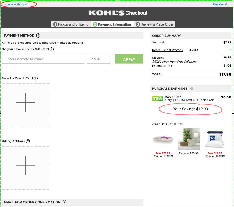
Competitive analysis: Kohl's cart
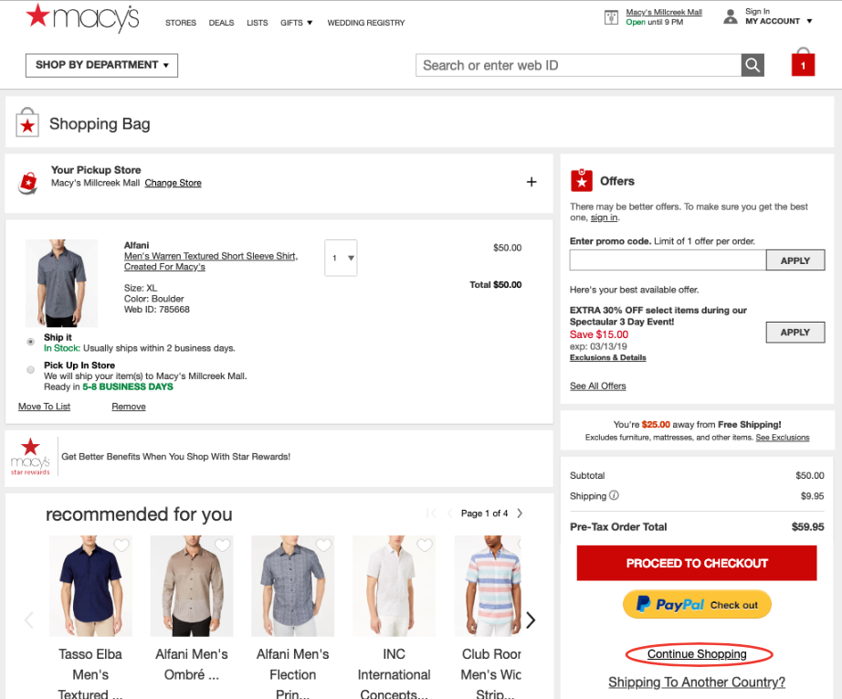
Competitive analysis: Macy's cart
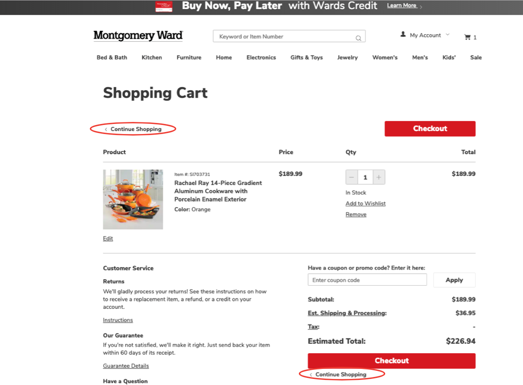
Competitive analysis: Montgomery Ward cart
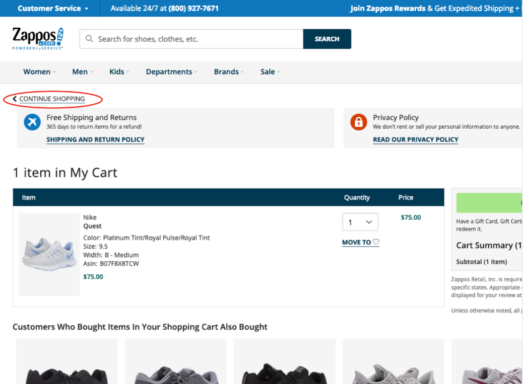
Competitive analysis: Zappos cart
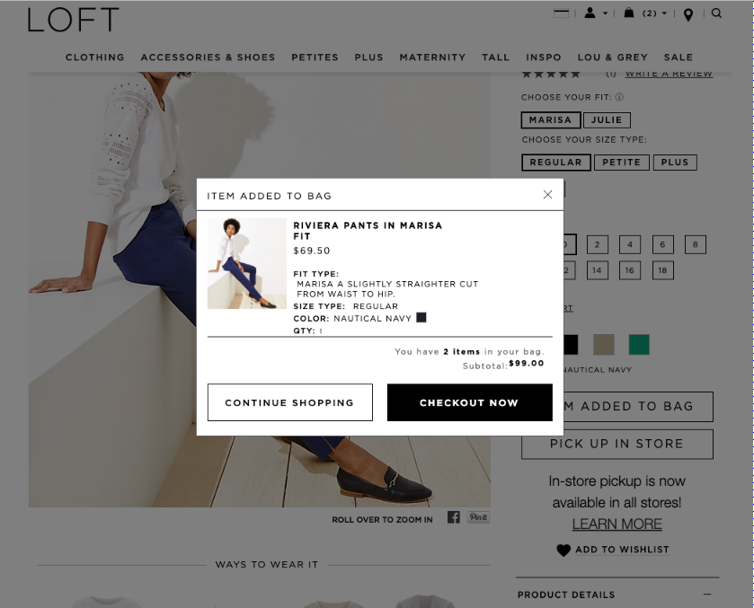
Competitive analysis: Loft add to cart modal
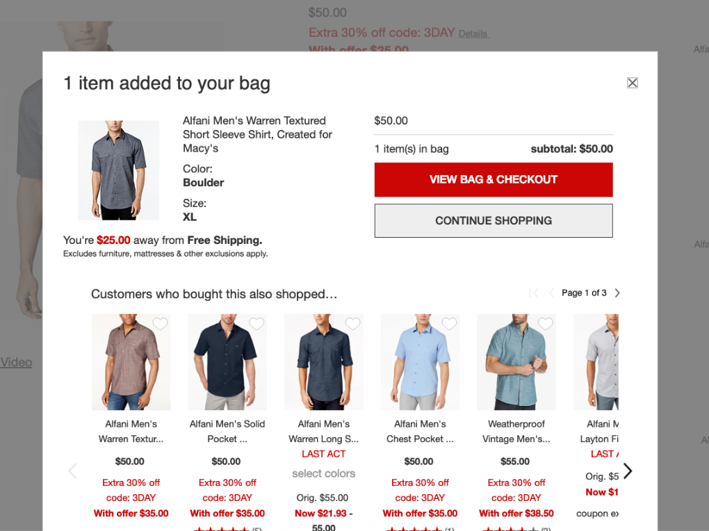
Competitive analysis: Macy's add to cart modal

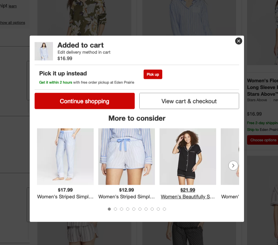
Competitive analysis: Montgomery Ward add to cart modal
Competitive analysis: Target add to cart modal
Conclusion
This was a truly fun project for me. UI is one of those things where I can get super detailed, right down to the pixel because it’s all part of the visual design. It also really made me appreciate the time and effort that goes into research and competitive analysis. If you want to prove your point, you need the data to back it up! In the end, the work on this project will help make for a better user checkout experience.
This was a truly fun project for me. UI is one of those things where I can get super detailed, right down to the pixel because it’s all part of the visual design. It also really made me appreciate the time and effort that goes into research and competitive analysis. If you want to prove your point, you need the data to back it up! In the end, the work on this project will help make for a better user checkout experience.