Learning about medical insurance coding and building the “coding module” feature for a clinical productivity software application was truly a great learning experience for me. The “what” and “why” were simple enough: Creating a module for coding that users can access separately from the procedure note, as some users need to be able to access more coding options than what’s currently presented.
Research (Discovery)
To successfully design this feature, I had to dig down and learn about medical insurance billing and coding. If you’ve ever tried learning a foreign language or a any kind of math, you can appreciate the workout my brain had. For every injury, diagnosis and medical procedure, there’s a corresponding code. There are also a number of sets and subsets of code, including the International Classification of Diseases (ICD) (which correspond to a patient’s injury or sickness) and Current Procedure Terminology (CPT) (which relates to functions and services the patient received). Various codes are used throughout the wireframes and mockups presented below.
My role and tools
The core team for this feature consisted of five subject matter experts (SME): feature owner (product owner), coding specialist, designer (me), development and quality assurance.
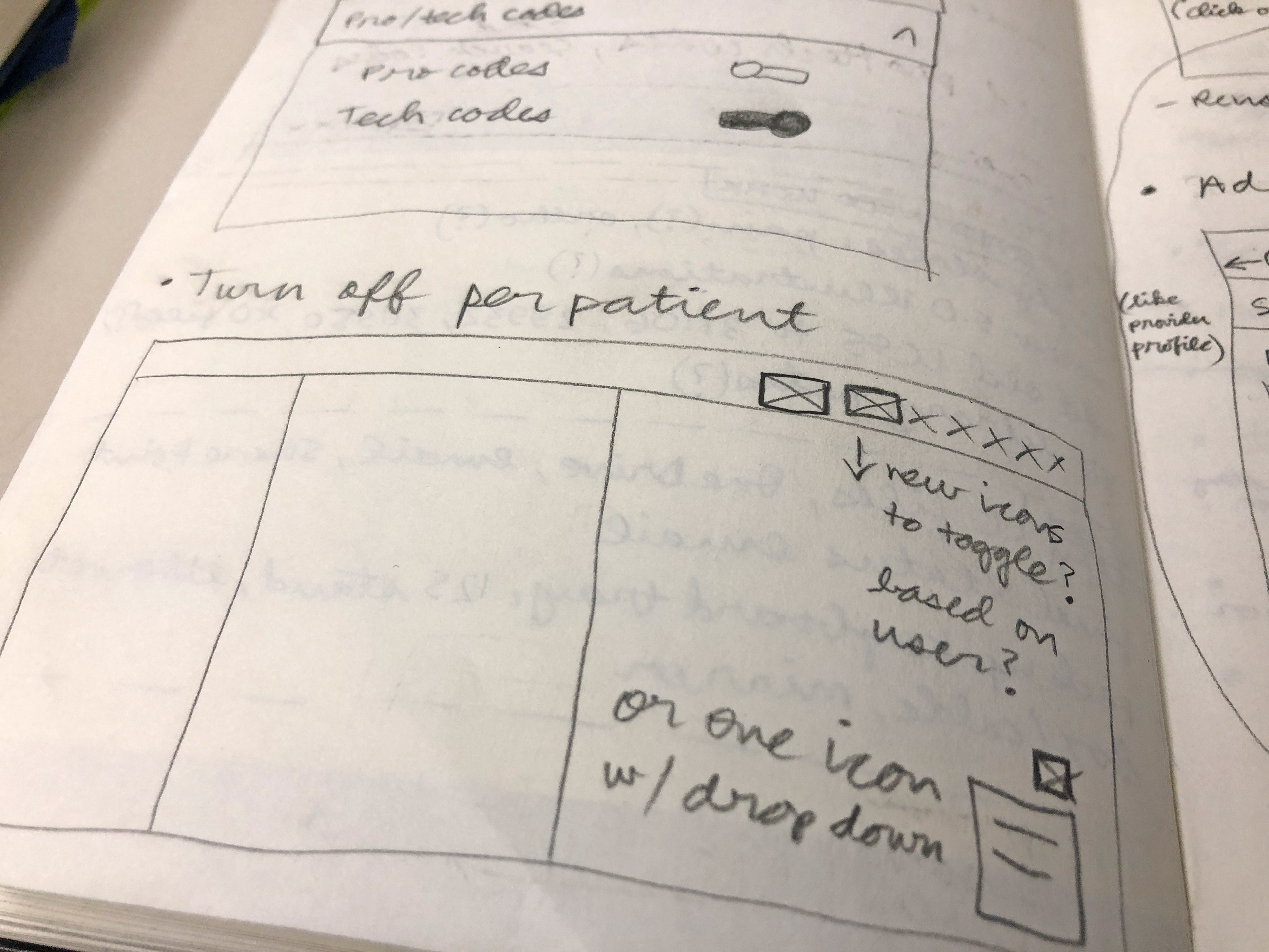
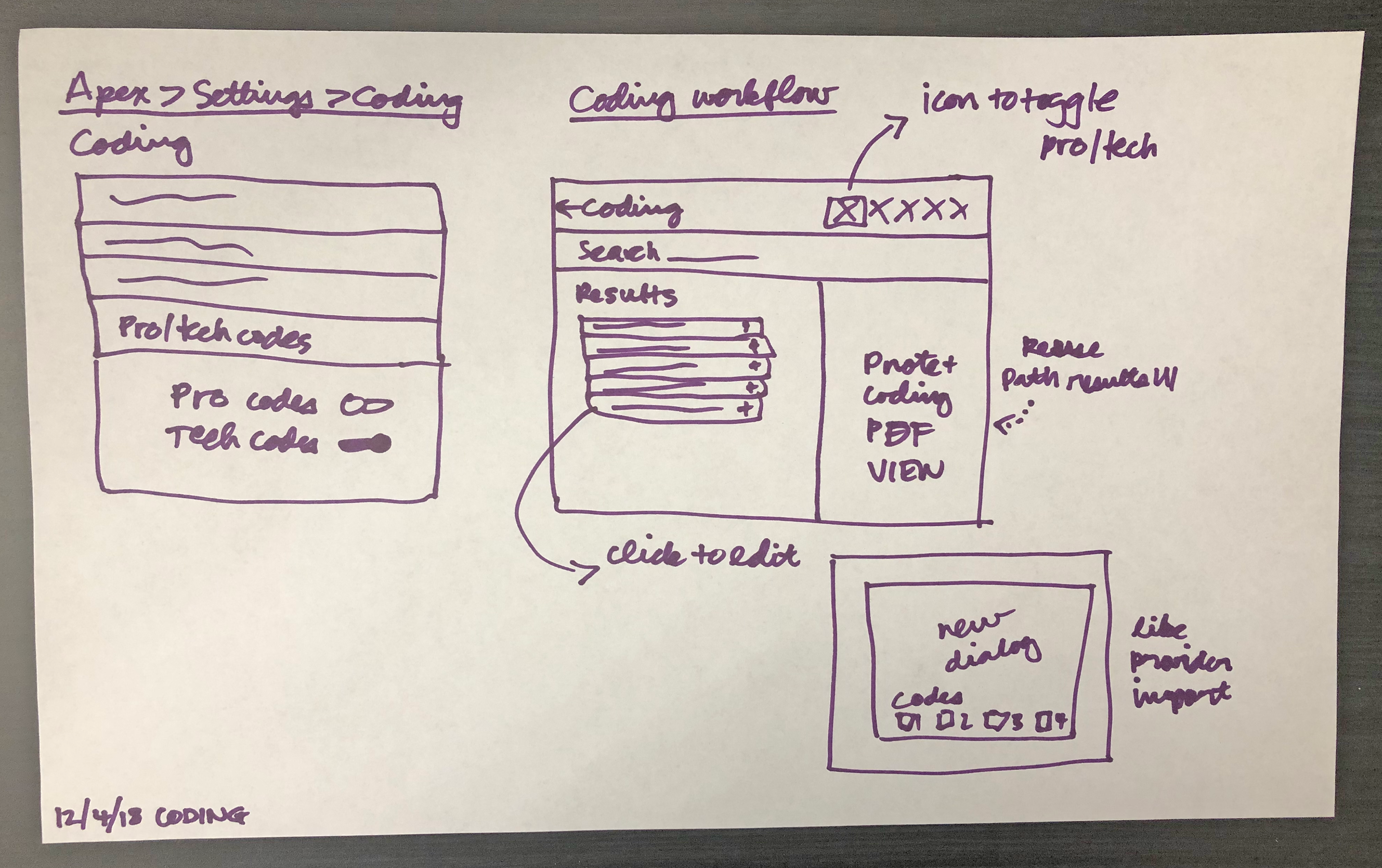
Early sketch of the coding module feature.
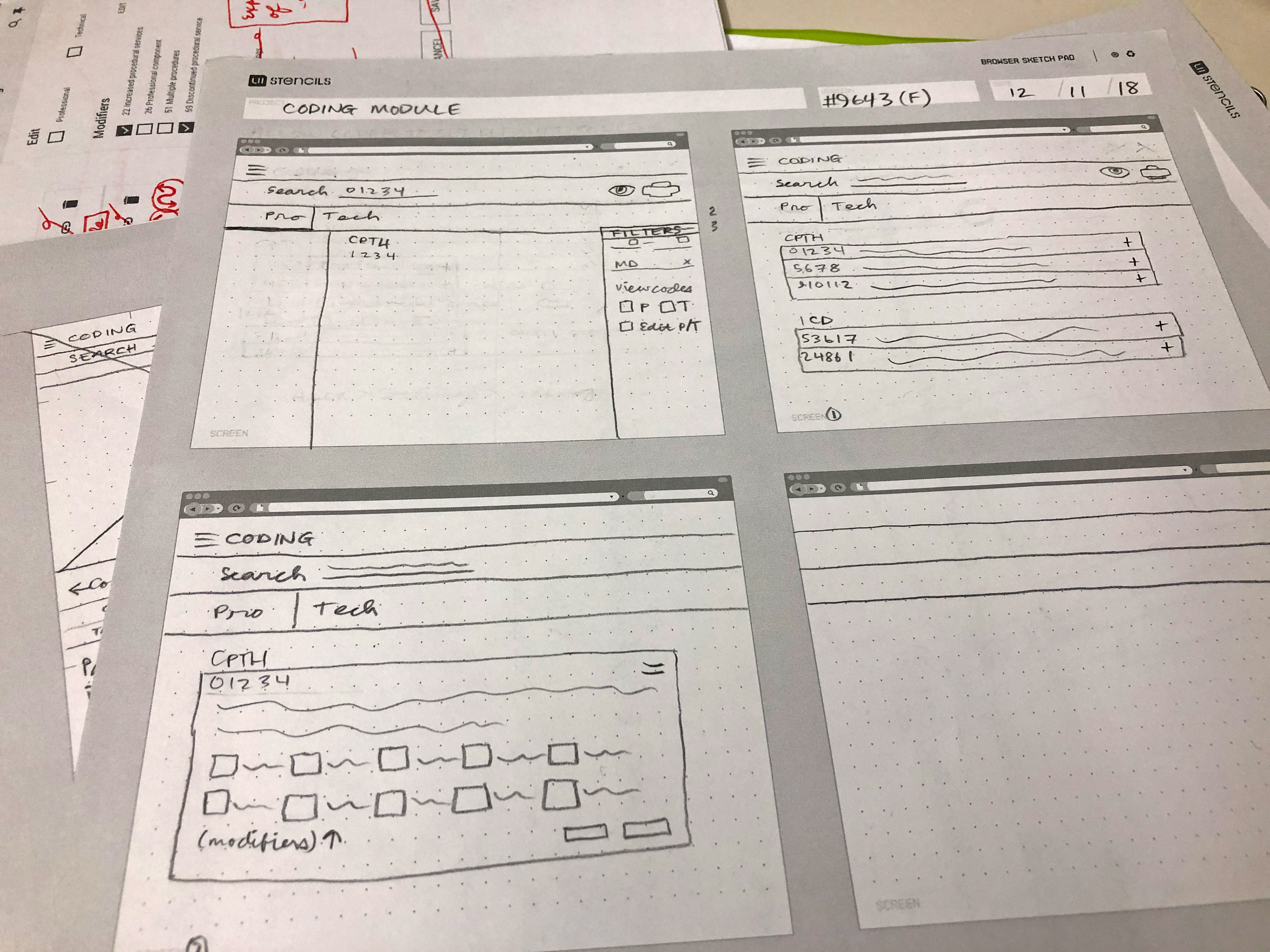
Collection of early sketches.
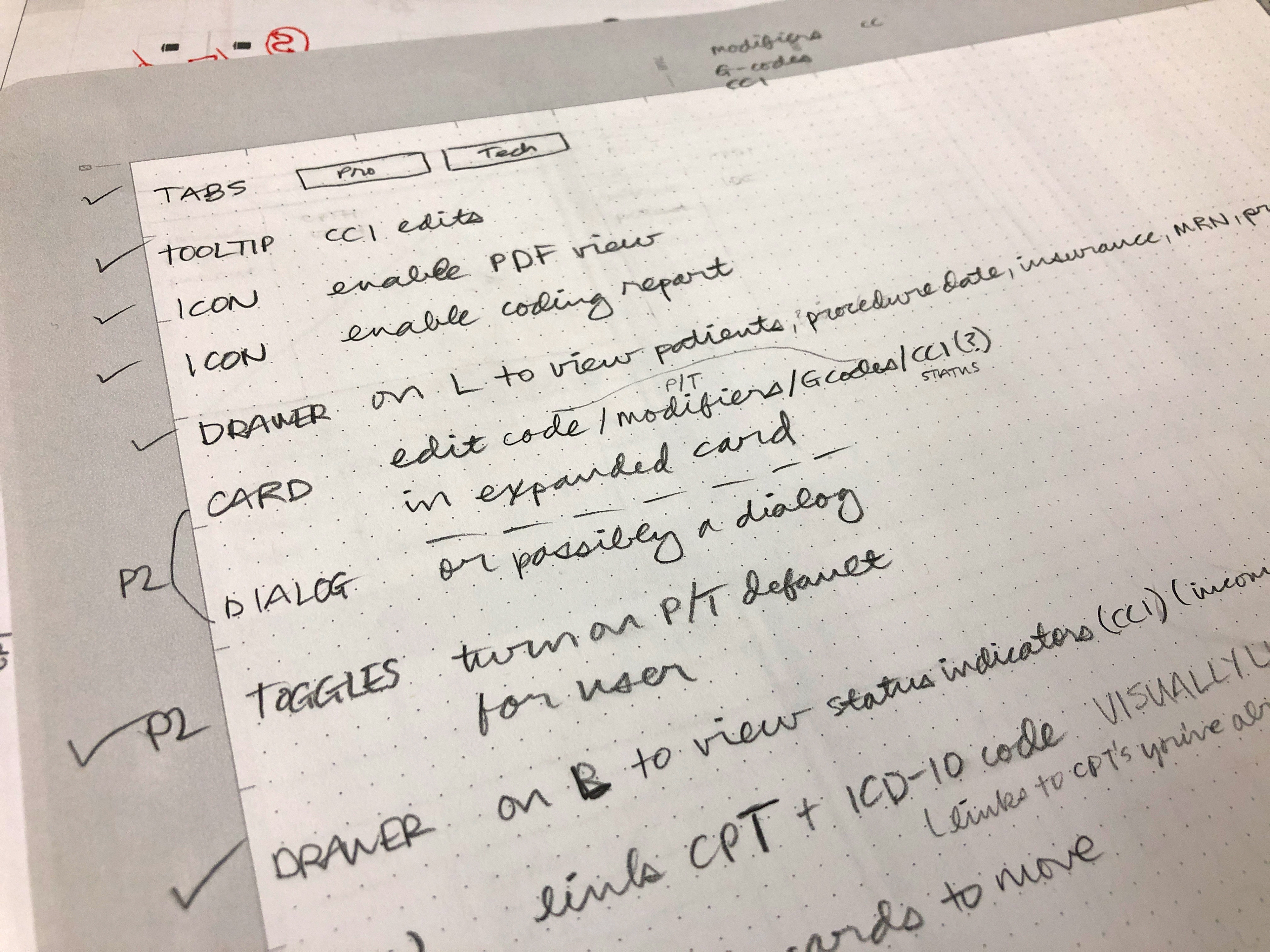
Set of notes taken early in the design process.
As the design SME it was my job to guide the design process and create design deliverables. I lead the group ideation/whiteboarding and design critique sessions for this feature. I also assisted with writing the acceptance criteria. I used different resources and tools to complete my work, including: Material Design guidelines, pencil and paper, Adobe XD (wireframes, high-fidelity mockups), Adobe Illustrator (empty state graphics), Zeplin (design specifications) and PowerPoint (presentation). Additionally, the team used Azure DevOps (formerly Visual Studio Team Services) to manage the project.
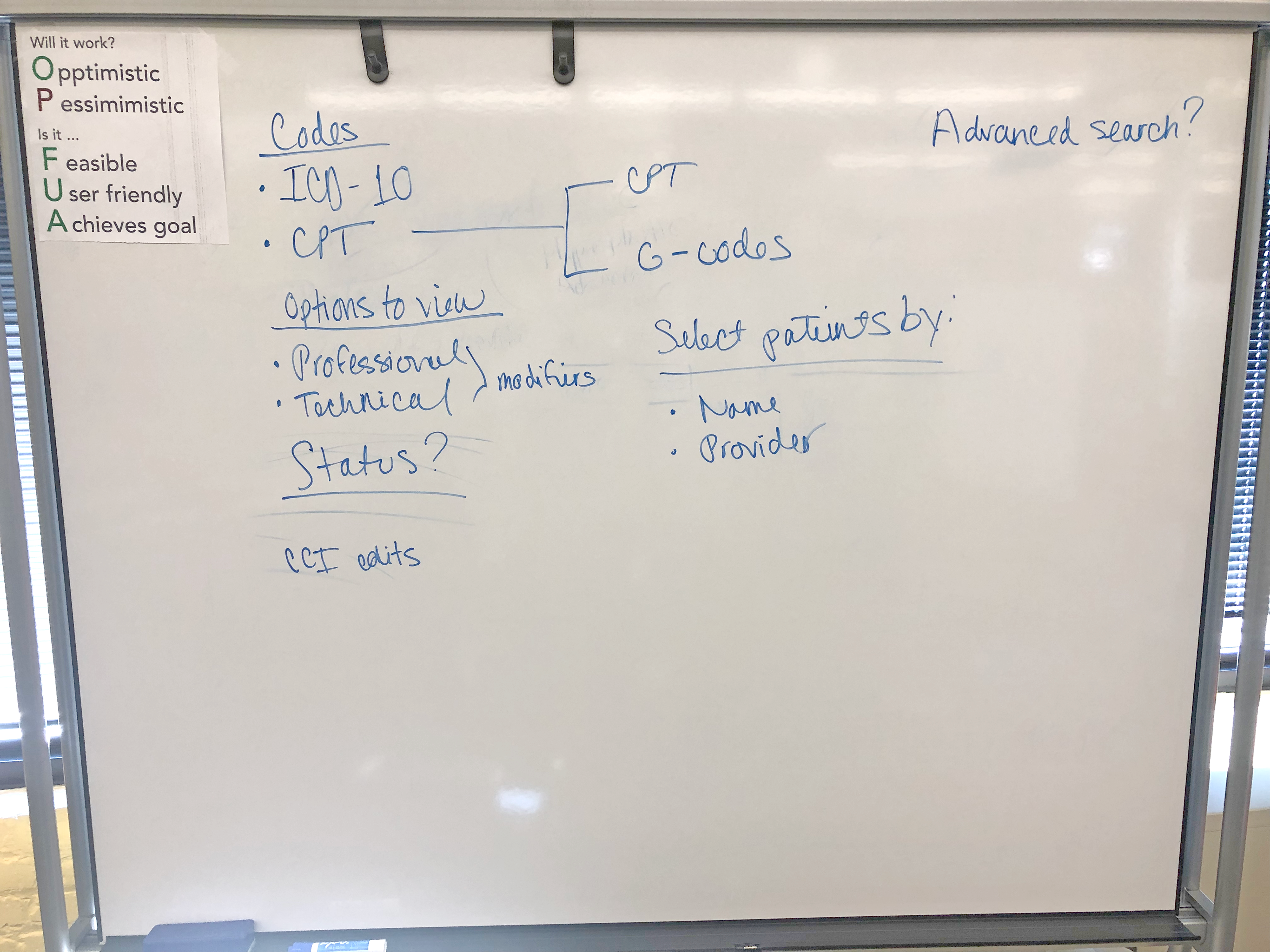
Ideas generated during the ideation/whiteboarding session.
Close-up of my whiteboard sketch generated during the ideation/whiteboarding session.
Analysis (Ideation) + wireframing
Prior to a group ideation/whiteboarding session, I sketched out several ideas on paper. Initially, I thought we could utilize a drawer that’s currently in that section and move some of the code specifics (like being able to add modifiers and being able to toggle between one view and other) to that spot. I prepared some early wireframes for our first core group discussion to reflect this.
Prior to a group ideation/whiteboarding session, I sketched out several ideas on paper. Initially, I thought we could utilize a drawer that’s currently in that section and move some of the code specifics (like being able to add modifiers and being able to toggle between one view and other) to that spot. I prepared some early wireframes for our first core group discussion to reflect this.
Further core team discussion led to removing the drawer all together and moving the functionality to the cards/panels containing the codes. The user of this particular feature is a seasoned medical coder, so he or she would be adding many codes for lots of patients per session - everything should be designed to viewed on the same screen. Another high priority that emerged was the ability to view a PDF of the patient’s procedure note from their attending physician on the screen as the coder was doing their work. I had recently designed something similar for another feature, so I decided to reuse this component here. It would save the user from having to open a separate PDF on their desktop or from opening a view in a new window.
Design and prototype + final outcome
Overall, the final design provides an easy way for users to get in and add codes for multiple patients in a single session with minimal page changes. It was well-received by the core team, UX/UI team and product management. It will be implemented into the current product in a later iteration.
Overall, the final design provides an easy way for users to get in and add codes for multiple patients in a single session with minimal page changes. It was well-received by the core team, UX/UI team and product management. It will be implemented into the current product in a later iteration.


