

A long requested feature from physicians that use the older flagship desktop product from the medical company I worked at is the ability for users to create their own procedure note templates. This was subsequently turned to a multi-part feature. Phase one was called “normal note” and it allowed providers to apply a pre-written procedure note for a normal colonoscopy with the click of a button. Phase two was called “custom templates” and allows providers to create their own custom templates for any specialty (i.e. pain, orthotics).
I designed the first normal note phase and was assigned the second phase as well. The goal of custom templates was to design a solution that would incorporate the previous work and expand upon it. Ultimately, this feature will save physicians time in documenting procedure notes.
My role and tools
The core team for this feature consisted of four subject matter experts (SME): feature owner (business analyst), designer (me), development and quality assurance. We met over the course of a few weeks to prep the feature.
As the design SME, it was my job to guide the design process and create design deliverables. I lead the group ideation/whiteboarding and design critique sessions for this feature. I also assisted with writing the user flow, requirements and acceptance criteria. I used different resources and tools to complete my work, including: Material Design guidelines, pencil and paper, Adobe XD (wireframes, high-fidelity mockups), Adobe Illustrator (empty state graphics), Zeplin (design specifications) and PowerPoint (presentation). Additionally, the team used Azure DevOps (formerly Visual Studio Team Services) to manage the project.
Analysis (Ideation)
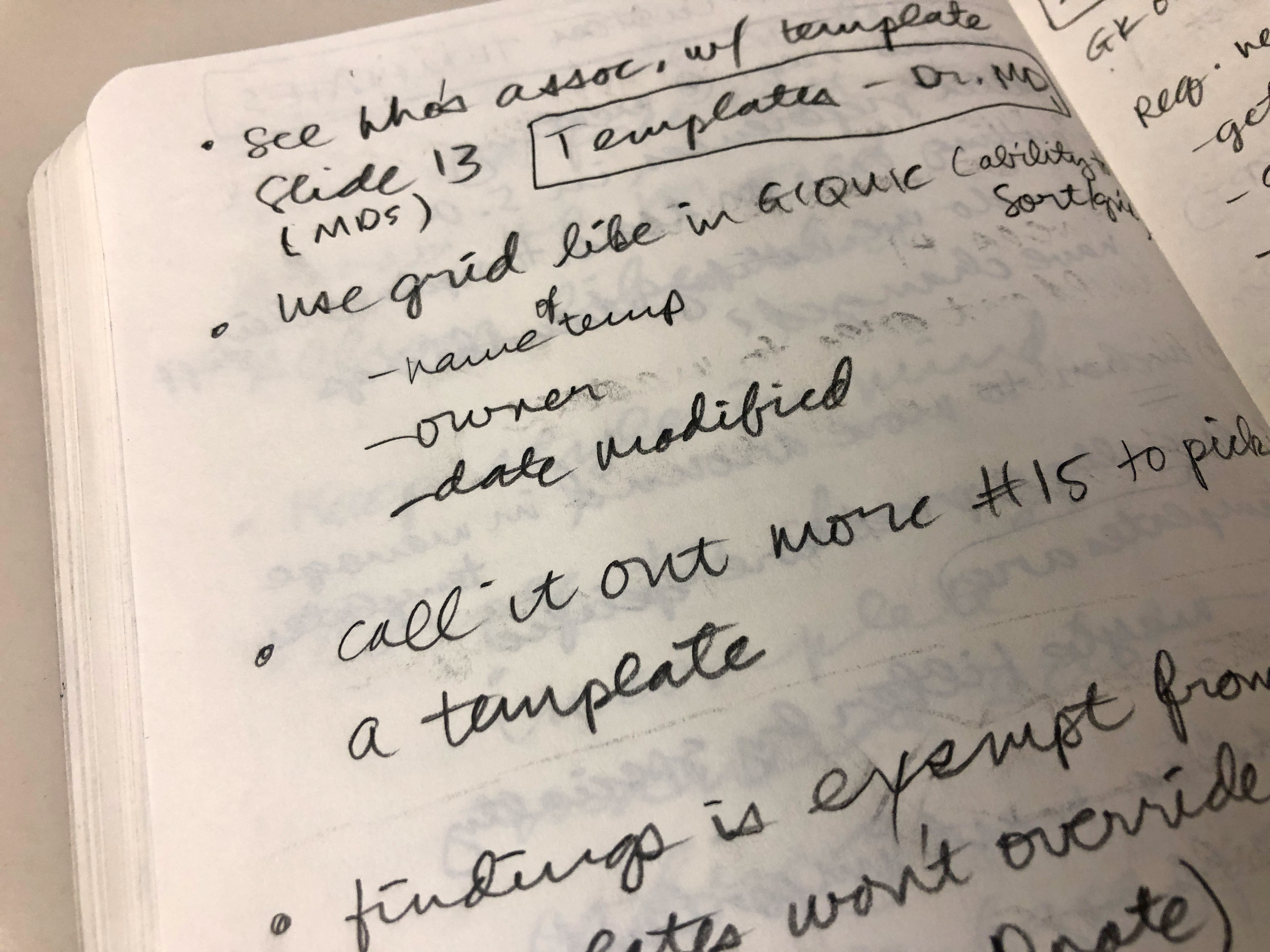
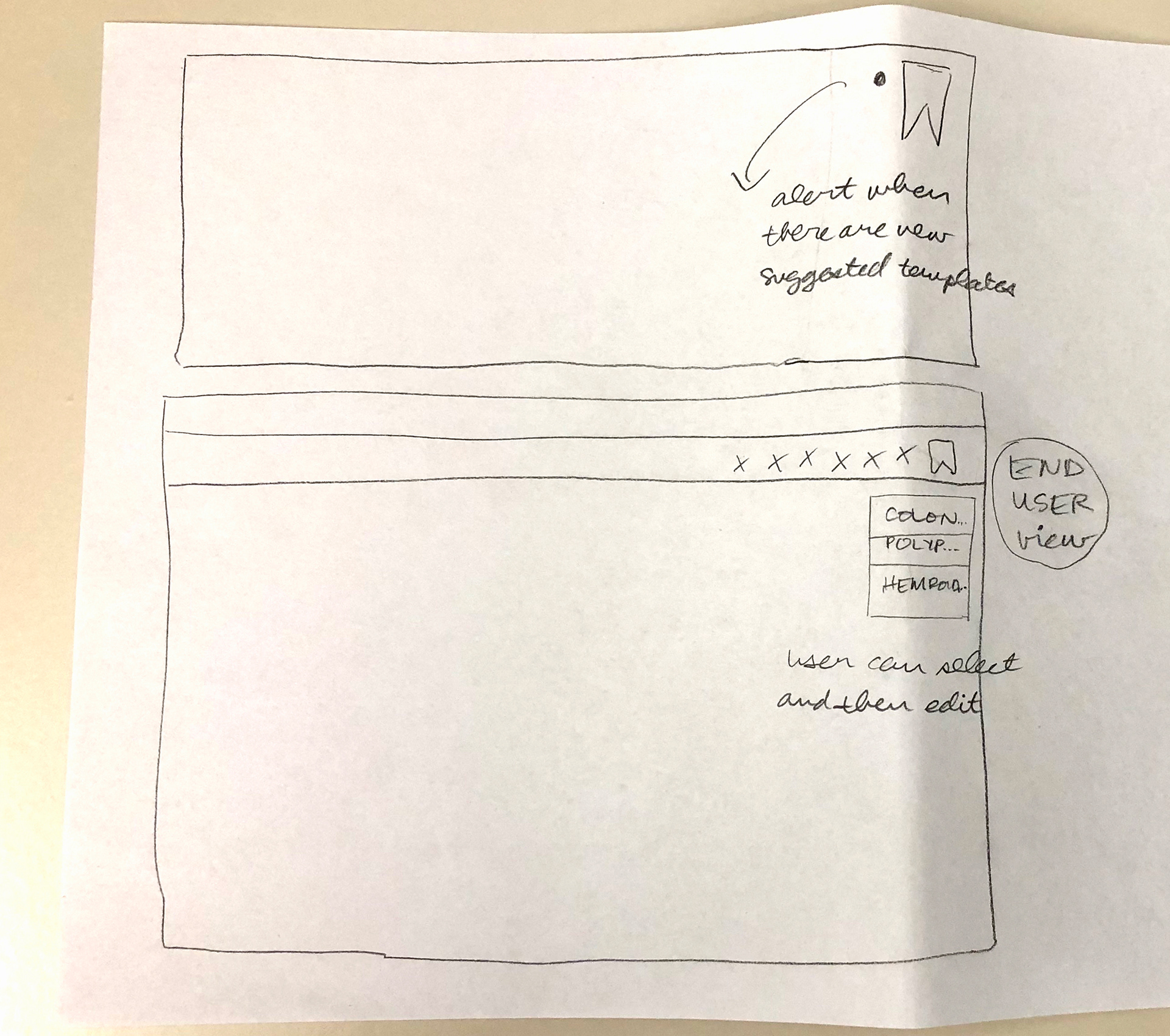
I initially sketched out some ideas on paper during our group ideation/whiteboarding session. I definitely wanted to keep the functionality that was completed in phase one (which involved adding an icon to an existing toolbar) and expand on that in this second phase with a dropdown menu of sorts for users to be able to use the templates they made. One thought was to utilize the existing normal note bookmark icon as a way to alert users when a new suggested template is available. However, at this point, the requirements, etc. had not been completed yet, so I didn’t have much to go on yet.
I designed the first normal note phase and was assigned the second phase as well. The goal of custom templates was to design a solution that would incorporate the previous work and expand upon it. Ultimately, this feature will save physicians time in documenting procedure notes.
My role and tools
The core team for this feature consisted of four subject matter experts (SME): feature owner (business analyst), designer (me), development and quality assurance. We met over the course of a few weeks to prep the feature.
As the design SME, it was my job to guide the design process and create design deliverables. I lead the group ideation/whiteboarding and design critique sessions for this feature. I also assisted with writing the user flow, requirements and acceptance criteria. I used different resources and tools to complete my work, including: Material Design guidelines, pencil and paper, Adobe XD (wireframes, high-fidelity mockups), Adobe Illustrator (empty state graphics), Zeplin (design specifications) and PowerPoint (presentation). Additionally, the team used Azure DevOps (formerly Visual Studio Team Services) to manage the project.
Analysis (Ideation)
I initially sketched out some ideas on paper during our group ideation/whiteboarding session. I definitely wanted to keep the functionality that was completed in phase one (which involved adding an icon to an existing toolbar) and expand on that in this second phase with a dropdown menu of sorts for users to be able to use the templates they made. One thought was to utilize the existing normal note bookmark icon as a way to alert users when a new suggested template is available. However, at this point, the requirements, etc. had not been completed yet, so I didn’t have much to go on yet.
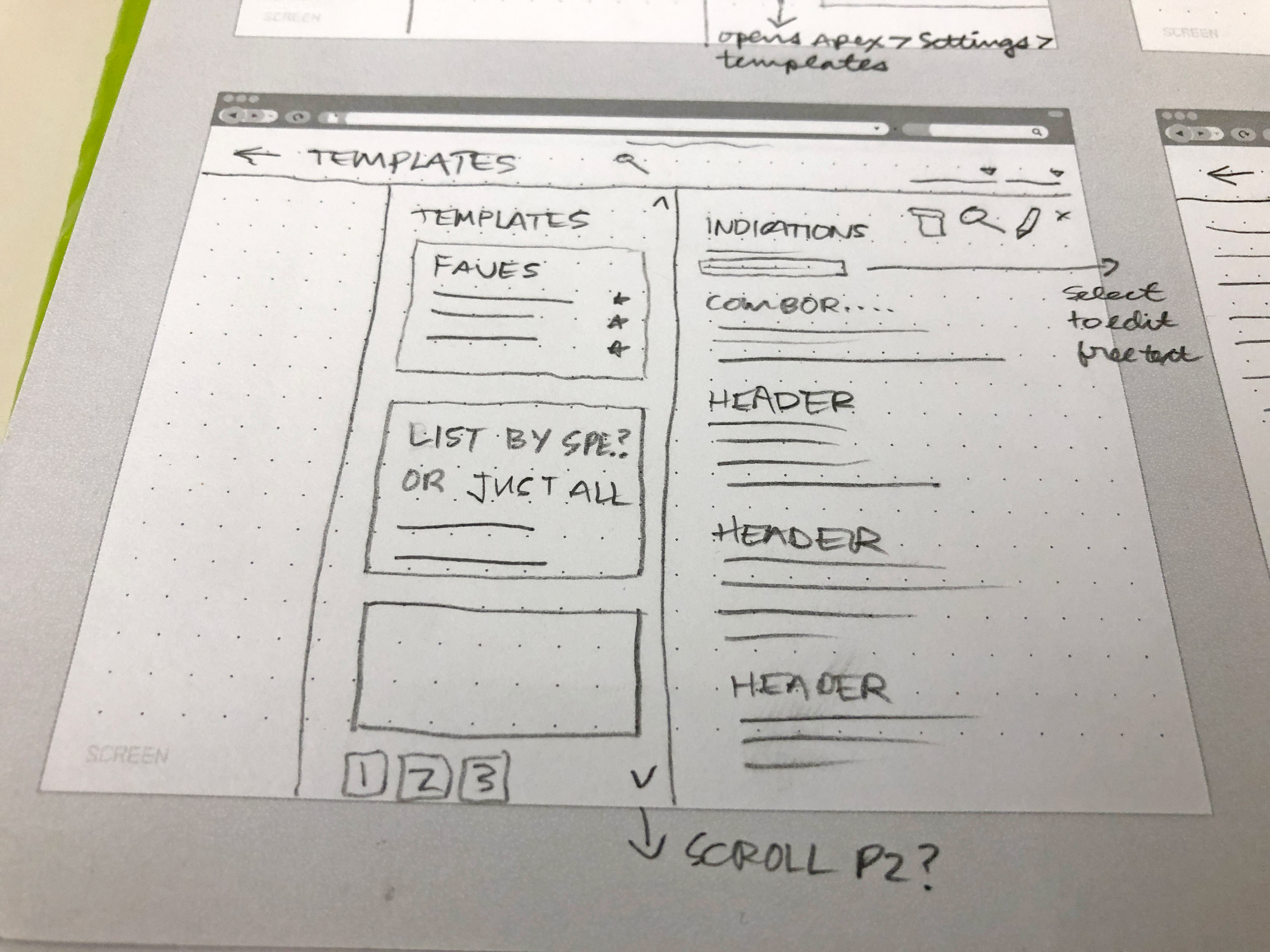
Early sketch of the custom templates feature.
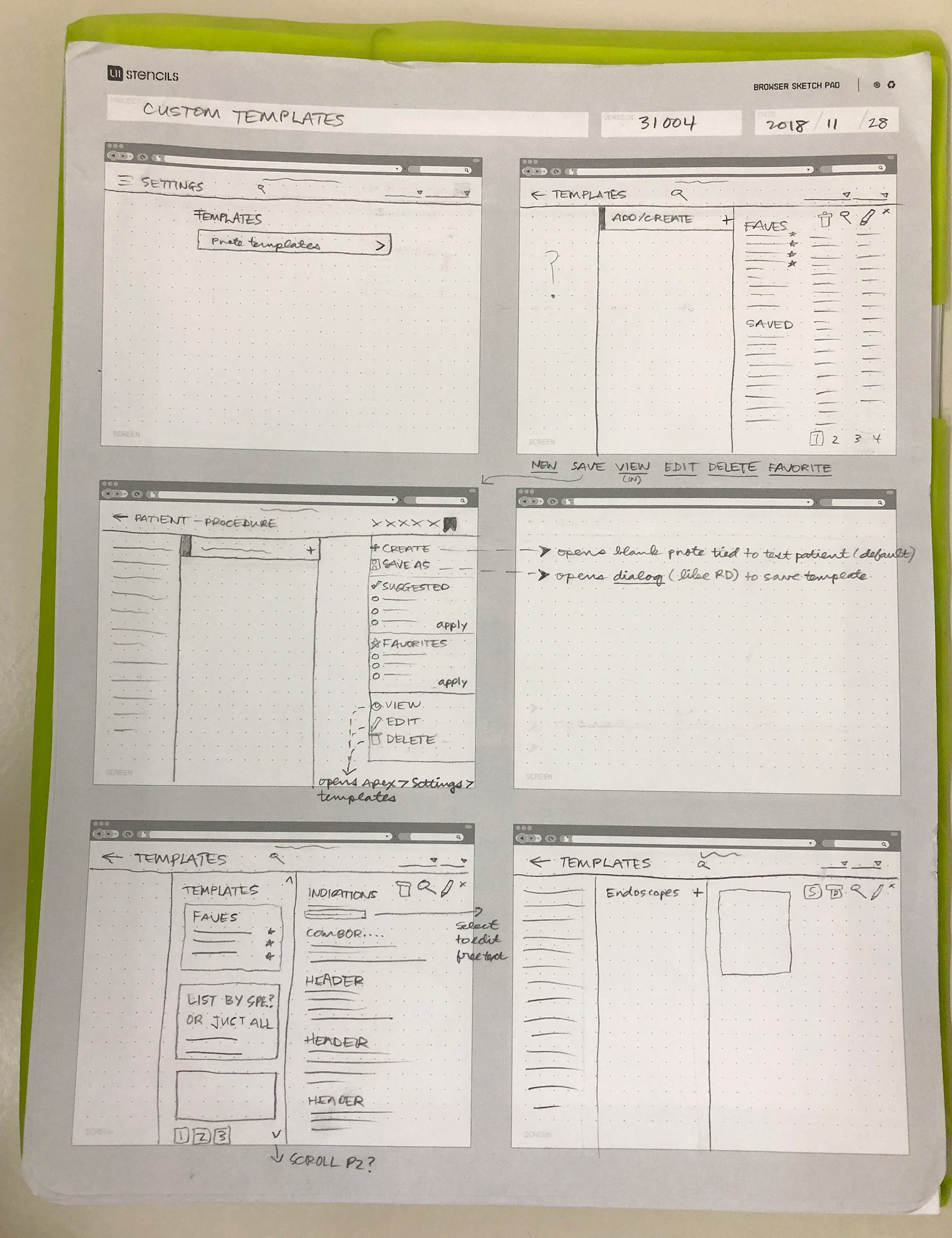
Collection of early sketches.
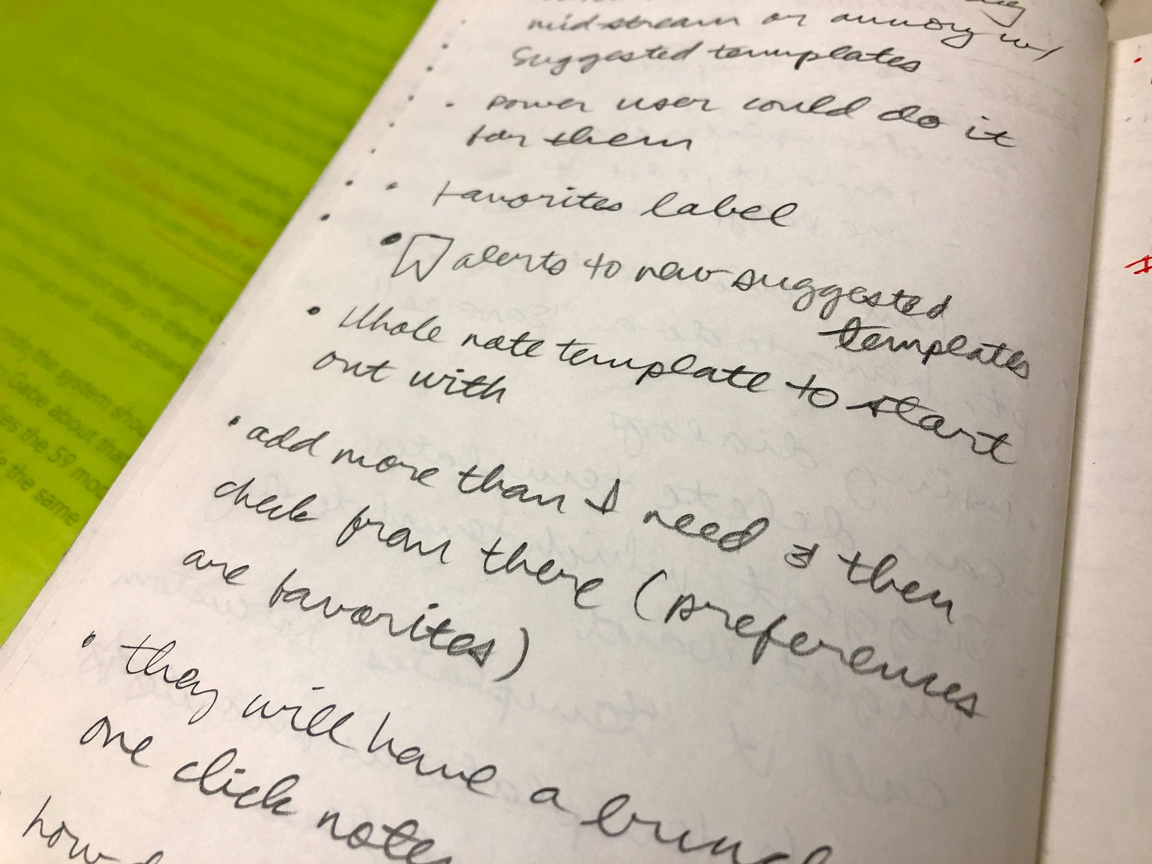
Set of notes taken early in the design process.
Wireframes
During a work session between myself and the feature owner, it quickly emerged that we would need to solve this problem with two workflows: one for managing custom templates and one for using the custom templates. Based on the sketches and wireframes I had done earlier, I knew we could reuse existing components (e.g. floating action button, grid/table, mega menu) to solve both flows. This would allow users to save templates, apply those templates to procedure notes and manage the templates.
During a work session between myself and the feature owner, it quickly emerged that we would need to solve this problem with two workflows: one for managing custom templates and one for using the custom templates. Based on the sketches and wireframes I had done earlier, I knew we could reuse existing components (e.g. floating action button, grid/table, mega menu) to solve both flows. This would allow users to save templates, apply those templates to procedure notes and manage the templates.
Ideas generated during the design critique session.
Close-up of my whiteboard sketch generated during the ideation/whiteboarding session.
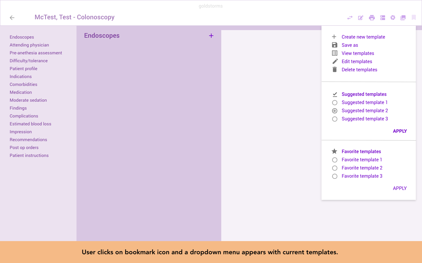
A prototype of the wireframes I created for this feature (complete with descriptive text to explain the user flow).
Design and prototype
I was able to quickly turn around design mockups after this session and bring them to the core group. We had a productive discussion about what we’d need to do for the first and later phases of the feature. The most important was being the “save as” function. Users should always be able to access the “save” button and the “templates” button (which would allow them to select available templates from a drop down menu). Ultimately, the final design represents a clean user experience that is also familiar since components were reused.
Although the product management team had settled upon a new/final design process at the time this work started, the order in which things were done on this feature were not necessarily in order. For example, the high-level requirements weren’t completed until after the design mockups had been completed. It made the process feel out of sync and required me to do more of the management activities that a designer may not necessarily do (i.e. scheduling meetings, working on requirements), but I was happy to help as I’m a team player.
Down the road, this feature will end up being one of the key selling points, as the company is always looking for ways to save doctors time and money. I was excited to have worked on such a high-profile feature for the company and was pleased with the work the core group did.