Currently, I'm working with a developer to create a mobile app based on antique glass patterns created by the A.H. Heisey Company (1896 through 1957). As a Heisey glass collector myself, I feel there's a need for an app that would serve as a mobile database of Heisey patterns so collectors can better identify Heisey pieces when out shopping at businesses.
This is a pet project that is designed to showcase my skills and thought process using User Centered Design (UCD) and Agile methods. As a visual/UX designer, I think it's important to understand all of the areas associated with a collaborative UX team. Not only is it fun to learn new things and practice knowledge that might be out of your normal, everyday skill set, it gives you a better appreciation for the skills your fellow team members are bringing to the table.
To that end, I plan to cover as many of the high-level design phases (strategy, research/discovery, analysis, design and production) and associated tasks (personas, scenarios, user flows, sketching, wireframing, mockups, prototypes, development, reviewing, testing, delivery) as I can. As mentioned above, I will be working with a developer to do the actual coding, but I expect to roll up my sleeves and do as much as I can. Completed segments will be added to this section upon completion. Stay tuned!
This app is for any Heisey glass fan - young, old, novice or expert - in identifying the likelihood of a glass piece being of Heisey origin. This app will help identify antique glass that was likely made by Heisey. It’s core appeal is that it will represent a walking, visual database of Heisey glass patterns. Long term, I hope that this app will eventually contain all known Heisey glass patterns (which is a lot - numbering somewhere in the hundreds, possibly in the thousands).
This app is for any Heisey glass fan - young, old, novice or expert - in identifying the likelihood of a glass piece being of Heisey origin. This app will help identify antique glass that was likely made by Heisey. It’s core appeal is that it will represent a walking, visual database of Heisey glass patterns. Long term, I hope that this app will eventually contain all known Heisey glass patterns (which is a lot - numbering somewhere in the hundreds, possibly in the thousands).
Research (Discovery)
My searches to see what’s already out there in the (Apple) App Store for depression glass, Heisey, Heisey glass and antique glass patterns didn’t yield anything useful. A search for antique glass did bring up an app for silver jewelry hallmarks and a jewelry trading app, however, there doesn’t seem to be any existing apps out there that solely focuses on identifying antique glass patterns.
Analysis (Ideation)
I typically like to start out any project by brainstorming ideas on pen and paper. It’s easy enough to get caught up in going into the design or prototype stage right away, so I find that this method forces me to better plan out my process.
I typically like to start out any project by brainstorming ideas on pen and paper. It’s easy enough to get caught up in going into the design or prototype stage right away, so I find that this method forces me to better plan out my process.
This stage of the process included creating proto-personas, user scenarios and user flows. The proto-personas were created using Xtensio and are based on previous discussions I’ve had with various Heisey study club members. I like to try new programs whenever possible and I think Xtensio is pretty slick. Plus it offers a "free forever" plan, which is always great.
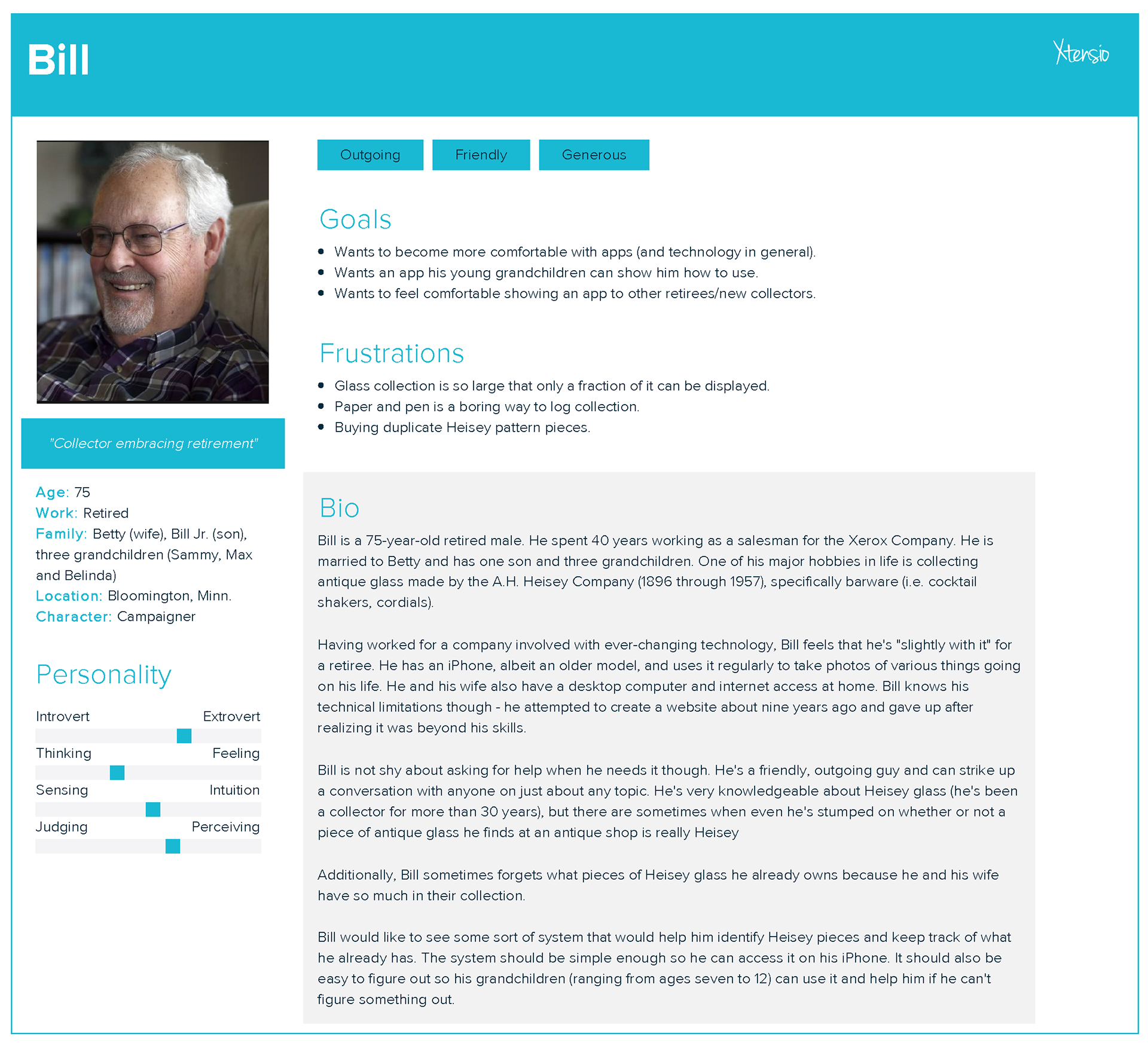
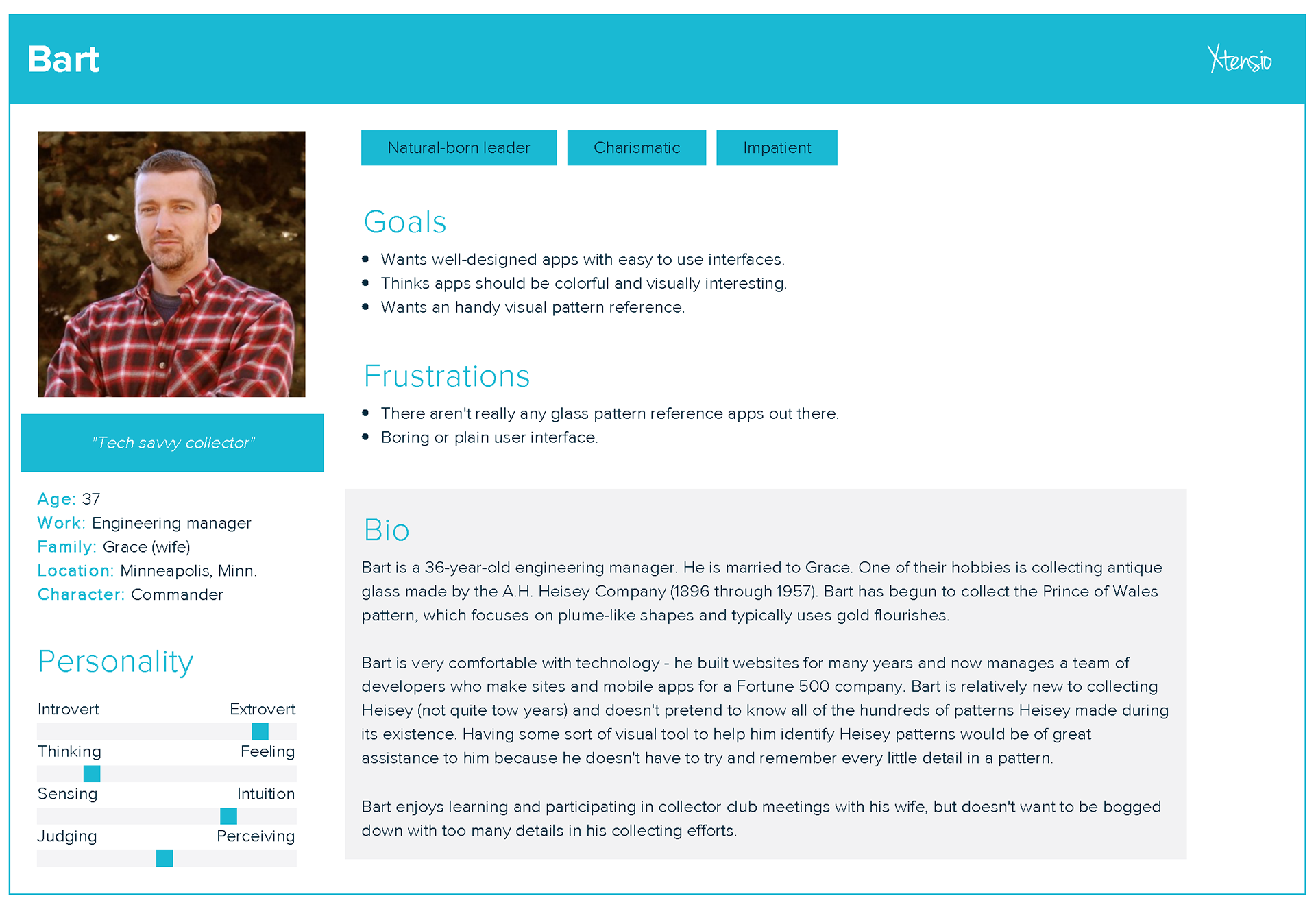
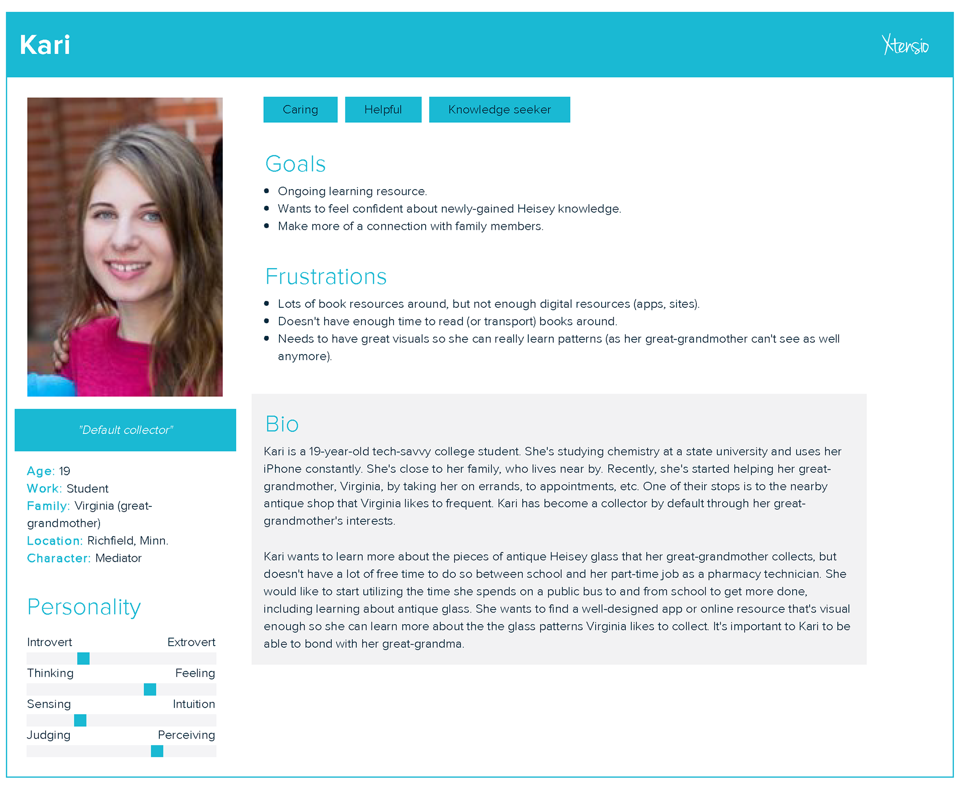
We've mapped out some epic user stories using a quick layout I made in Adobe Illustrator. I experimented with some user story software at this point, but I wasn't quite finding what I wanted.
Some basic user scenario examples created using my own Illustrator template.
The user flow for this app is going to be pretty simple. Aside from the splash page, users can go to maps (to see where others have found Heisey pieces), patterns (to identify a potential piece with a photo, or, to review the library/database) or news (to view news from the national Heisey organization).
Design
I enjoy creating sketches the old fashioned way - with pen and paper. The next two images are divergent sketches of the home or splash screen for the Is it Heisey mobile app. I sometimes include a bit of user research notes in my sketches.
I enjoy creating sketches the old fashioned way - with pen and paper. The next two images are divergent sketches of the home or splash screen for the Is it Heisey mobile app. I sometimes include a bit of user research notes in my sketches.
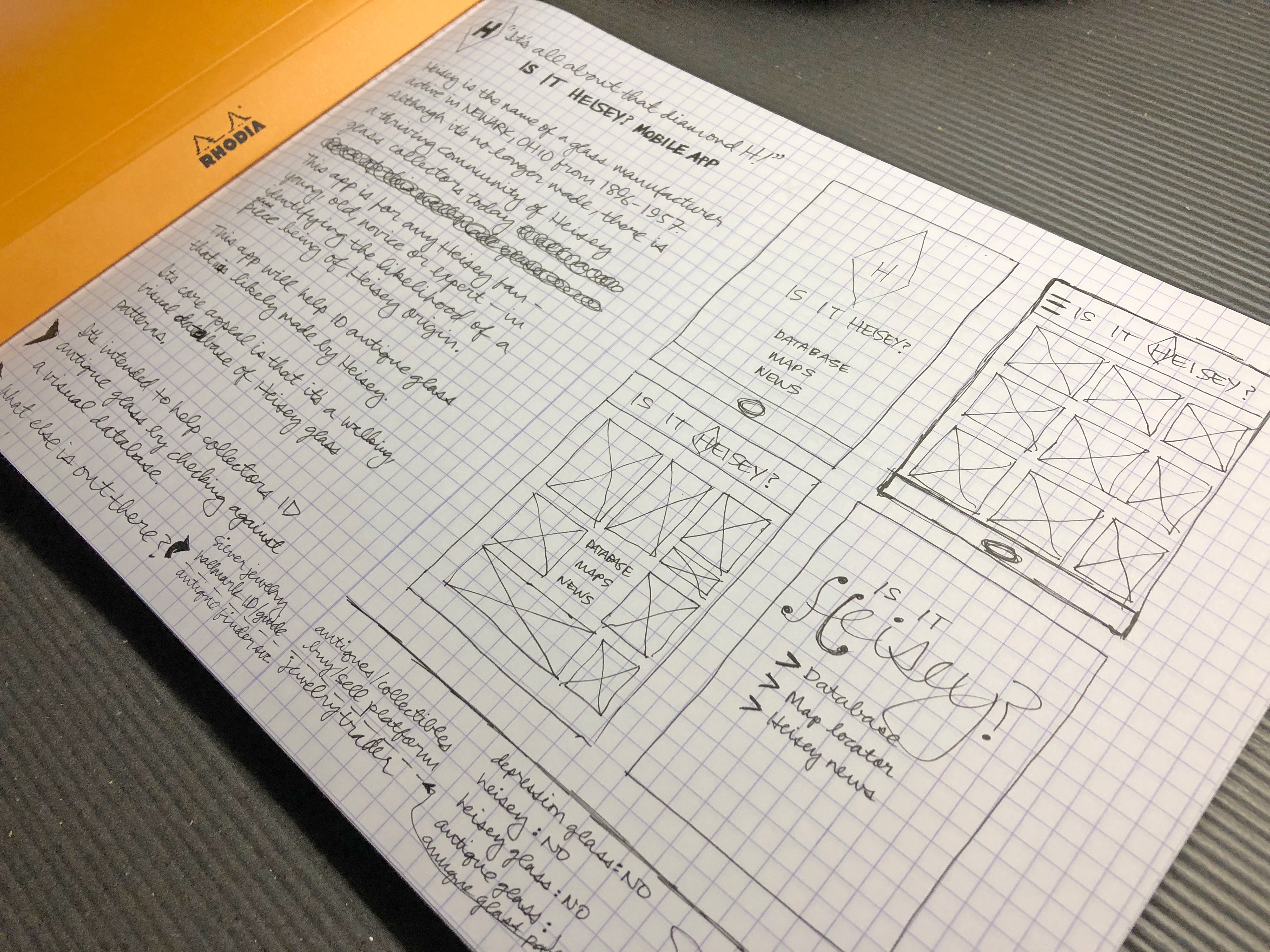
Heisey app sketches 1
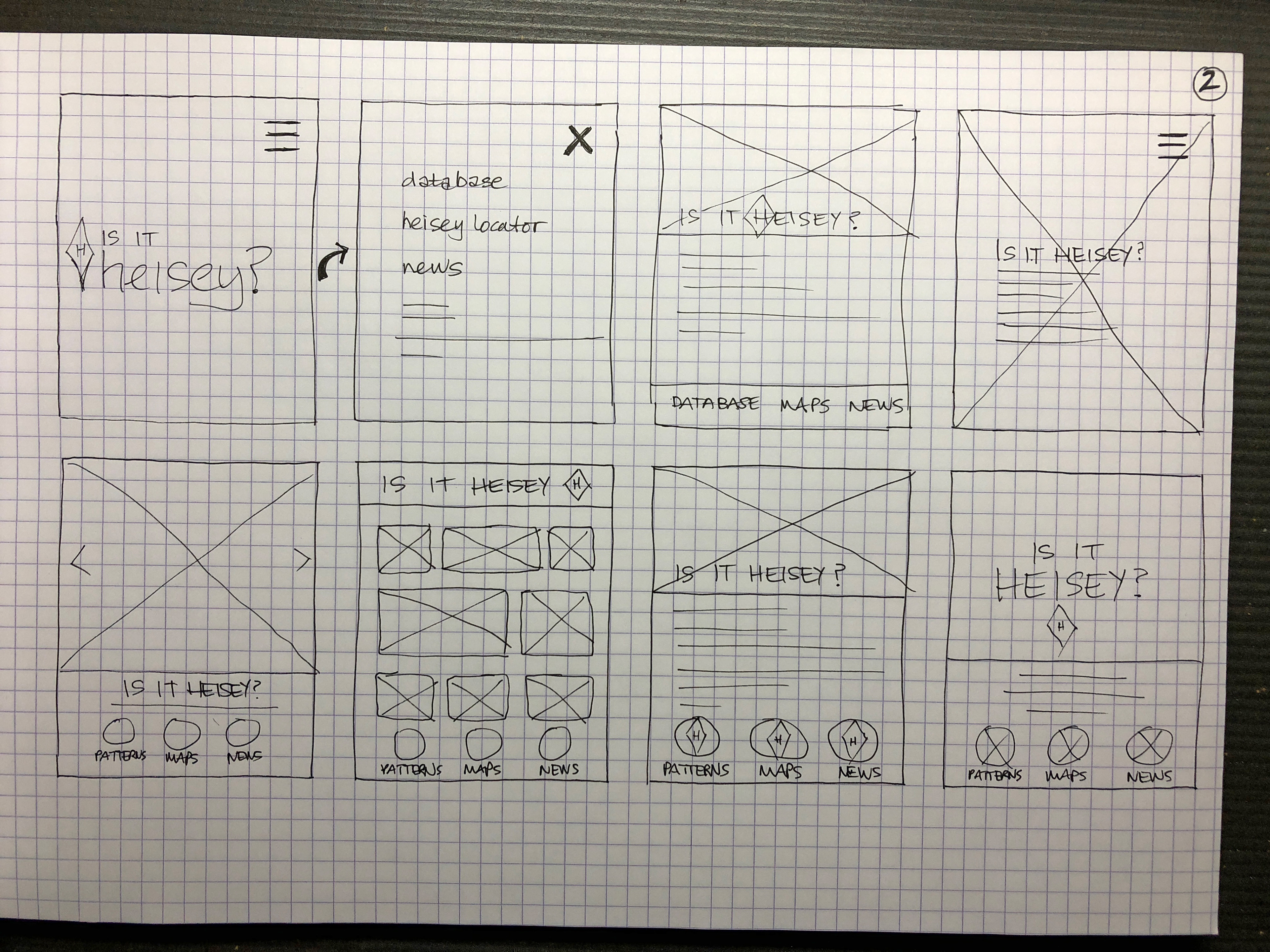
Heisey app sketches 2
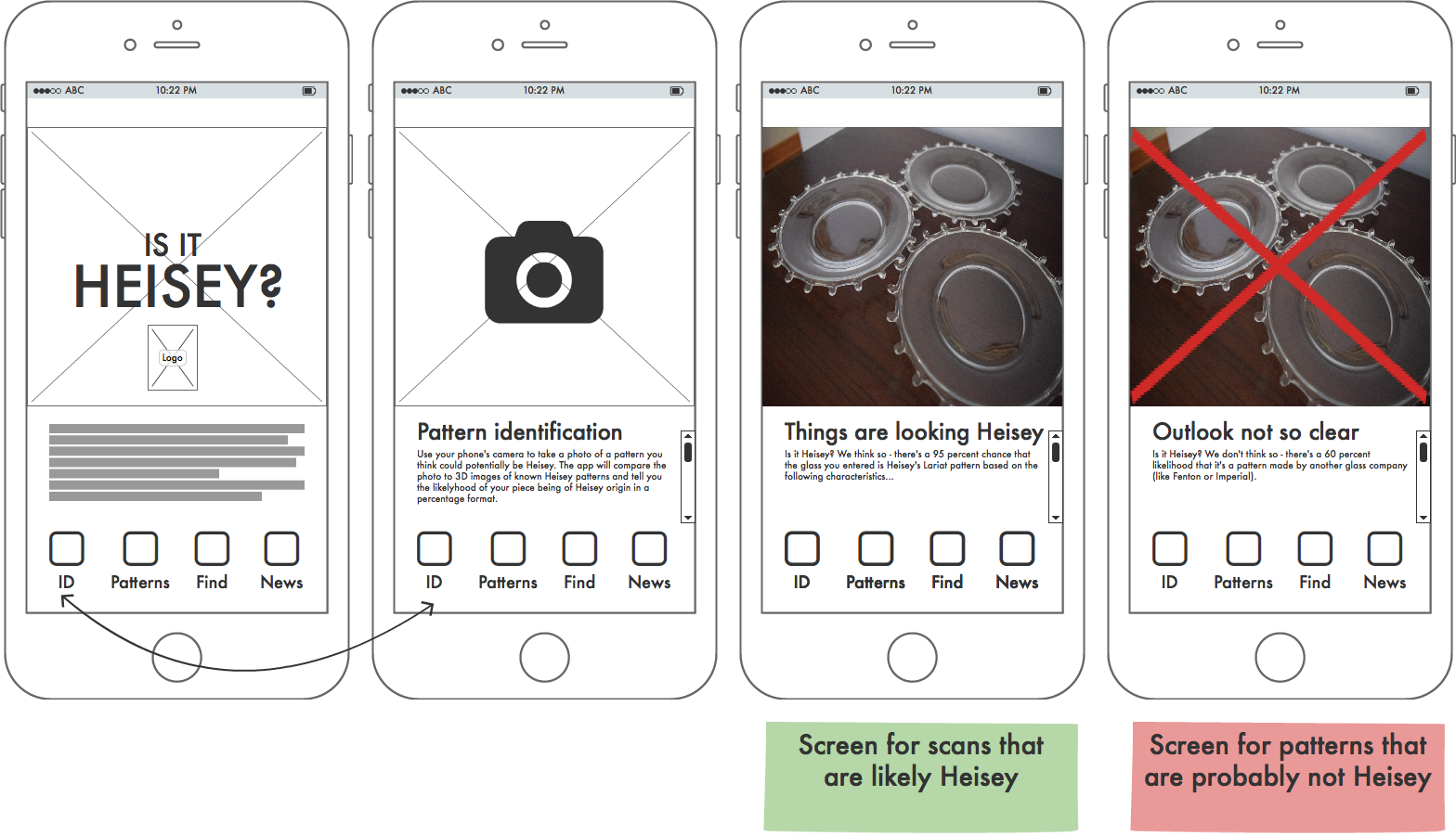
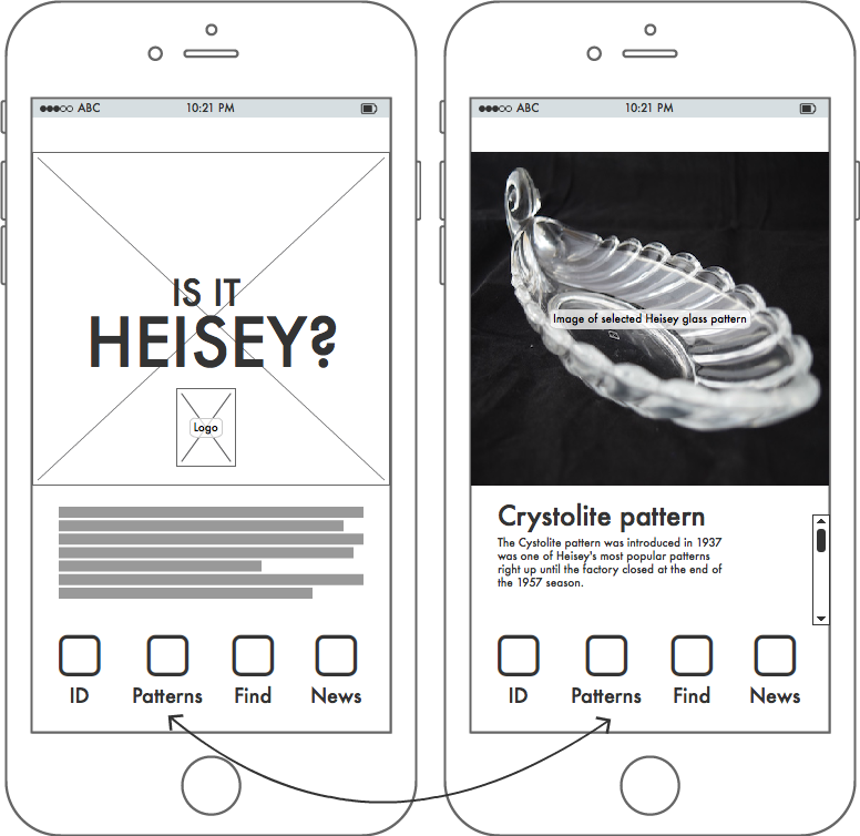
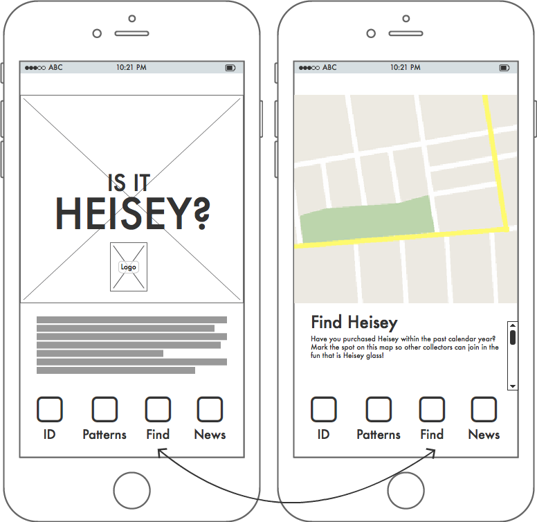
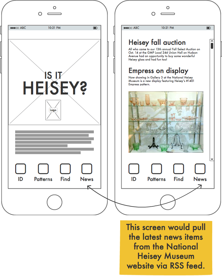
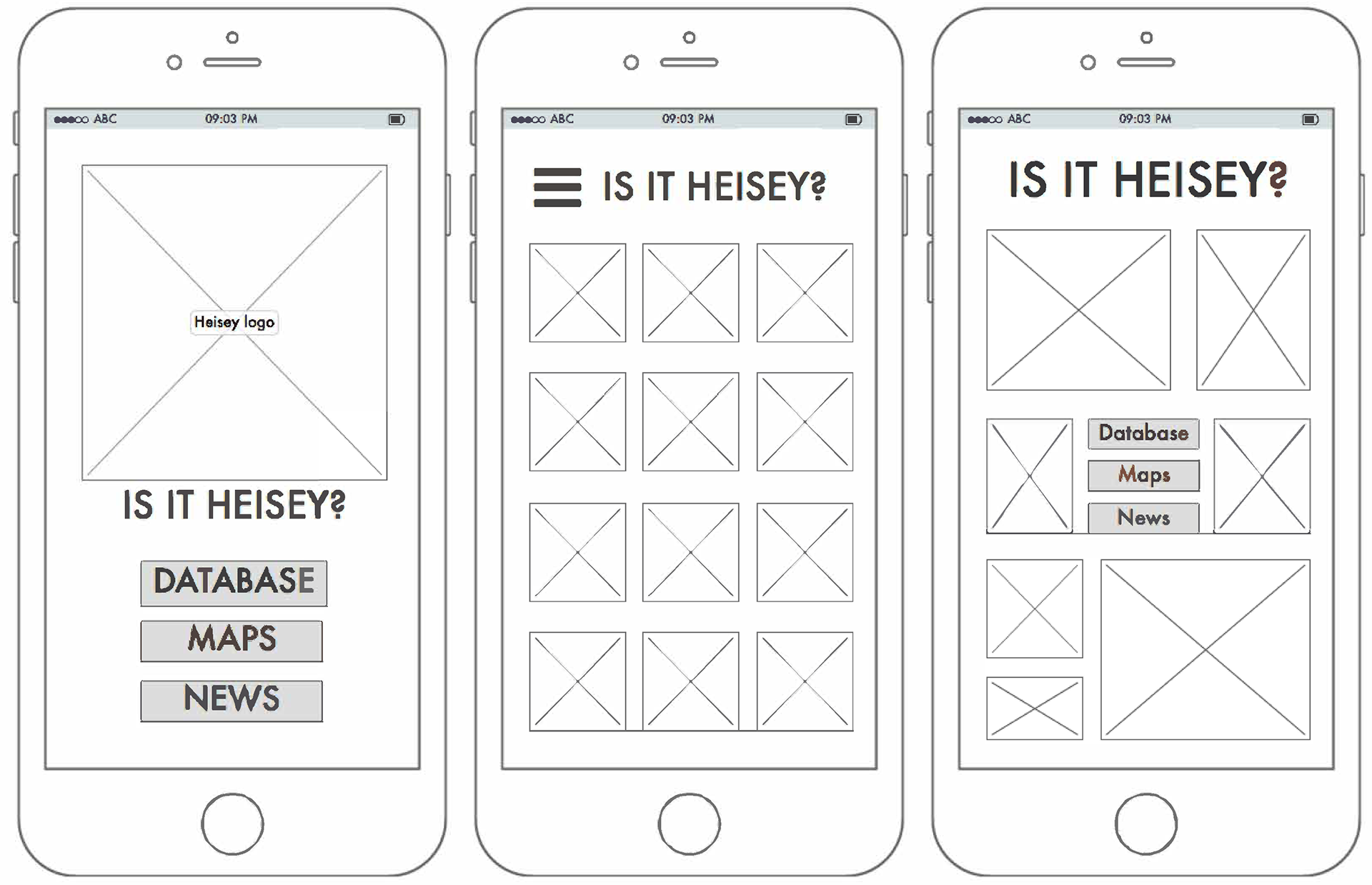
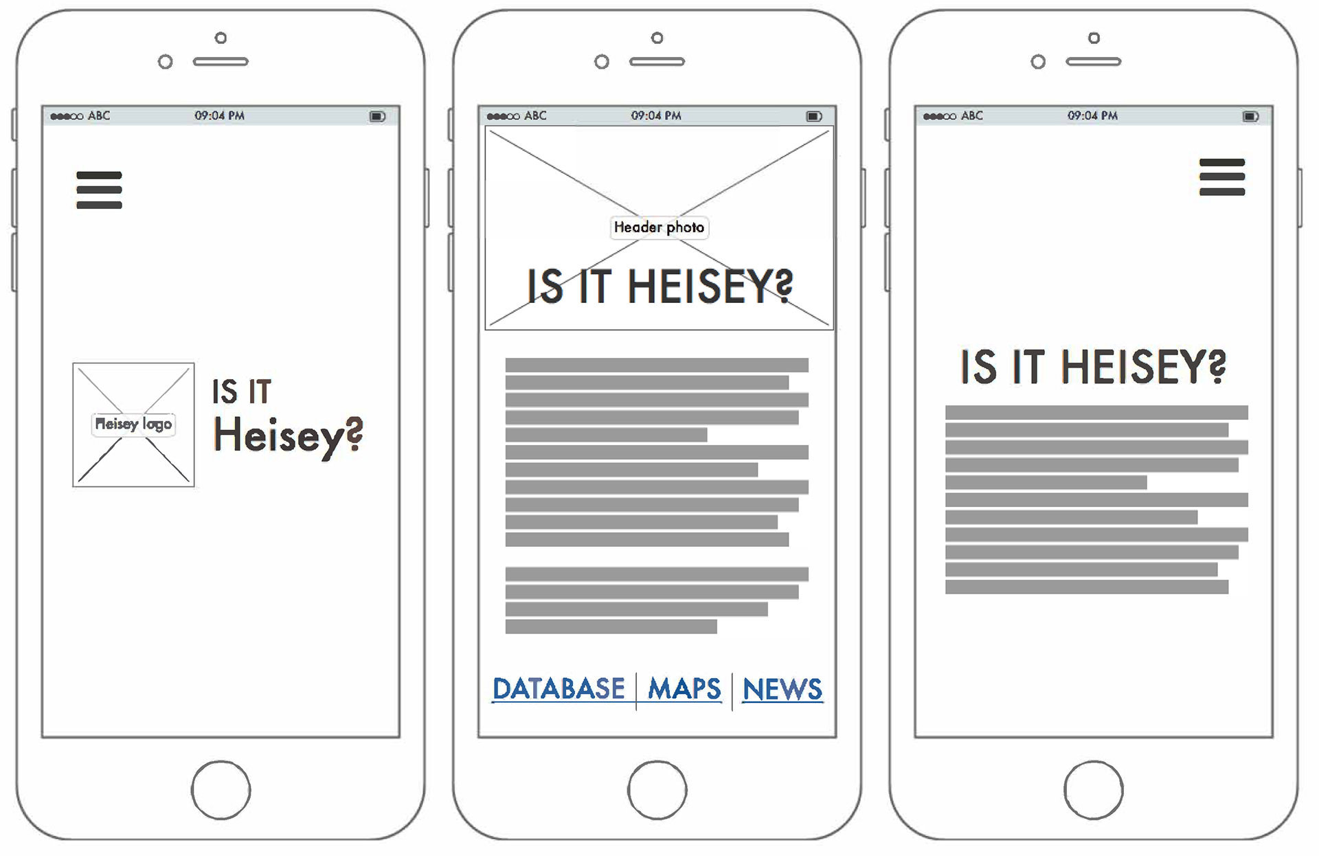
Several different home/splash page wireframe iterations completed in Balsamiq.
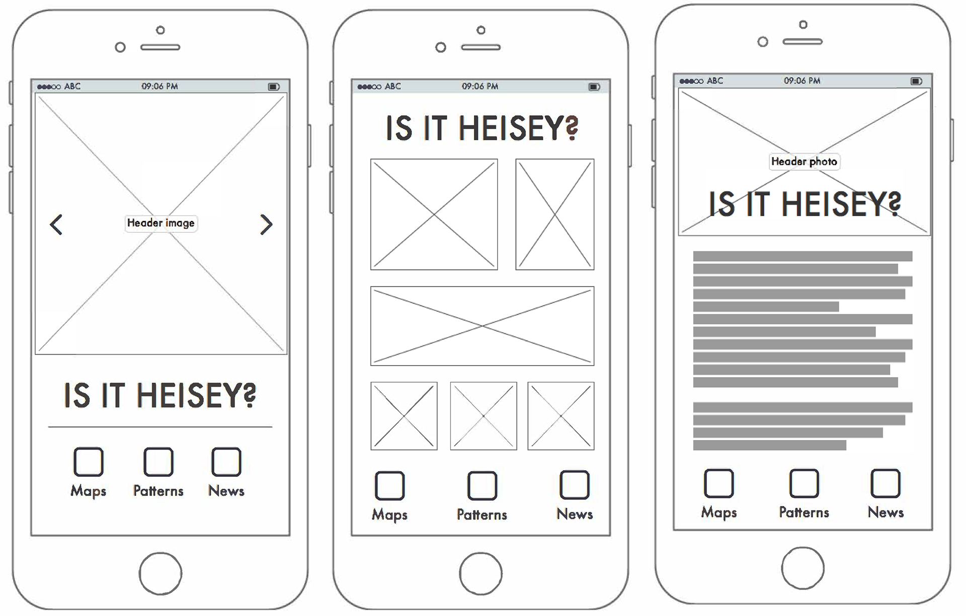
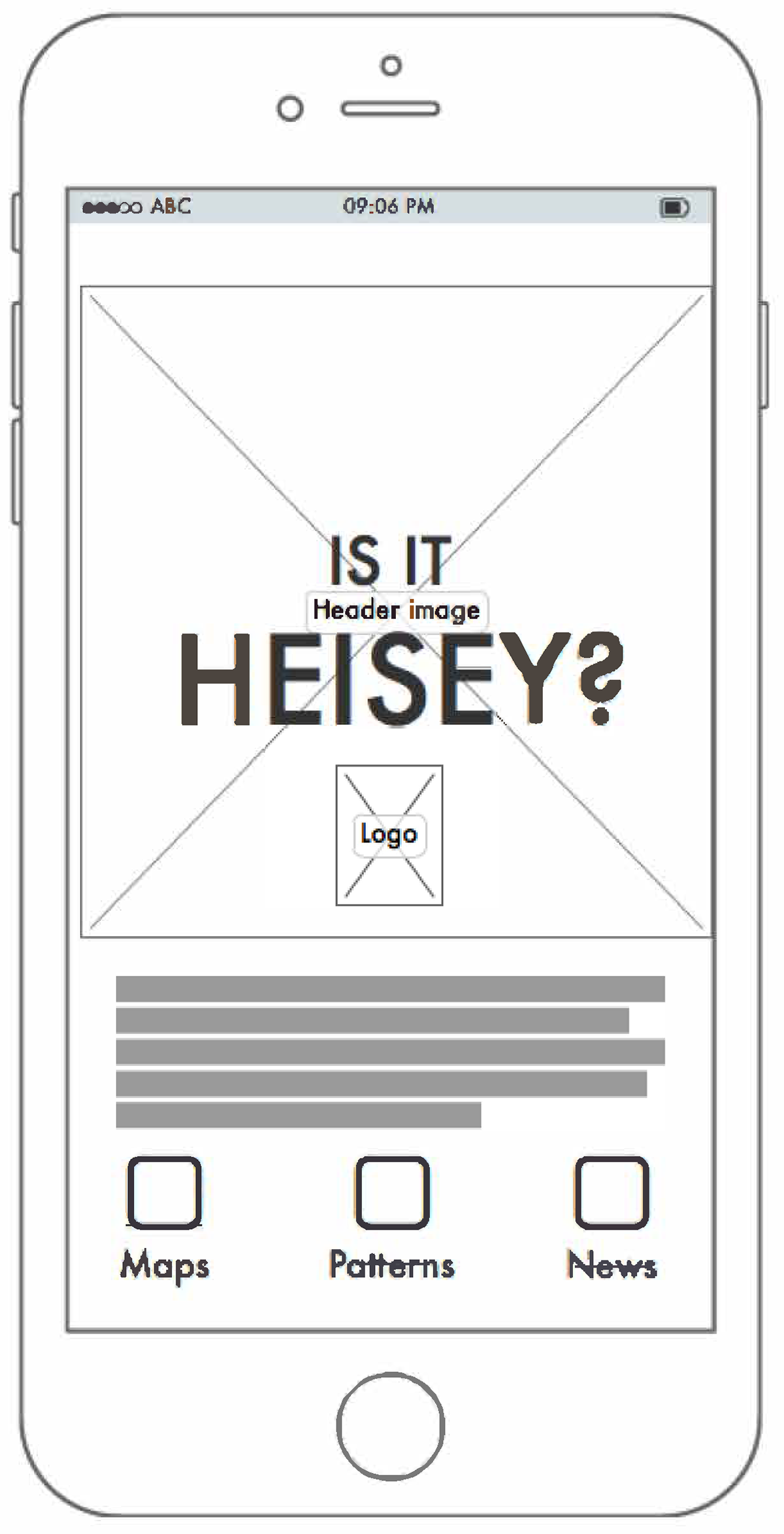
Second iteration of wireframe (or screen flow) examples completed in Balsamiq. This round focuses on going to the next layer of user interaction and is currently in progress.
