Bluestem Brands had a few retail sites that were going to be discontinued as part of their migration process to a new eCommerce/retail platform. Specific messaging would be needed on these sites to inform visitors about why the brand was being discontinued with the ability to link to other key content/functionality.
The UX team was asked to create a mockup to serve as a landing page template on all affected sites. The template would identify managed content area for marketing messages, as well as content needed by existing customers, such as URL redirects, information on order status, order history, credit card account details/payments, etc.
My role
I was the UX designer assigned to this task. Due to the high profile status of the project, I worked directly with the UX manager and various directors, senior directors, vice presidents and senior vice presidents in marketing, online branding, eCommence, site optimization, general counsel, etc. It was my job to help guide the design process and create design deliverables. The group met a few times over the course of a month to discuss the brand discontinuation transition plan, customer engagement and overall template.
Research (Discovery)
I hit the ground running on this project with a lot of enthusiasm (it was my second day and I didn’t have all of my design software yet) and got started by reviewing the brand and its sister sites to see how they were structured. It was important to get a feel for this brand set as this template would be used for other discontinued brands.
Analysis (Ideation)
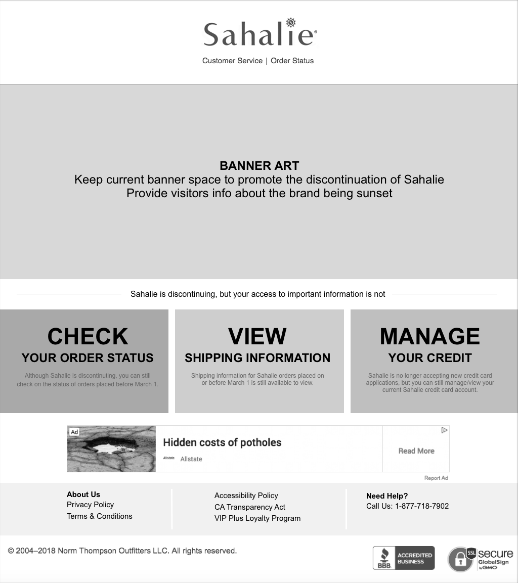
The primary objective of this project was organizing the information for the user and it turned out to be an excellent information architecture exercise. My main job was to think about the most important info users need to see on this page. What kinds of questions would I have as a user if I wasn’t aware that this brand was being discontinued? How will I access my order history? How can I check on an order I placed recently? What about payments for the brand’s store credit card? With this in mind, I made several design iterations.
The UX team was asked to create a mockup to serve as a landing page template on all affected sites. The template would identify managed content area for marketing messages, as well as content needed by existing customers, such as URL redirects, information on order status, order history, credit card account details/payments, etc.
My role
I was the UX designer assigned to this task. Due to the high profile status of the project, I worked directly with the UX manager and various directors, senior directors, vice presidents and senior vice presidents in marketing, online branding, eCommence, site optimization, general counsel, etc. It was my job to help guide the design process and create design deliverables. The group met a few times over the course of a month to discuss the brand discontinuation transition plan, customer engagement and overall template.
Research (Discovery)
I hit the ground running on this project with a lot of enthusiasm (it was my second day and I didn’t have all of my design software yet) and got started by reviewing the brand and its sister sites to see how they were structured. It was important to get a feel for this brand set as this template would be used for other discontinued brands.
Analysis (Ideation)
The primary objective of this project was organizing the information for the user and it turned out to be an excellent information architecture exercise. My main job was to think about the most important info users need to see on this page. What kinds of questions would I have as a user if I wasn’t aware that this brand was being discontinued? How will I access my order history? How can I check on an order I placed recently? What about payments for the brand’s store credit card? With this in mind, I made several design iterations.
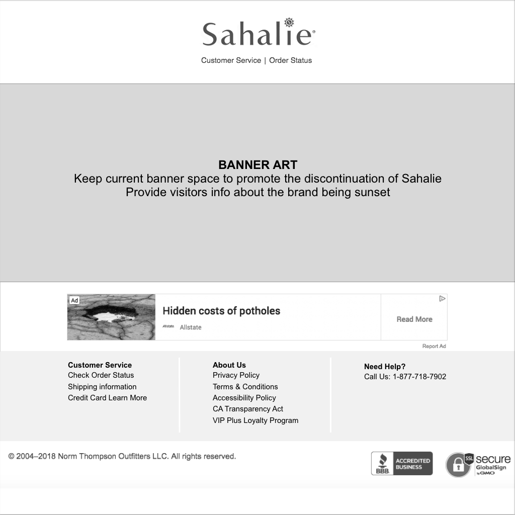
Early sketch of the feature.
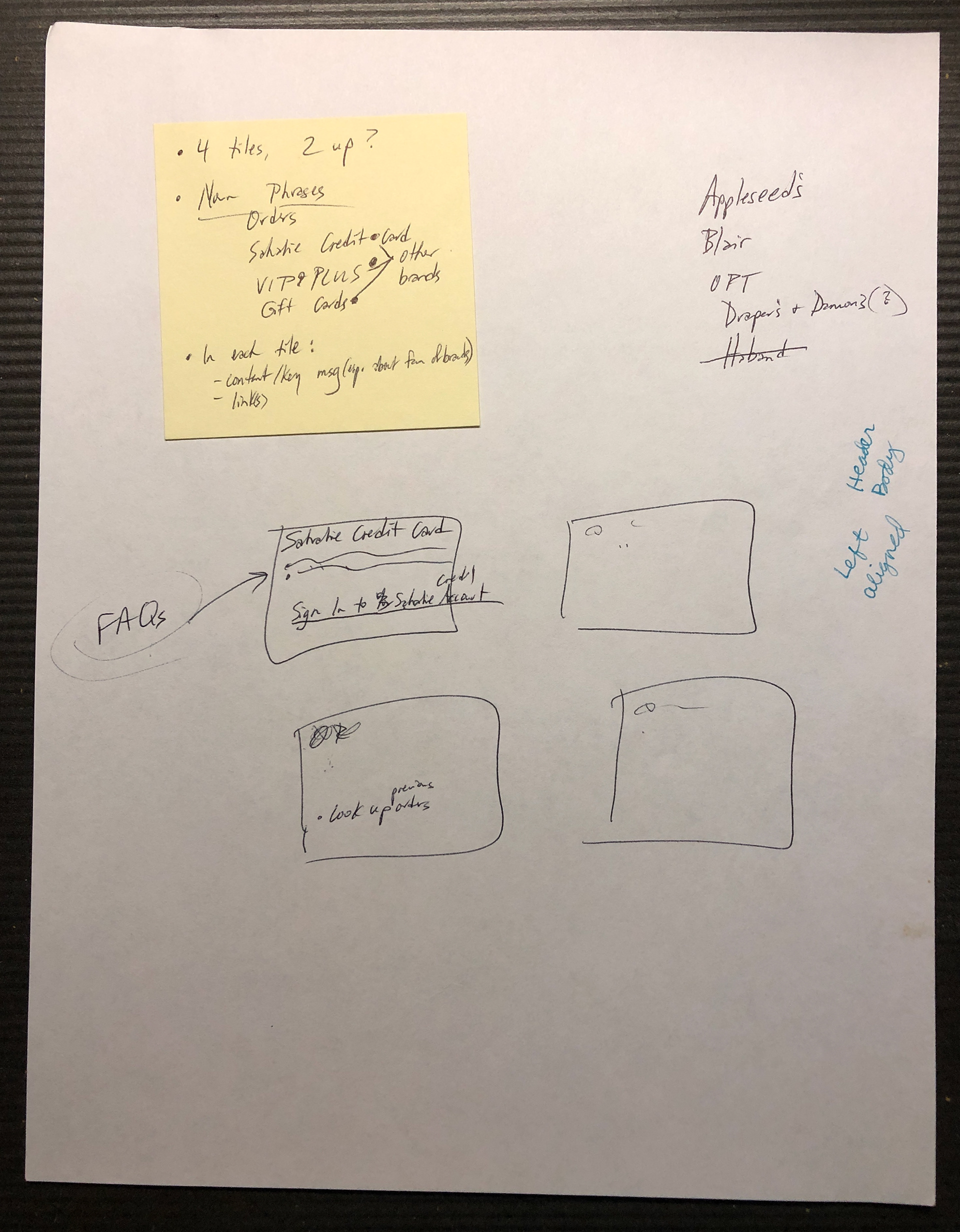
Sketch notes after a discussion on how to present information to users.
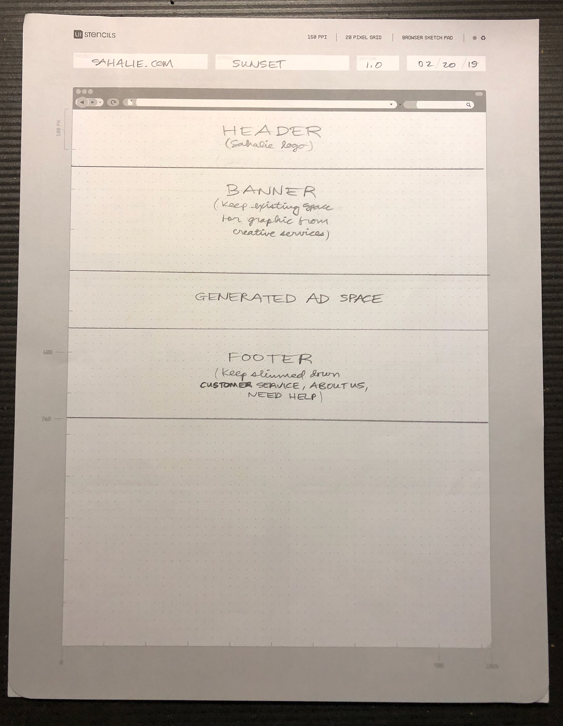
First wireframe iteration.
After some consideration, I decided on a block-style layout so that they appeared the same size.
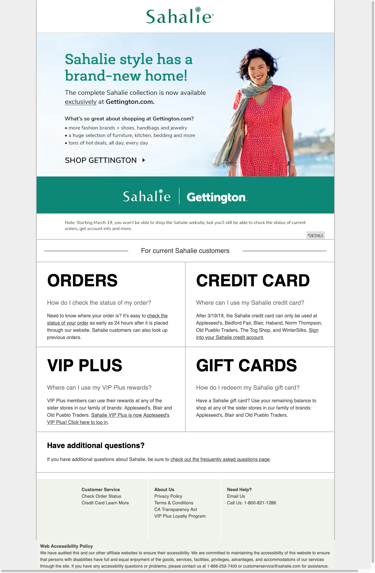
Four major help topics/frequently asked questions emerged and gradually, the design evolved into a block-style layout to prominently display the info. The wording of the help topics/instructional text was were I spent most of my time. It was important that links to the FAQ page were included in the instructional text. Coming from a visual design background where I had to do many roles (writing, photography, graphics, layout, etc.), it was weird to not have to worry about managed content (e.g. banners, ads) as the creative team would take care of it.
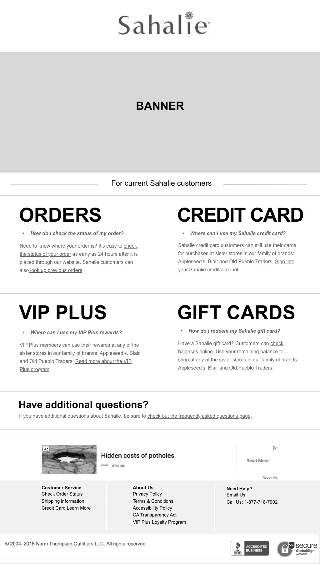
Design
The final outcome was a low-fidelity, block-based, black and white wireframe created in Sketch. It was a relatively quick turnaround from design to development, so that left the group with a good feeling. I was excited to be able to contribute so early on in my tenure. After the desktop version had been created, I put together a mobile wireframe with the same information.
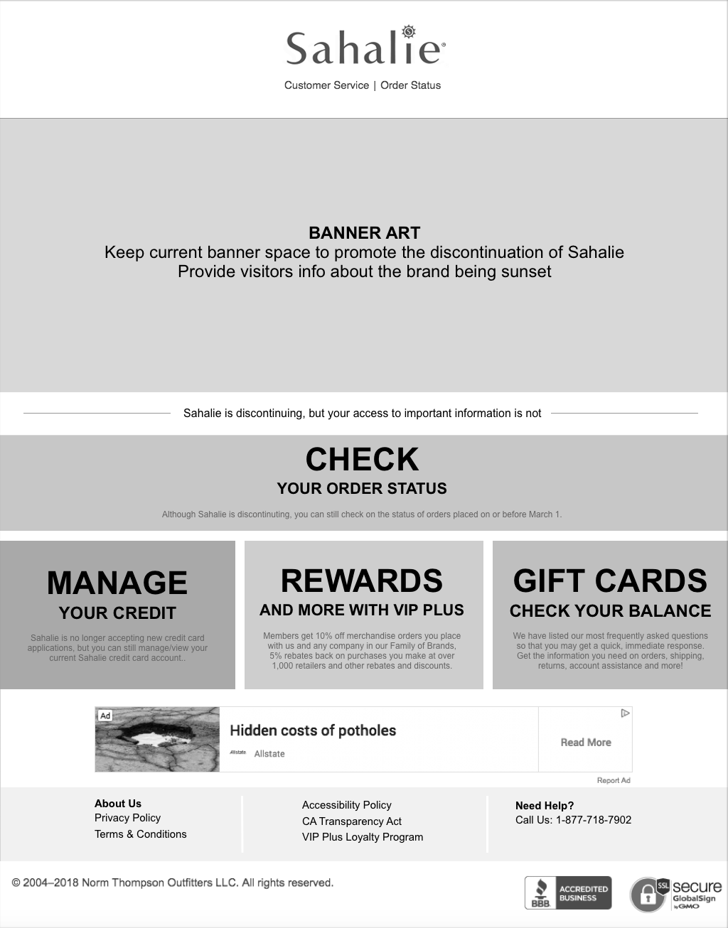
An additional help topic question was added to the mix.
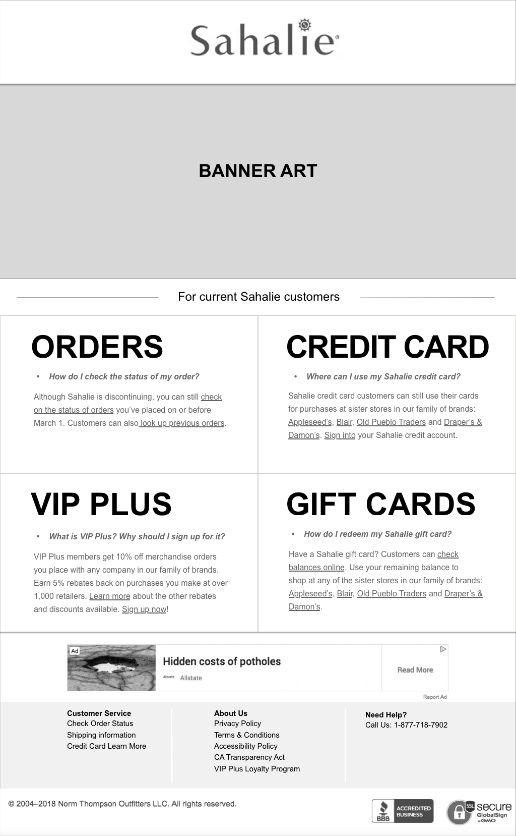
Further edits were made to the instructional text.
A link to the FAQ page was added in the final iteration.