


Roles: Graphic design, art direction, layout, branding, logos, logo design, photography. Tools: Adobe Illustrator, Adobe Photoshop.
A collection of logos designed by Courtney G. Markuson.
Logo created for the Northwoods Heisey Study Club, which is a non-profit, tax-exempt corporation dedicated to the education, preservation and encouragement of collecting fine handmade glassware produced by A.H. Heisey and Company from 1896 to 1957. The club consists mainly of members from the northern mid-west area (Minnesota and Wisconsin), hence the moniker "Northwoods." The row of pine trees pays respect to the original club logo (which featured pine trees). The logo also includes the national club logo as well as the year the Northwoods club started.
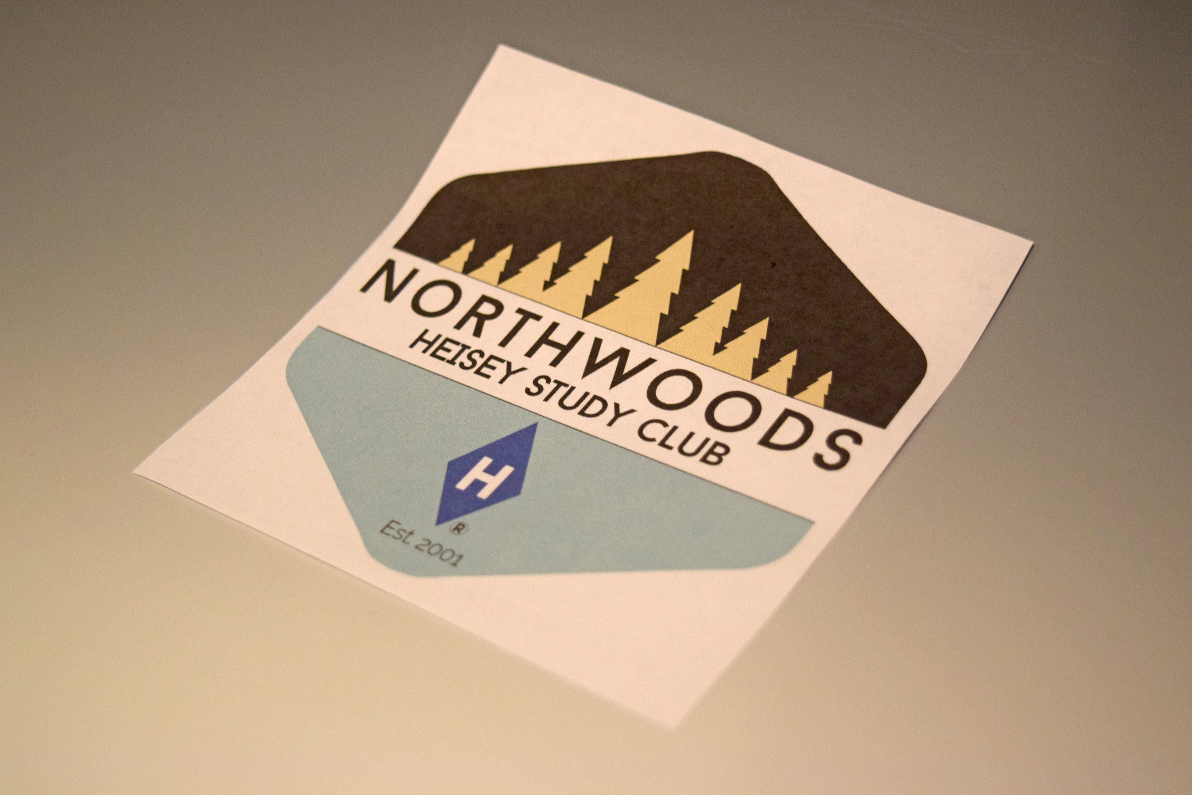
Northwoods Heisey Study Club logo.
Monogram logo for my professional endeavors [CGM]. The monogram is primarily golden brown with blue and gray accents when used on my letterhead, etc.
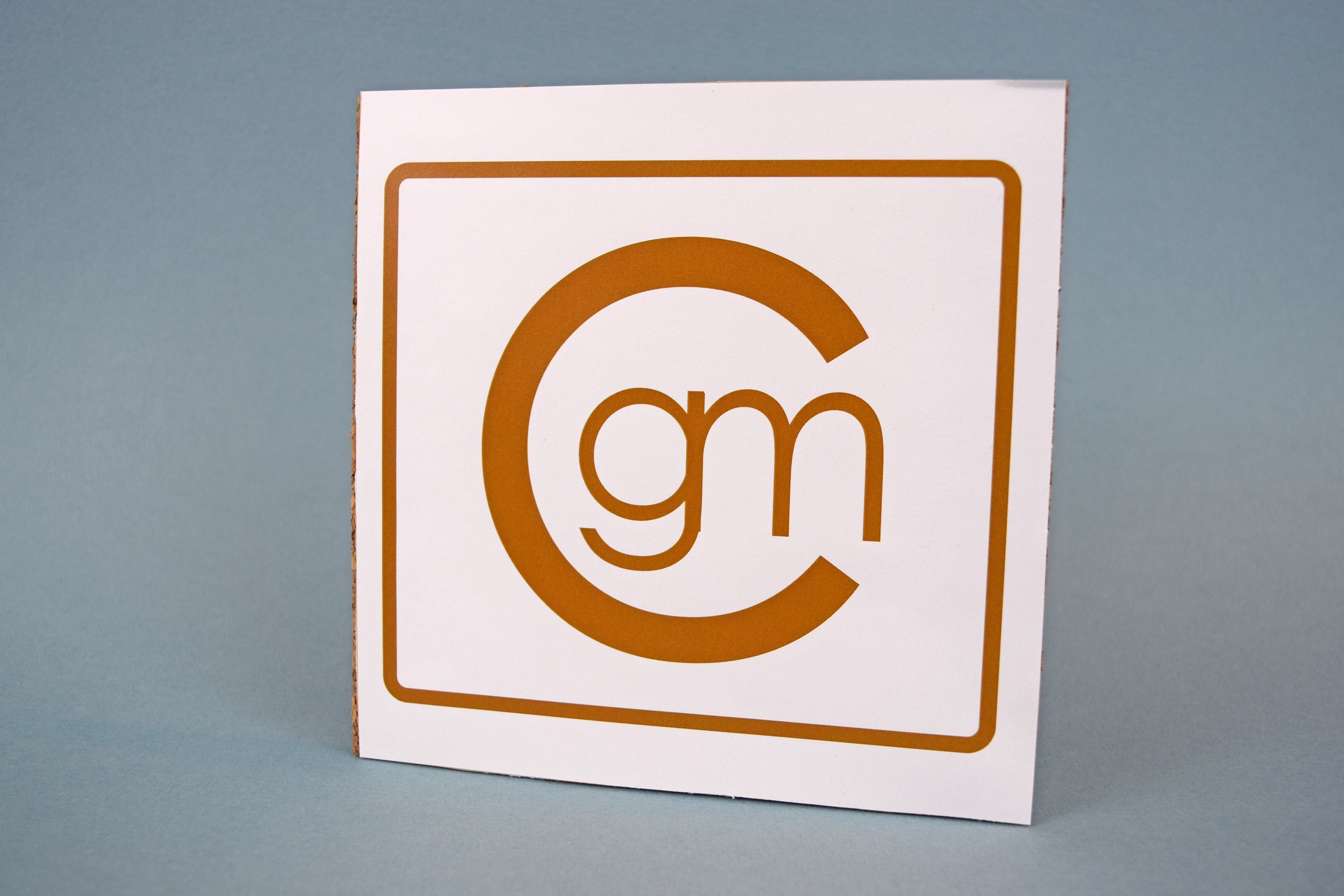
Personal logo.
Logo for the Sam Kuusisto Band, a local variety act that plays a mix of classic rock, country, R&B and more. Sam, the band leader, is a very structured, but also organic, musician. Chords and tasty guitar licks seem to flow out of him effortlessly, so I created a organic-styled logo to match. Sam has been known to cover old classics, so there's a hint of old fashioned lettering too.

Sam Kuusisto Band logo.
Logo for Pretty in Pink Guitar Duo, a local musical act. Pretty in Pink played an eclectic mix of acoustic, folk, country, rock and pop songs. To match their laid back style and seamless harmonies, I created a logo that attempts to look seamless. There aren't many details (like strings) in the outline of the main part of the logo (which is guitar), but it flows into the text nicely.
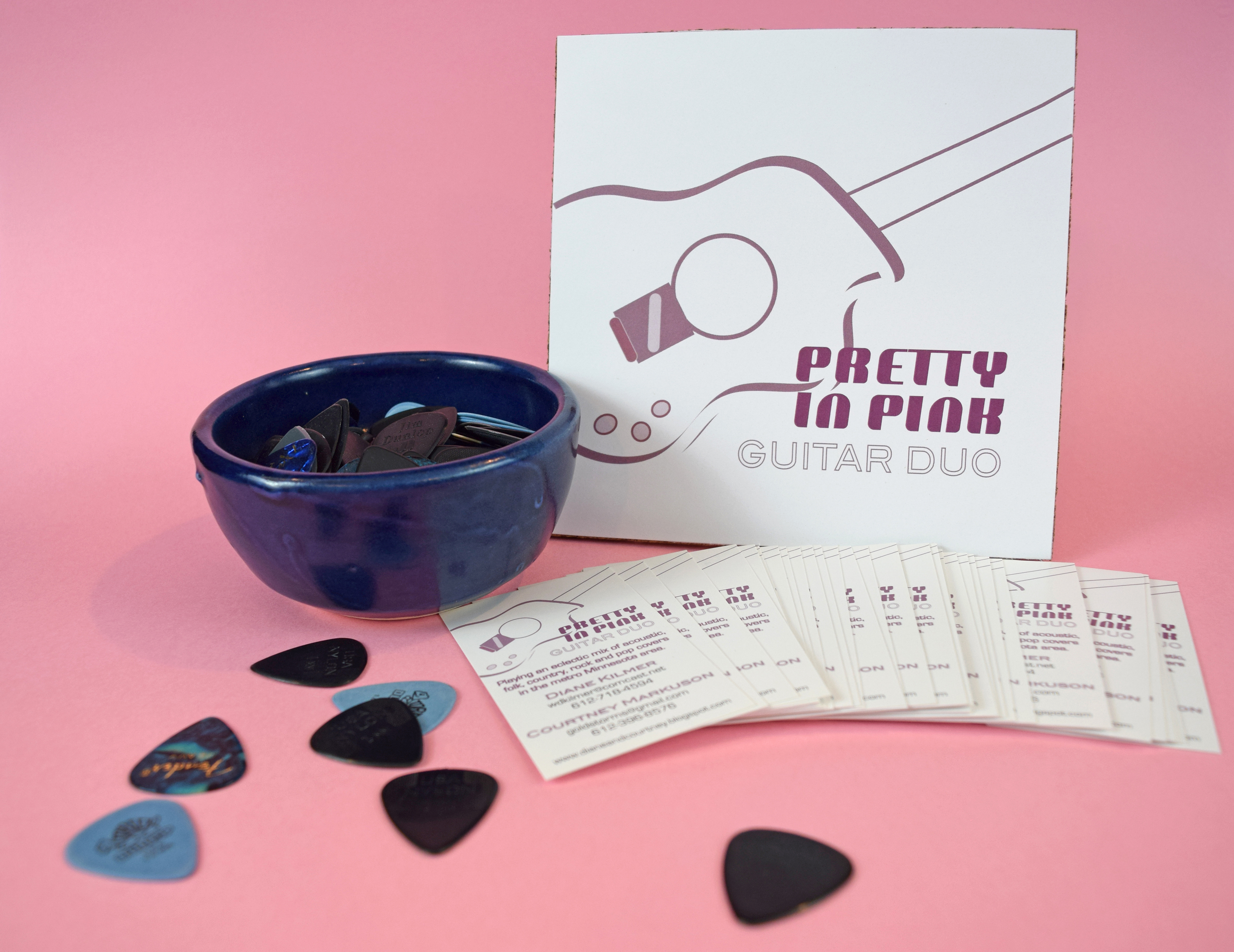
Pretty in Pink Guitar Duo logo.

Horizontal logo variation for Anoka-Hennepin Schools.
Organic logo for local lawn service [Lawns by Addison]. This logo utilizes the rich colors of fall to help keep prospective clients thinking about their lawns and how they plan to maintain them.
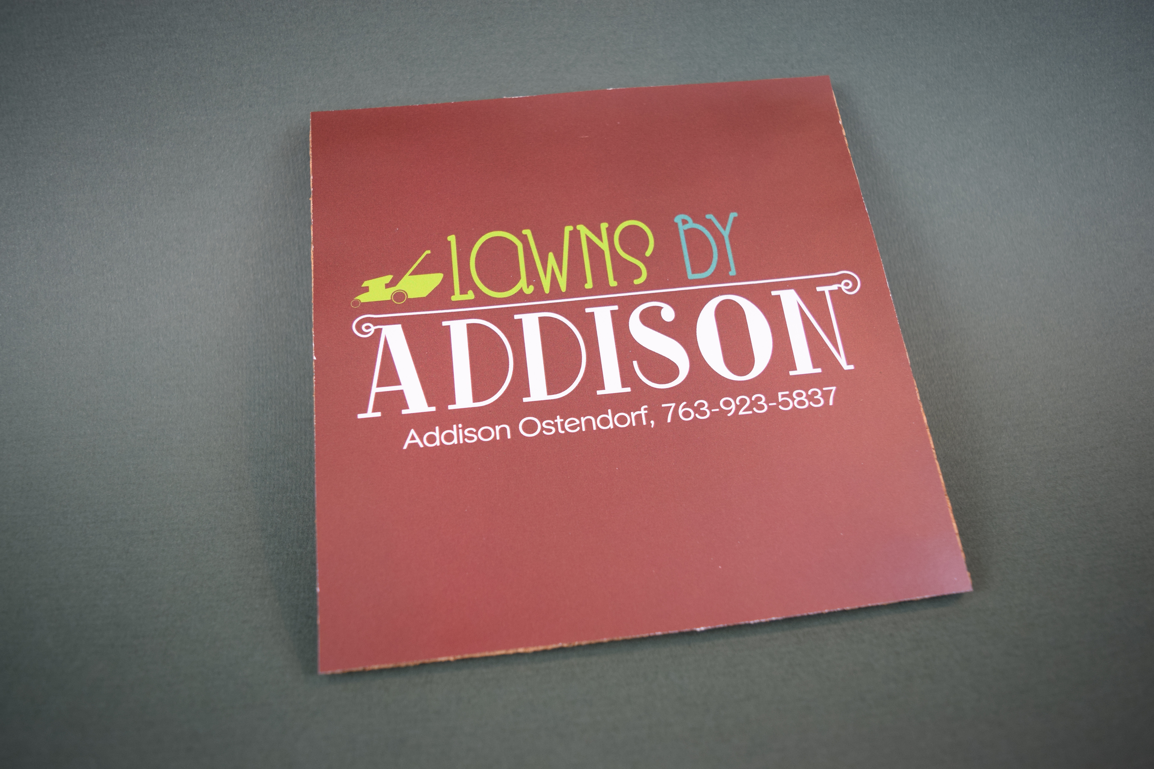
Organic logo for local lawn service [Lawns by Addison]. This logo utilizes the rich colors of fall to help keep prospective clients thinking about their lawns and how they plan to maintain them.
Practice logo for a fictional potato company in Idaho [Sun Valley Idaho Potatoes]. The outline of the sun smoothly flows into the mountains, creating an effect of continuity and togetherness.
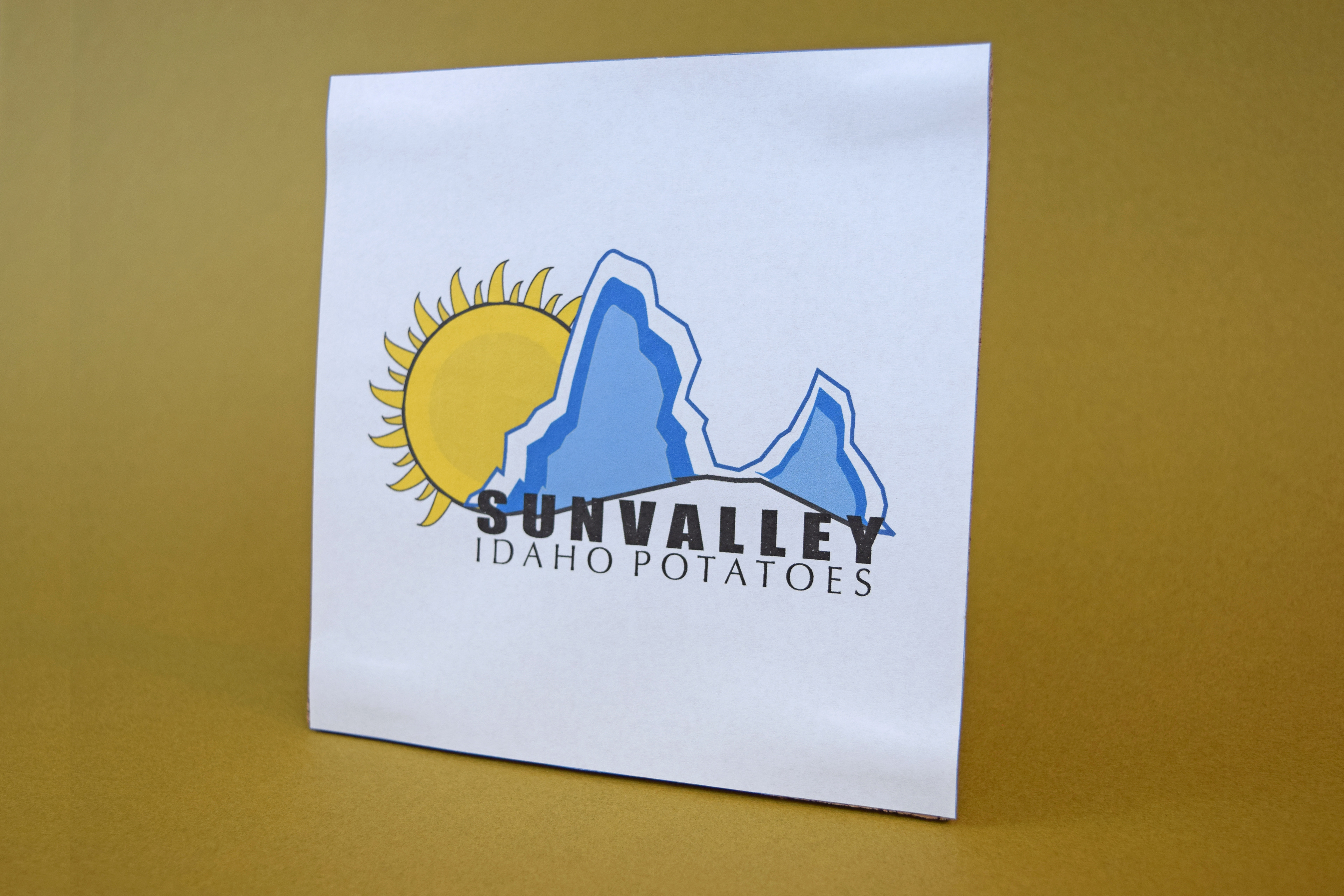
Sun Valley Idaho Potatoes logo.
Logo for a fictional company in California [Bay Street - Fremont's Finest Coffee House]. Because of the rich, diverse history of early California, I added some older looking accent lines to the top of the logo (like the old metal works you might see on an older building).
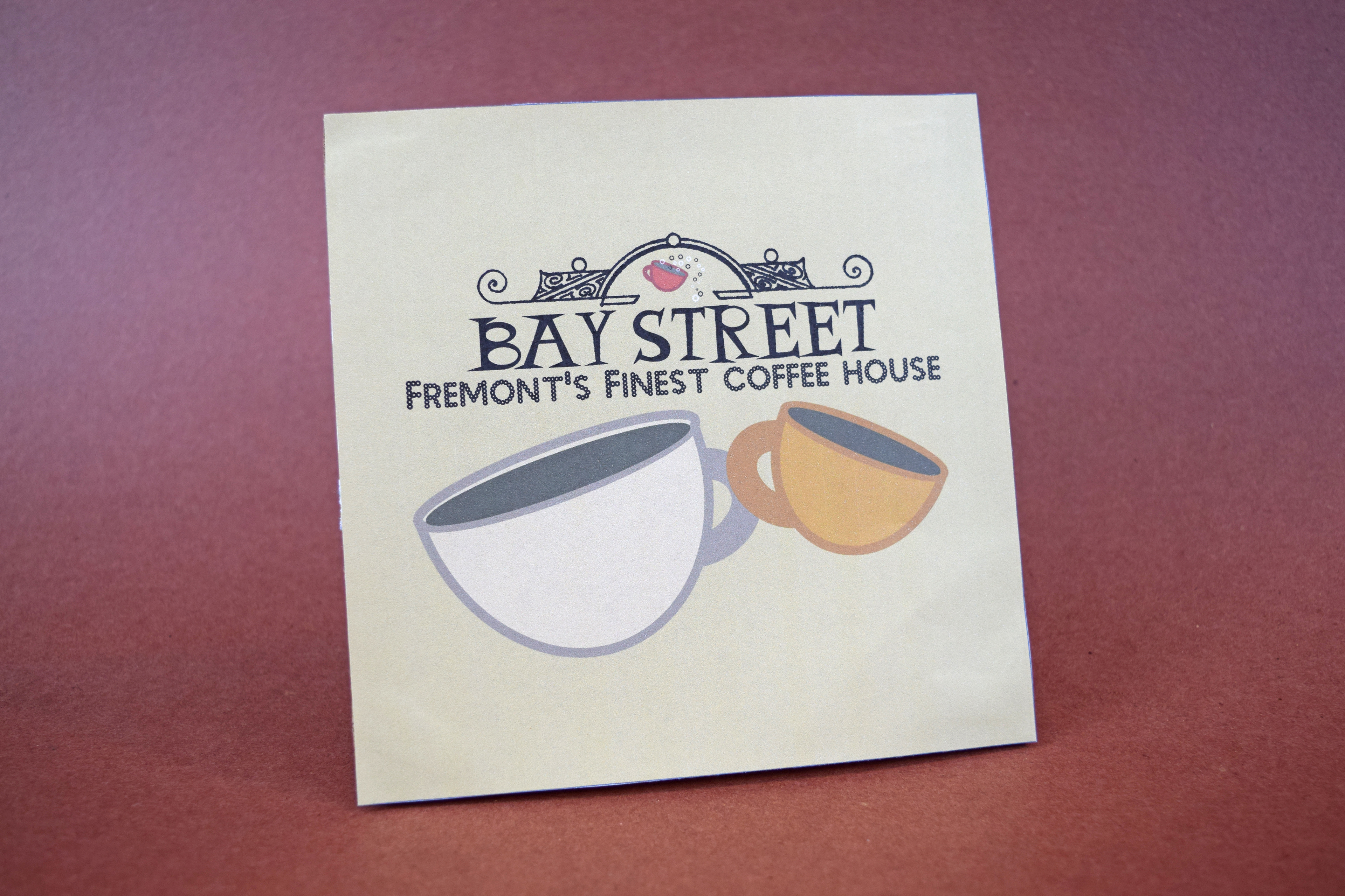
Bay Street Coffee House logo.
Logo for StepAhead Online High School, an Anoka-Hennepin School District school. The goal of this logo was to use current, designated fonts and really drive home the fact that it's an online school.
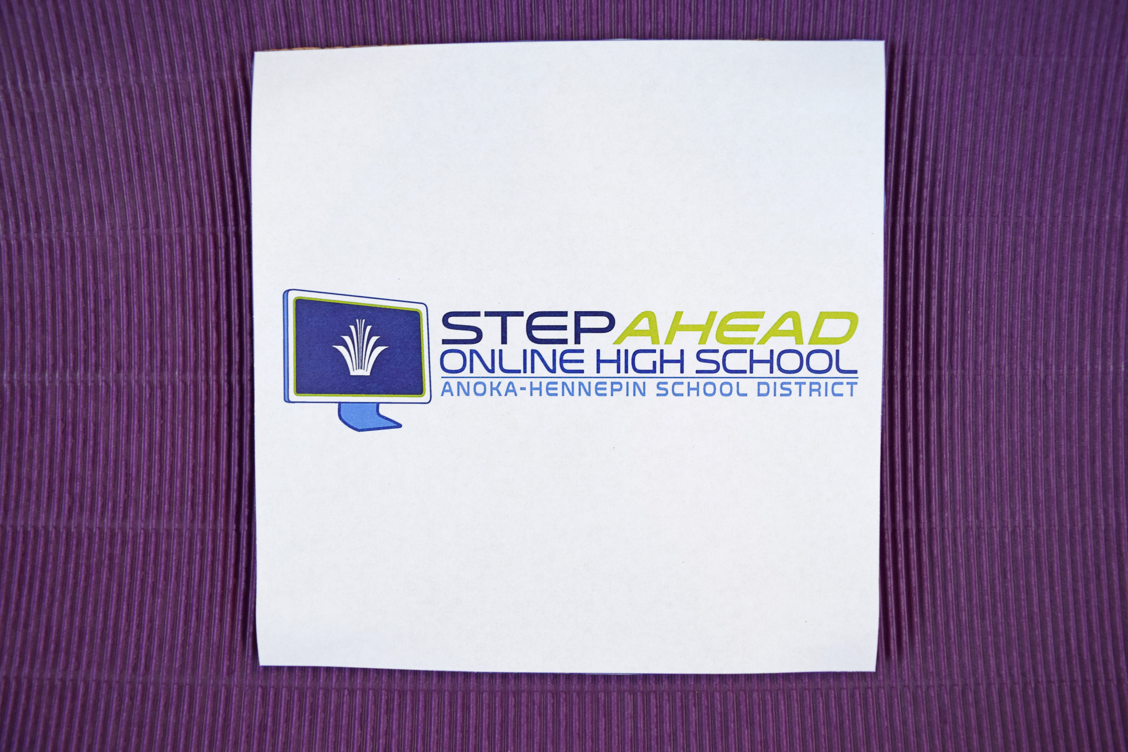
StepAhead Online High School logo.
Logo for So Connected Mental Strength Coaching and Personal Training. The goal of the logo was to create something that was interconnected and could be rearranged vertically/horizontally or stand alone with just the main identity (the letters S and C).
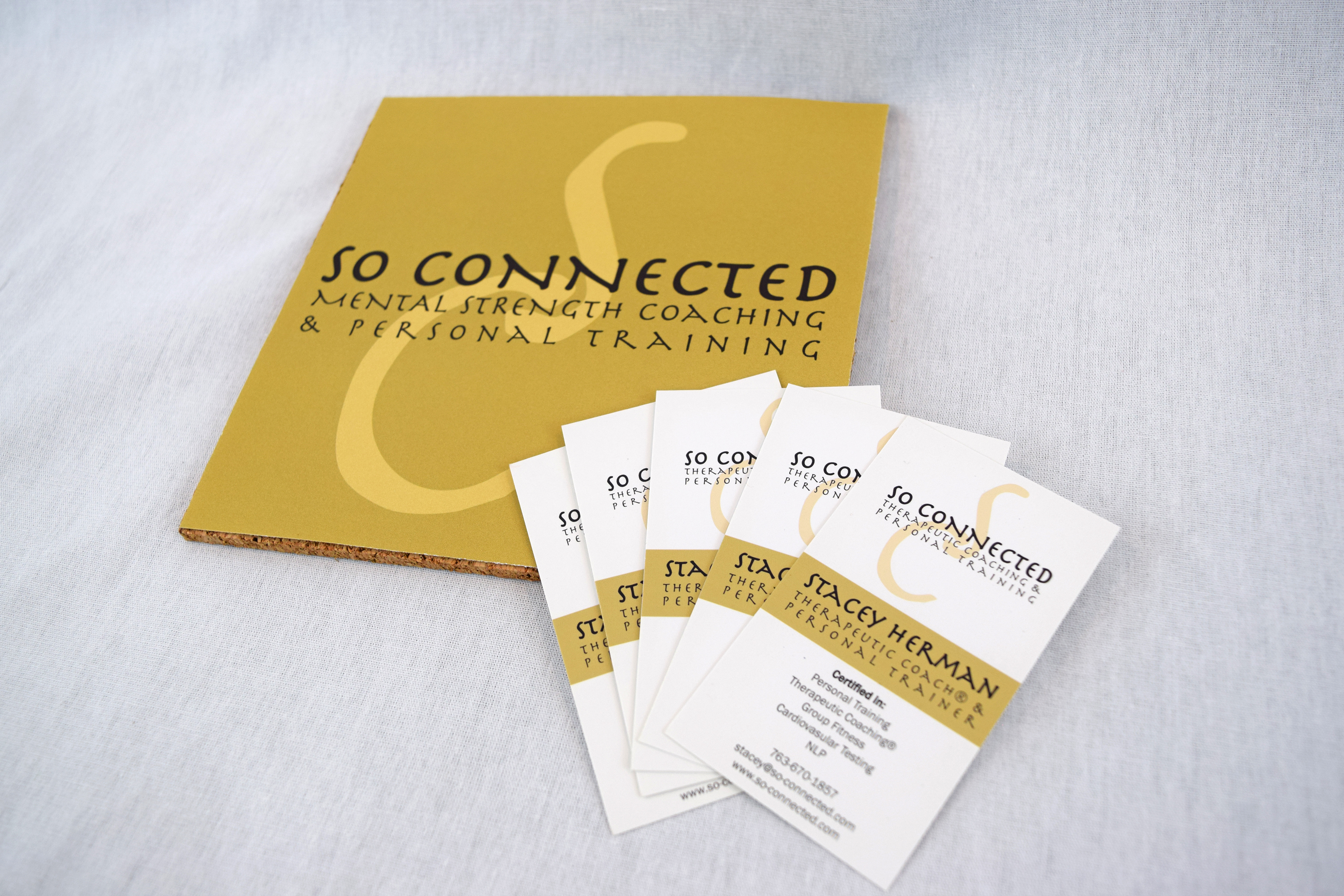
So Connected logo.
Logo for a local fundraiser [Kennedy's Crew]. The recipient was a 12-year-old girl who liked dolphins.

Kennedy's Crew logo.
Logo for Goldstorms Visual Communications, which is what I brand my freelance work under. When I was 15 years old, I decided to create a handle for myself to use online and eventually came up with goldstorms after two of my favorite Stevie Nicks songs (Gold Dust Woman and Storms). Ever since then, it's been part of my online identity.

Goldstorms Visual Communications logo.
Logo for AHlert, the district's emergency alert systems for parents/guardians. The name is a take on the district's initials (AH) and the word alert. Put them together and you have ah-lert, or AHlert. This logo came about from a sketch I did to provide direction for the print shop to complete.
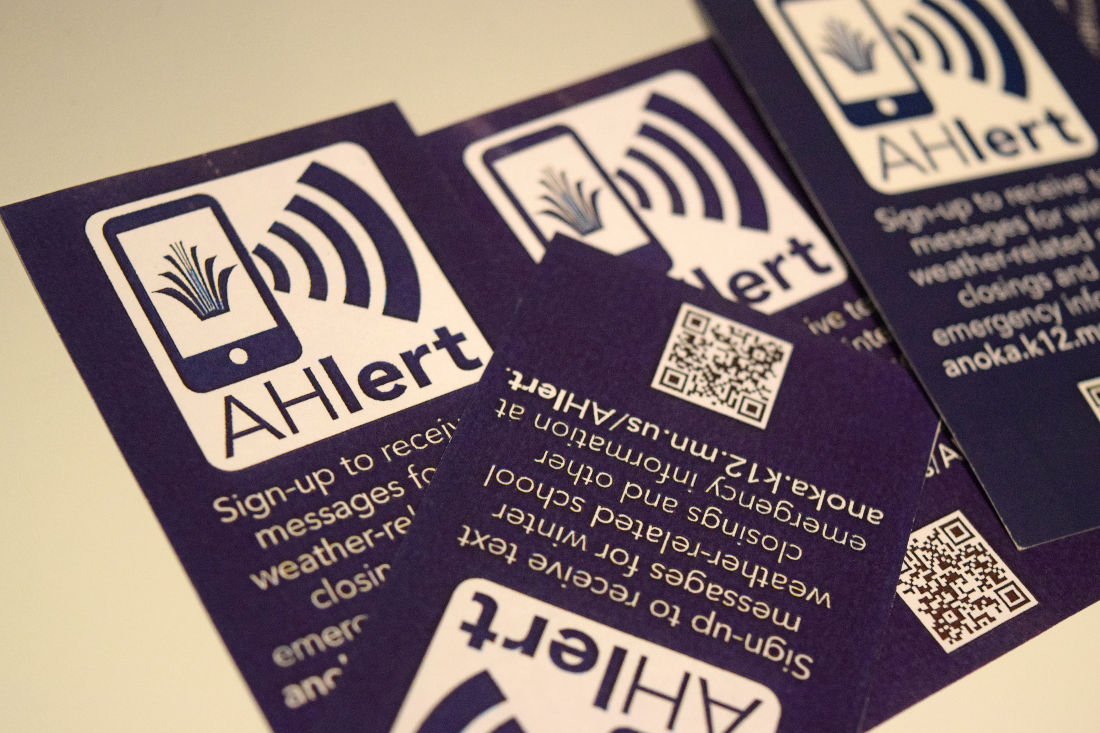
AHlert notification system logo.
Logo for the district's student information system (e.g. grades) for parents/guardians. The district logo was incorporated into a lock and key icon as this is an access-controlled system.
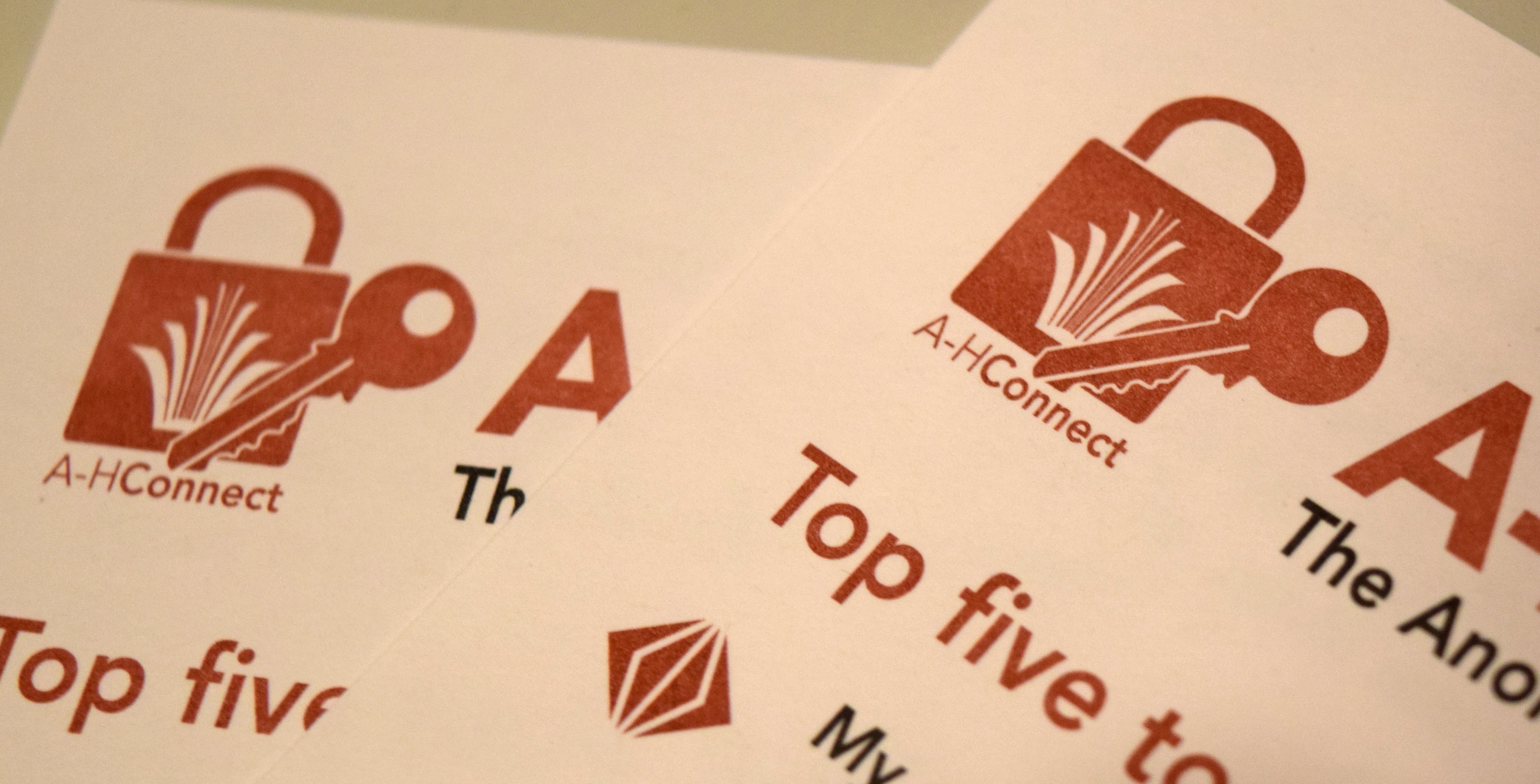
A-HConnect logo.