


Purpose
The eCommerce and product management team had added PayPal as a payment method to its Orchard brand sites and wanted to see how users were interacting with it. The UX team was asked to conduct some user research and then make design recommendations (i.e. Does anything need to be applied to the flow?).
Process
My role as a UX designer on this product was to review recorded user sessions (via SessionCam) of users interacting with PayPal, see how users are dealing with it, write a summary to present to the team and make design recommendations. I also conducted competitive research. The research I did was used by another UX designer to complete the project. I used different resources and tools to complete my work, including Sketch (wireframe), Axure (prototype), SessionCam (user research) and PayPal (payment tool).
My competitive analysis findings weren’t too outrageous - Many eCommerce/retail sites offer PayPal as a payment option during the checkout process. Typically, you can click on a “Checkout with PayPal” button and the merchant will then use your PayPal info to fill out the address, payment info, etc. versus using it as just a method of payment where the user still has to enter billing address info on the merchant’s site. I found a number of competitors where users can opt to use PayPal before entering any checkout info, which is always nice from a user’s perspective. Not surprising, a few sites did require the user to enter info, or, didn’t offer PayPal as an option.
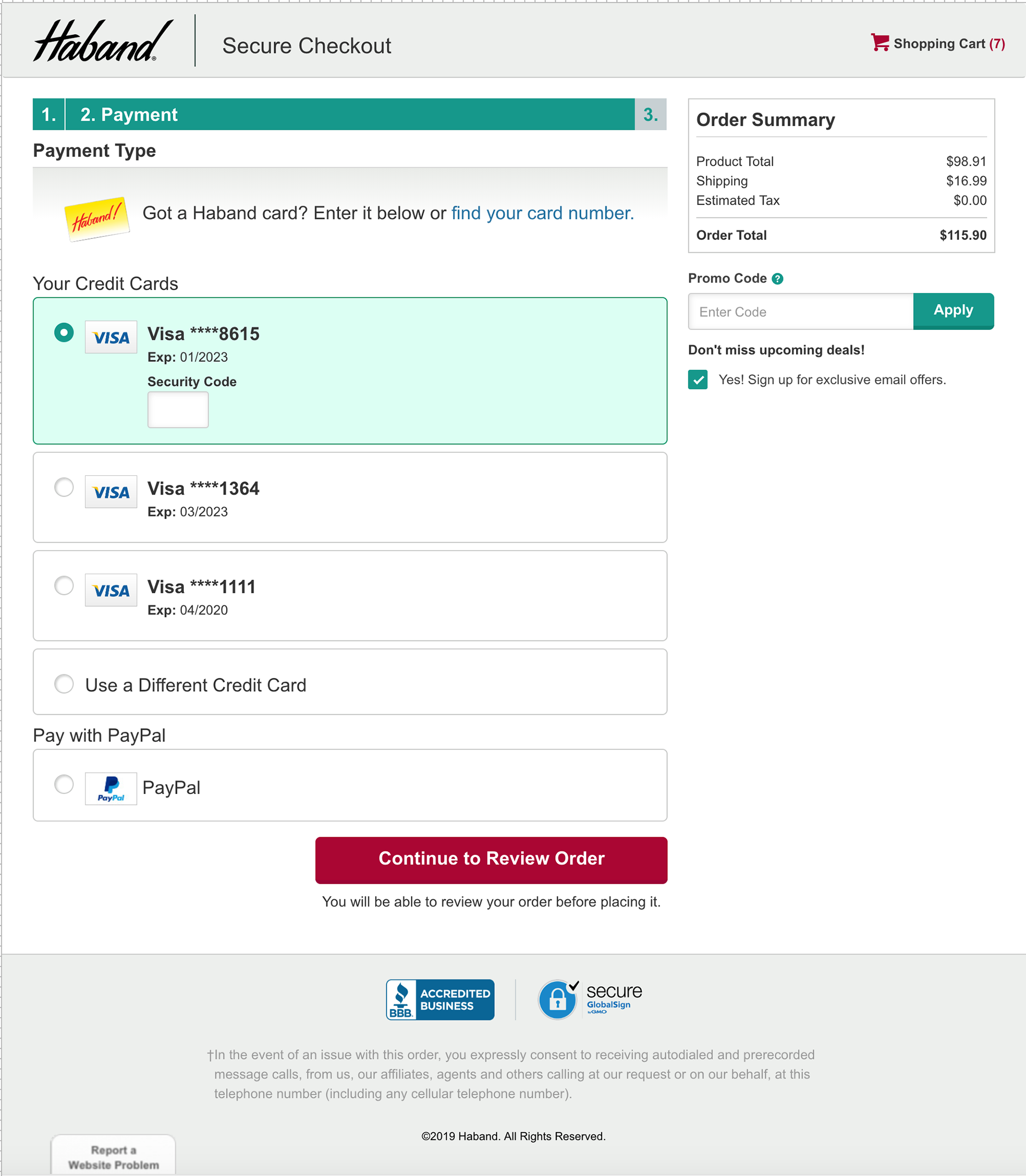
Current state of checkout, including the PayPal option.
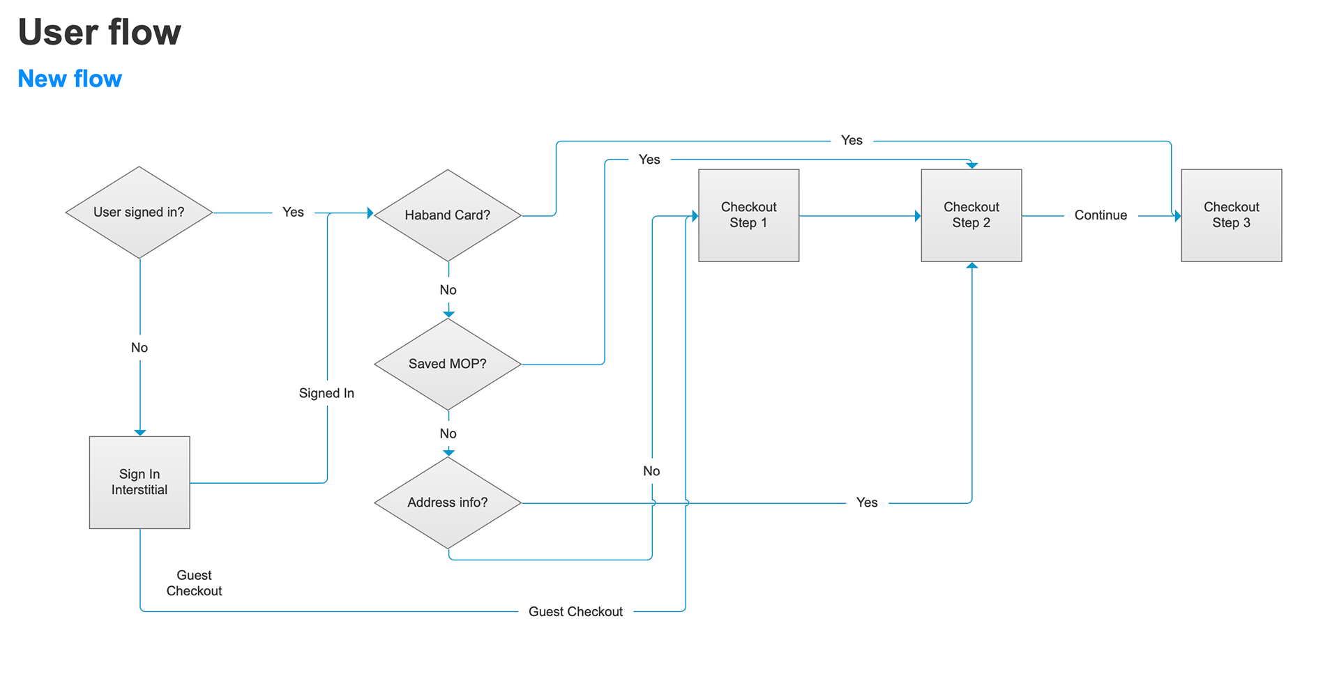
User flow created at the start of the project.
Reviewing almost 100 user sessions, I found the prognosis to be surprisingly good. About 66 percent of the users successfully checked out using PayPal, although some of them did run into small hiccups along the way. The time it took our site to make the initial connection to PayPal sometimes caused users to panic (in that they started clicking around to other stuff), which I found fascinating. Users also seemed to be confused by the error messages for PayPal (in that there was an error message displayed on our site, but the problem was on PayPal’s end). In a few cases, users got stuck in a loop of error messages and efforts to try PayPal again. Sometimes the session ended without them completing the transaction.
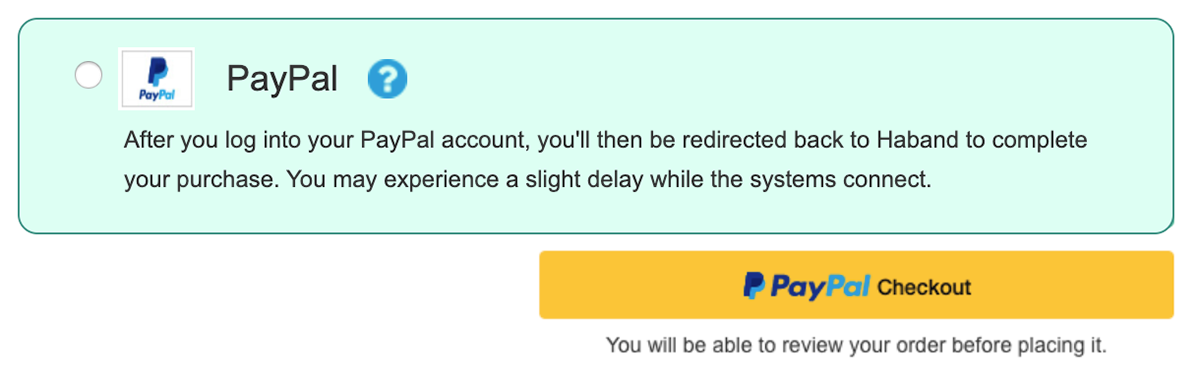
Because of the results I observed, I strongly felt that we needed to revise the instructional text that appears along with the PayPal button on our checkout page to indicate that it may take a few moments to connect. I recommended adding a help bubble icon (that links to PayPal’s learn more page) as well for users that may not be familiar with PayPal.
Additionally, I recommended clarifying the error messages that we had set up for PayPal to include more information for users.
Design recommendation (in old site style).
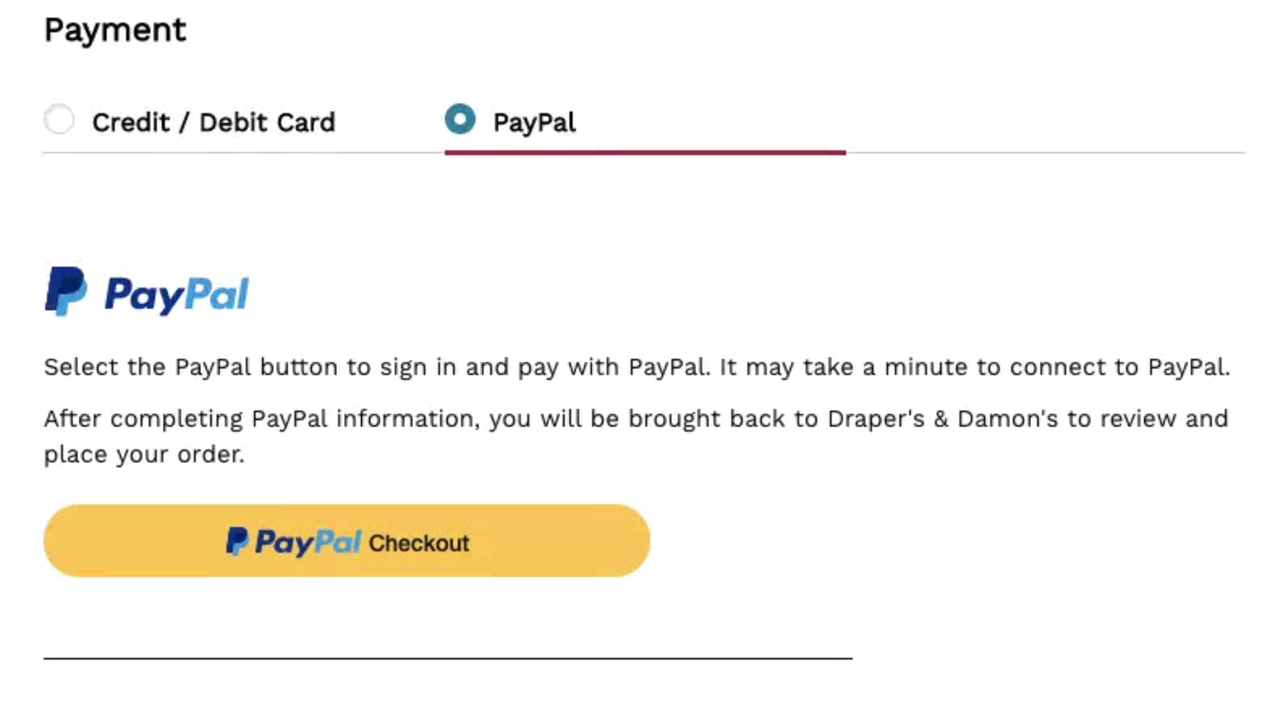
Final design (to be used on multiple sites).
Conclusion
I thoroughly enjoyed the UX research role I got to play for this project. Having data to be able to back up your design recommendations is always important in getting any process right for the user!
I thoroughly enjoyed the UX research role I got to play for this project. Having data to be able to back up your design recommendations is always important in getting any process right for the user!
