


On the surface, this feature wasn’t overly complicated - design a tool that allows users to download a template, fill said template out with their own data (physician profiles) and then upload it back into the system. It would allow users to perform these tasks on their own, versus having to rely on the company’s client support team to do it for them. Along the way, we realized some technical limitations that required design changes, but we ultimately came up with a design that makes it clear to the user on what on-page actions are available (download template, import data) and what data won’t upload (duplicate or invalid entries).
My role and tools
The core team for this feature consisted of four subject matter experts (SME): feature owner (junior technical business analyst), designer (me), development and quality assurance. We met several times over the course of a month to prep the feature. As the design SME, it was my job to guide the design process and create design deliverables. I also assisted with writing user stories, user scenarios, use cases and acceptance criteria. I used different resources (Material Design guidelines) and tools to complete my work, including: pencil and paper, Adobe XD (wireframes, high-fidelity mockups), Adobe Illustrator (empty state graphics), Zeplin (design specifications) and PowerPoint (presentation). Additionally, the team used Azure DevOps (formerly Visual Studio Team Services) to manage the project.
Research (Discovery)
Prior to a group ideation/whiteboarding session, I sketched out some ideas on paper. Initially, I was envisioning reusing a grid system from another feature, but adding inline editing to it so users could easily see all of the physicians they had imported, make any necessary edits and show filtering options (merge, delete, export) for duplicate entries.
My role and tools
The core team for this feature consisted of four subject matter experts (SME): feature owner (junior technical business analyst), designer (me), development and quality assurance. We met several times over the course of a month to prep the feature. As the design SME, it was my job to guide the design process and create design deliverables. I also assisted with writing user stories, user scenarios, use cases and acceptance criteria. I used different resources (Material Design guidelines) and tools to complete my work, including: pencil and paper, Adobe XD (wireframes, high-fidelity mockups), Adobe Illustrator (empty state graphics), Zeplin (design specifications) and PowerPoint (presentation). Additionally, the team used Azure DevOps (formerly Visual Studio Team Services) to manage the project.
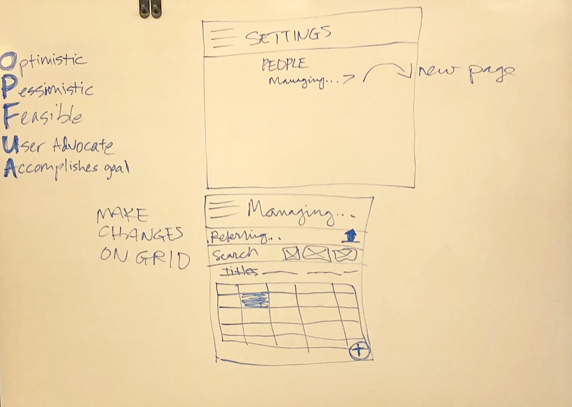
Research (Discovery)
Prior to a group ideation/whiteboarding session, I sketched out some ideas on paper. Initially, I was envisioning reusing a grid system from another feature, but adding inline editing to it so users could easily see all of the physicians they had imported, make any necessary edits and show filtering options (merge, delete, export) for duplicate entries.
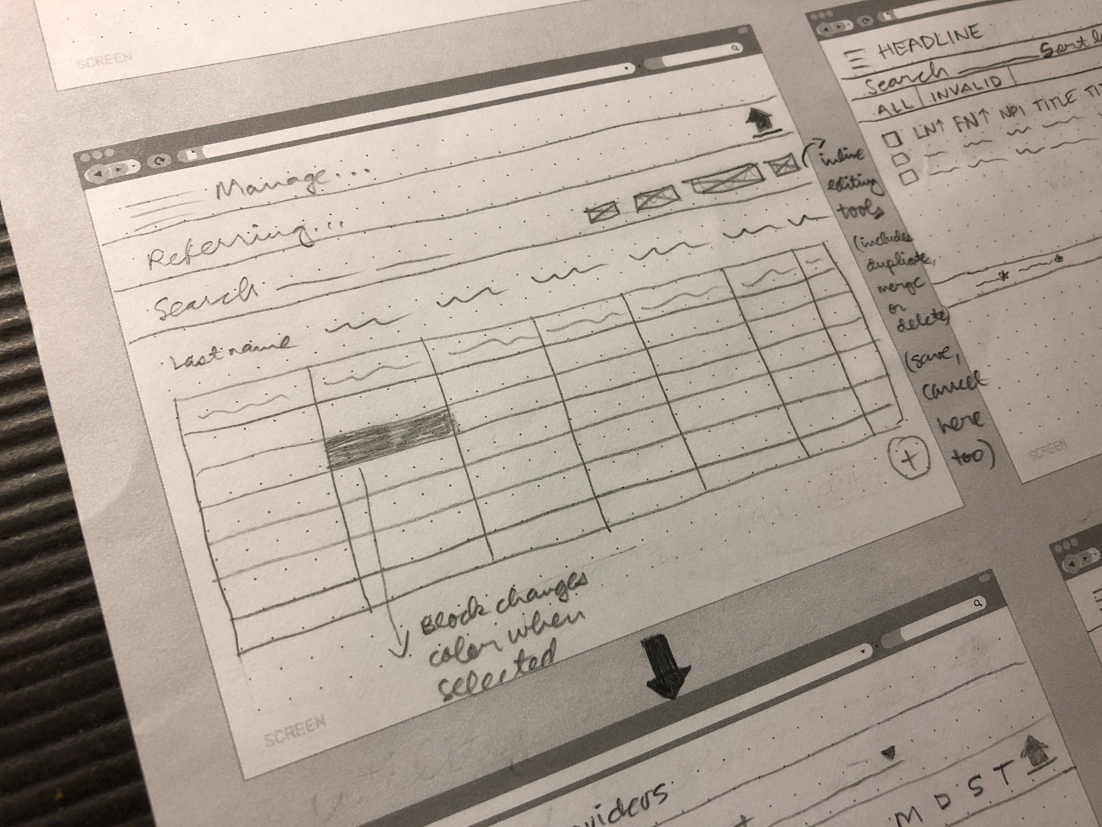
Early sketch of the provider import feature.
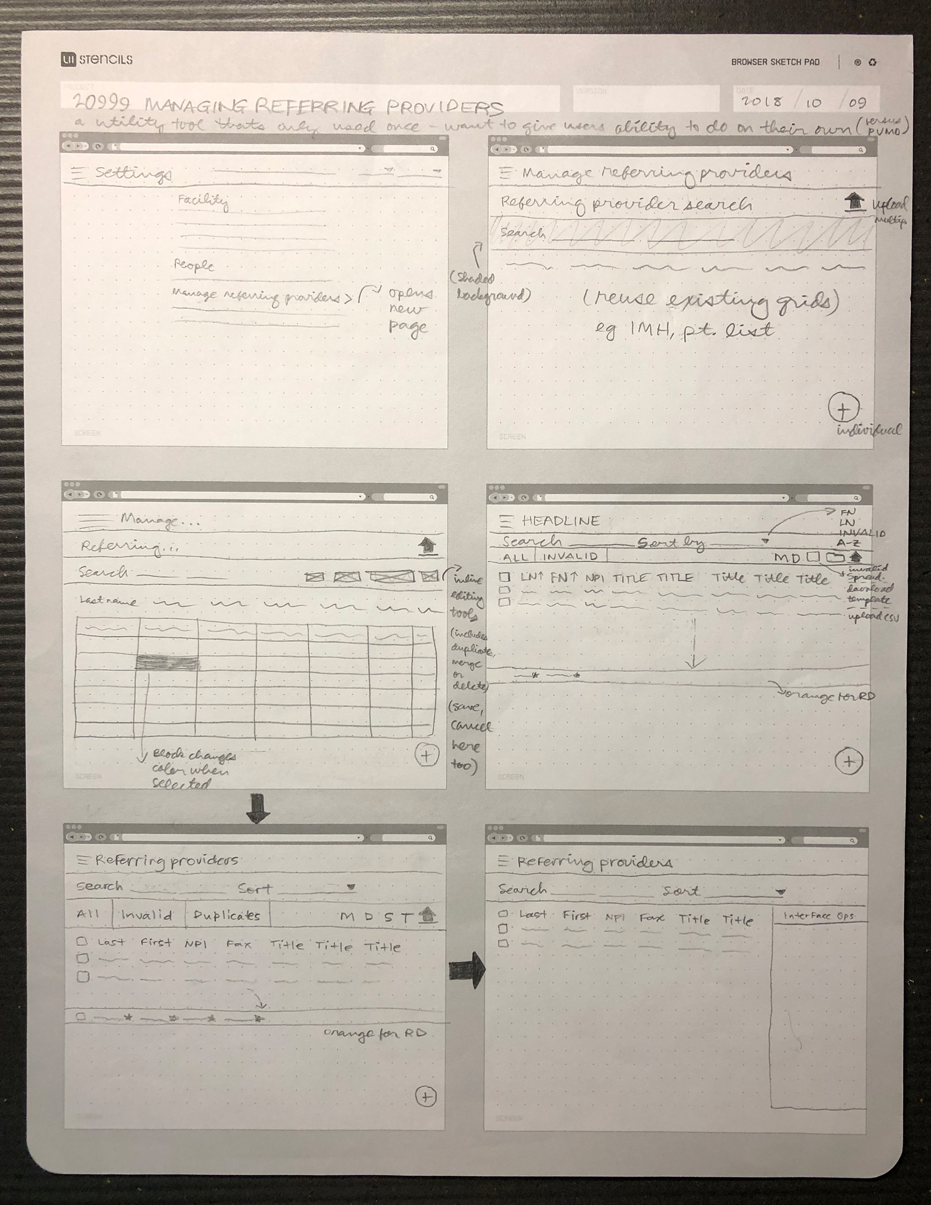
Collection of early sketches.
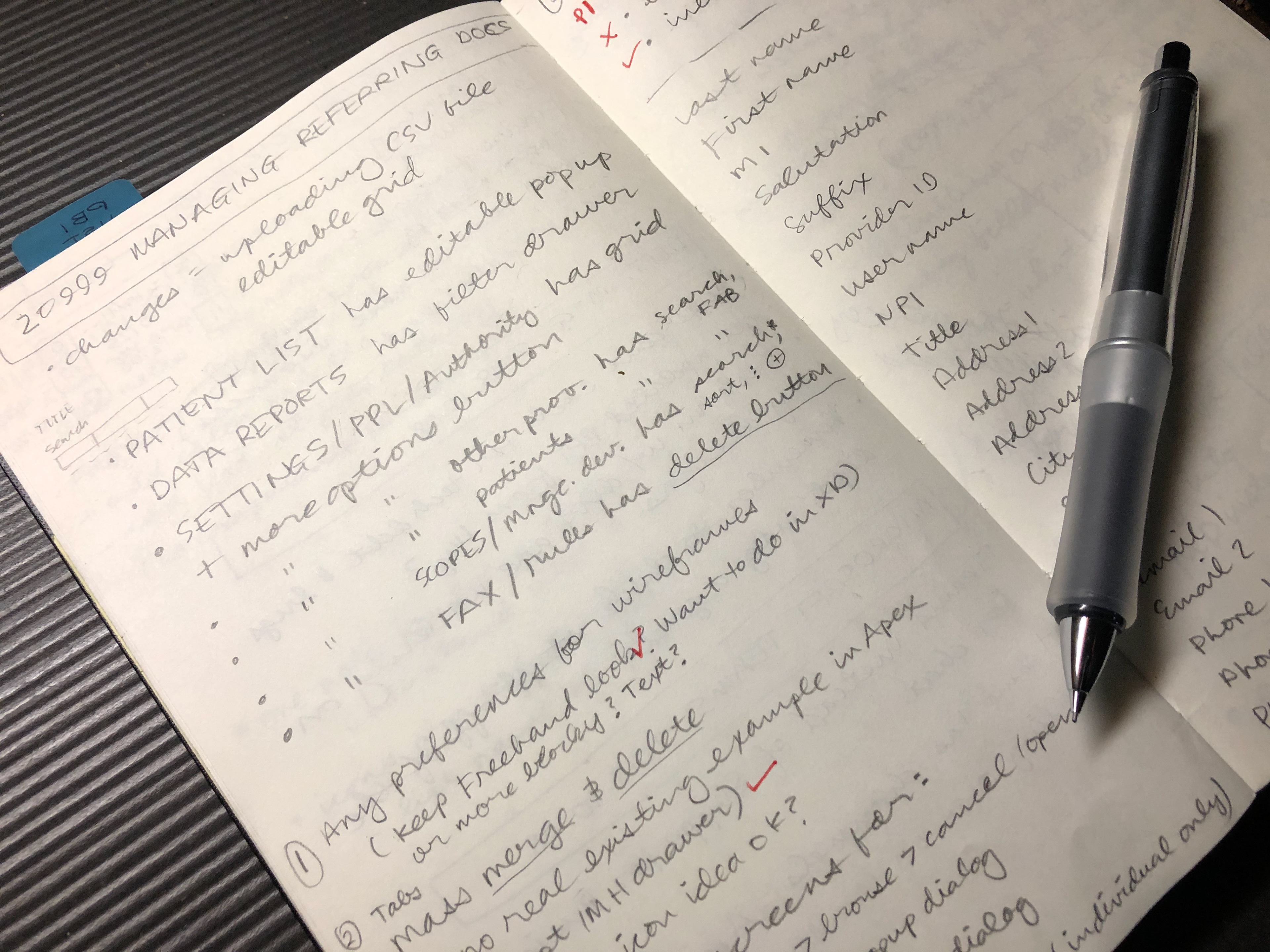
Set of notes taken early in the design process.
Analysis (Ideation)
During the ideation/whiteboarding session (which included input from developers, client services, technical services and medical content), the group decided against the inline editing idea as it wasn’t feasible for development. A great idea that came out of the session was to merge the import feature with an existing page that allows users to search for providers. This would save us a page and allow the team to utilize existing components, such as a floating action button (FAB), drawer and grid).
During the ideation/whiteboarding session (which included input from developers, client services, technical services and medical content), the group decided against the inline editing idea as it wasn’t feasible for development. A great idea that came out of the session was to merge the import feature with an existing page that allows users to search for providers. This would save us a page and allow the team to utilize existing components, such as a floating action button (FAB), drawer and grid).
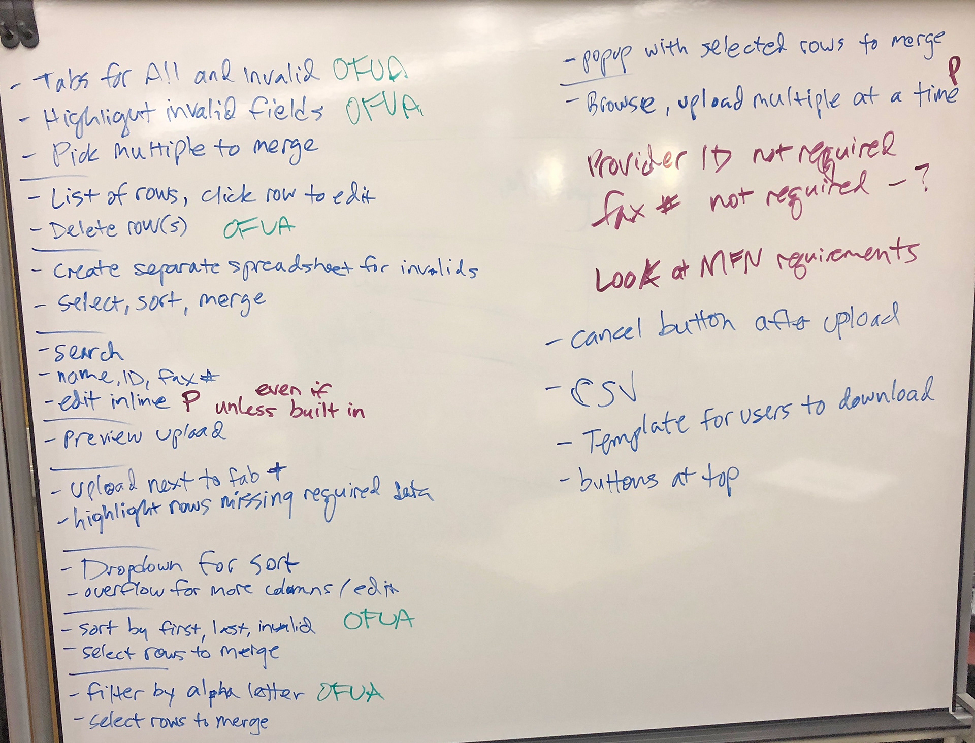
Ideas generated during the ideation/whiteboarding session.
Close-up of my whiteboard sketch generated during the ideation/whiteboarding session.
Beyond the initial ideation session, further discussion by the core team led to some wording changes for certain actions (upload to import) and utilities (log to report) to make for a clearer user experience.
Wireframes
Later on in the process, the developer SME reported back to the core team that the other devs expressed interest in using the Material Design “more options” icon and dropdown menu component instead of a drawer with buttons to represent the download and import actions. Although this setup is used elsewhere in the product, it’s better to have the buttons/actions presented and ready to go on the page right away versus having to make an extra click on the more options icon and then another click on the dropdown menu.
Designing the provider import feature was a huge thrill for me, as it was the first feature that I led the design on under a new/refined design process (which focused on doing things in small teams versus large groups). Overall, I learned a lot from my core team members. Everyone was prepared and were ready to ask the right questions when needed. I wish all feature work could run that smoothly!