


In the course of transferring a software company's flagship desktop product into a cloud-based platform, a non-ideal user experience environment was created and the company realized that some reworking of the design was needed (hence the creation of the UX/UI team I was part of).
My team was asked to review the latest iteration of company’s software and make a list of areas in which the design could be improved (kind of similar to when teams comb through software looking for bugs). We called it “UX polish.” This was only the second time we performed this particular task (aside from documenting random things that needed to be fixed), but it was expected that it’d be a regular part of our ongoing tasks. We ended up with close to 50 new design-related product backlog items (PBIs) during this run. There were six items that I felt required design, so I was tasked with creating mockups for the development team.
My team was asked to review the latest iteration of company’s software and make a list of areas in which the design could be improved (kind of similar to when teams comb through software looking for bugs). We called it “UX polish.” This was only the second time we performed this particular task (aside from documenting random things that needed to be fixed), but it was expected that it’d be a regular part of our ongoing tasks. We ended up with close to 50 new design-related product backlog items (PBIs) during this run. There were six items that I felt required design, so I was tasked with creating mockups for the development team.
Scheduling form
One of the very first things I noticed when first looking at this software was that the form for scheduling patient procedures was kind of a mess. The form fields didn’t line up (creating a poor visual experience for users), some fields opened up in a new window (which was confusing as the form itself was already in a dialog/popup) and the iconography was repeated in spots. When users go to schedule procedures, everything should be nicely laid out for them and not appear as disjointed. The scheduling form is the basis for many other tasks within the software, so the experience should start off on a positive note.
One of the very first things I noticed when first looking at this software was that the form for scheduling patient procedures was kind of a mess. The form fields didn’t line up (creating a poor visual experience for users), some fields opened up in a new window (which was confusing as the form itself was already in a dialog/popup) and the iconography was repeated in spots. When users go to schedule procedures, everything should be nicely laid out for them and not appear as disjointed. The scheduling form is the basis for many other tasks within the software, so the experience should start off on a positive note.
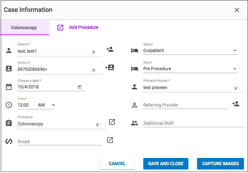
Screenshot of the scheduling form prior to redesign.
My proposed design consisted of making all of the form field lengths the same, lining up icons (as well as selecting new icons to replace ones that were repeated or not accurately represented) and changing two fields that opened in new windows into dropdown menus. The design, which you can view below in prototype form, was well-received by the rest of the UX/UI team, product management and development team. It provides a cleaner experience for the user and allows for them to easily schedule procedures without leaving the screen.
Security groups
In its current state, the security groups section organizes groups pretty haphazardly in panels. Each panel then has a dropdown menu for future phase actions (delete and copy). To make edits, a user has to click on a panel, which opens in a new window. From there, there are two main access levels that are organized by tabs (enterprise, exam access). Users then determine editing rights via basic button toggles (Material Design). Buttons are, of course, used throughout the software in contained and text versions, but this is the only spot to use basic buttons in gray. It’s a bit odd and makes for an inconsistent user experience.
In its current state, the security groups section organizes groups pretty haphazardly in panels. Each panel then has a dropdown menu for future phase actions (delete and copy). To make edits, a user has to click on a panel, which opens in a new window. From there, there are two main access levels that are organized by tabs (enterprise, exam access). Users then determine editing rights via basic button toggles (Material Design). Buttons are, of course, used throughout the software in contained and text versions, but this is the only spot to use basic buttons in gray. It’s a bit odd and makes for an inconsistent user experience.
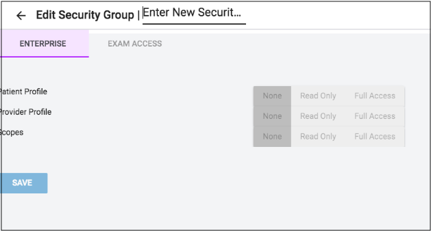
Screenshot example of original design
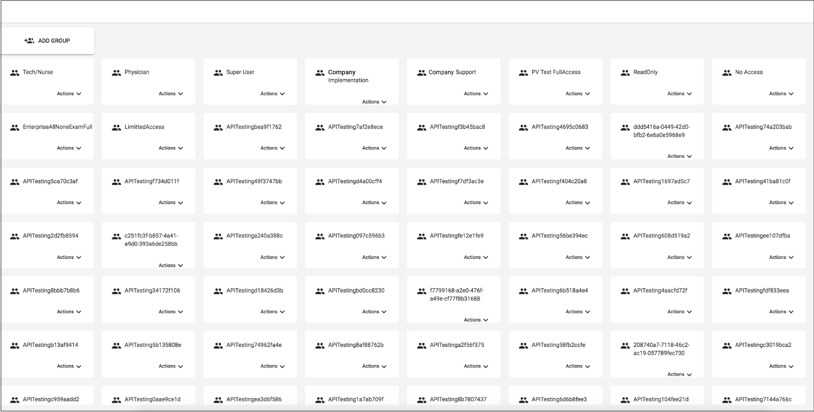
Screenshot example of original design
I felt that this section could be cleaned up by putting all of the available actions on the same page. My proposed design is based on a responsive grid with lengthened panels (three columns is the default number to show), panel expansion (so users wouldn’t have to edit security access on a separate page) and the delete and copy actions as icons within the panel. The basic buttons were replaced with radio buttons, which are already used elsewhere. Additionally, users would have the ability to open multiple panels at the same time so they can compare one group with another. Ideally, the user interface would be developed first, followed by the functionality (e.g. delete and copy actions) later on in future iterations.
When I presented my design to the UX/UI and development teams, we as a group realized that this was going to be a much bigger project than originally anticipated as these changes would end up impacting the user management section (which allows super admins to manage all of the users for their applicable sites).
The two sections would need to be combined at some point so super admin users can see which individual users are in each group and add/remove users and permissions (when in security groups), and, see which groups users are in and add/remove groups and permissions (when in user management). Additional requirements would need to focus on naming conventions (for sites with multiple specialities like: gastroenterology, pain, orthopedics, cardiology, pulmonary) and alerting users that users won’t have a group if the super admin users deletes anything. At a future point, both sections should employ the same design as well (e.g. expanding panels, tabs, icons).
This particular part of our polish project turned out to be very time consuming for me, as I ended up going through several design iterations before even presenting outside of the UX/UI team, but I definitely think it was worth it as users will have a much more clean and clear-cut user experience without having to leave the page. The final design is available to view below in prototype form: